BROWNIE BROS | Brand ReDesign | 2017
Brownie Bros is a small cake shop / cafe, located in Porto Velho, Rondônia. It is specialized in brownies and has quickly become one of the most traditional and beloved brands of the city. The old logo was rudimentary and did not carry on the concept/styling that the owners would like/imagine for the brand. We were challenged to give a new identity to the company maintaining some of its nature.
Brownie Bros is a small cake shop / cafe, located in Porto Velho, Rondônia. It is specialized in brownies and has quickly become one of the most traditional and beloved brands of the city. The old logo was rudimentary and did not carry on the concept/styling that the owners would like/imagine for the brand. We were challenged to give a new identity to the company maintaining some of its nature.
The brand's new visual identity design needed to be exhilarating, friendly, funky, lively, and above all transmit the idea that in Brownie Bros everything is done with care, and zeal, all of this without giving up the young and extroverted spirit the brand has earned through the years.
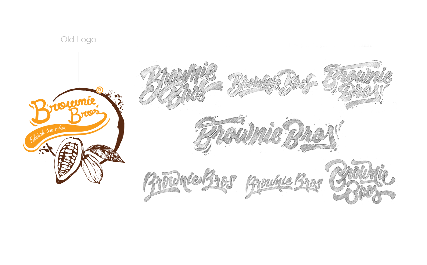
As we wanted something unique, the first step was to create an original lettering.

Typography and lettering design by Marcelo Schultz
Cool and soft touch.
Our objective was to keep the handwritten style, but at the same time give it a younger, cooler touch.
Our objective was to keep the handwritten style, but at the same time give it a younger, cooler touch.
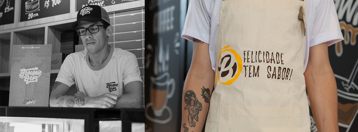
We kept the original color palette
It was important to keep the brand's original colors so as not to impact consumers who were already fond of it. The original colors closely matched the brand universe, so all we did was set the standard palette, define the pantones and add a third color tone to the set to increase brand nuances within the logo's possible applications.


Photography by Beethoven Delano


Strong flavour. Strong Identity.
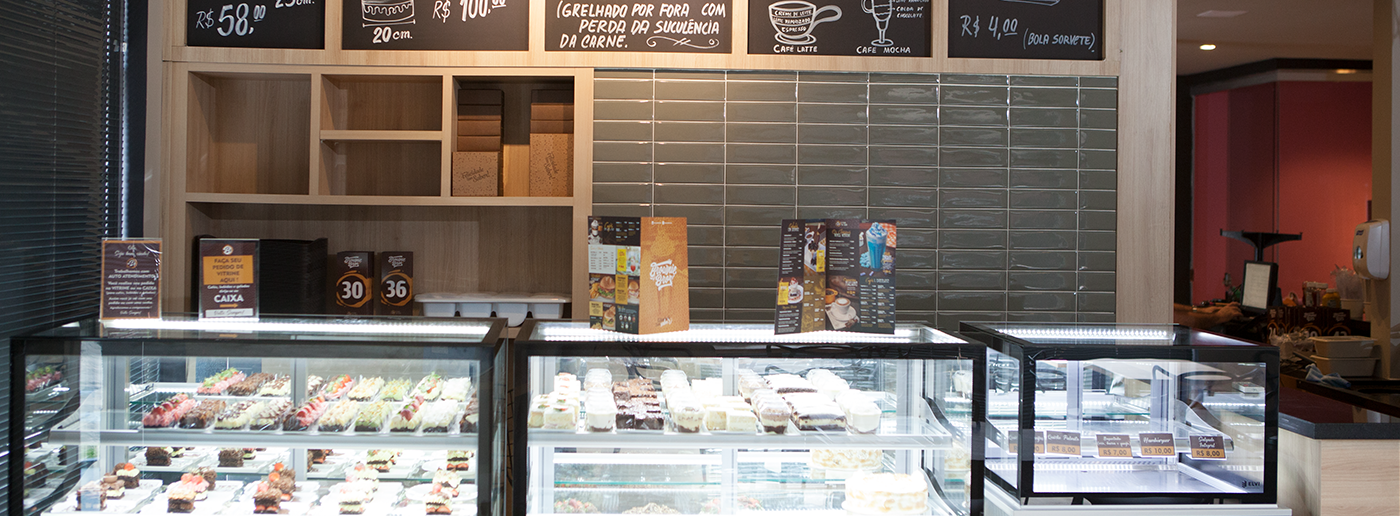
Young, cool, intelligent and full of attitude. It is with this audience that we wanted the brand to talk. We developed all the shop itens identity so that it was intense, easily recognizable, and had a strong presence inside the store.


One spirit, multiple signatures.
Inside a cafe, the variety of items where the brand needs to be applied is very large. It was our priority integrating the brand spirit and applying it in several places in a number of different ways without overwhelming the customer. Our idea was to create multiple signatures, adding freshness and variety in the way the brand is shown to consumers.


Really Tasty.
In our opinion, the menu needs to convince the consumer that what he sees is what he gets. We were careful to produce the images of the menu, highlighting the details and the qualities of the products that would be displayed. The layout is modular and follows a pleasant
reading flow, not overloading the reader with much unnecessary information.


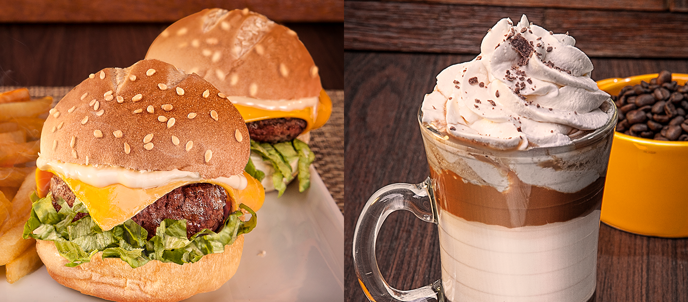


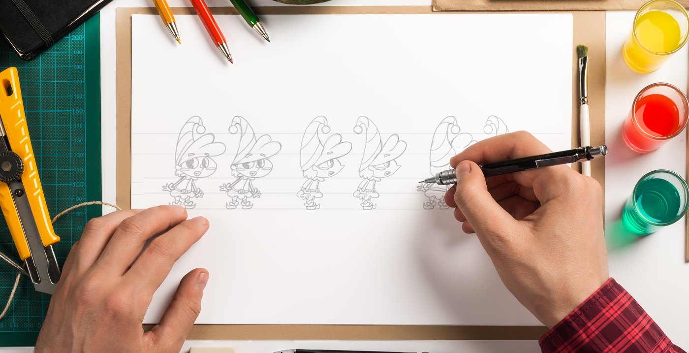
Illustration by Bruno Azevedo


Illustration by Bruno Azevedo