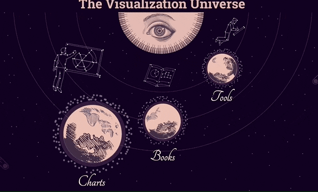
We made visualization for Google Trends that visualize the field of visualization itself. A meta visualization. It's interactive infographic.
The project page: visualizationunivers.com
The catalogue contains the most popular (according to Google Trends) charts, tools and books in data visualization field.
We used progress bar to visualize current popularity, and a sparkline to show change in popularity (search interest).
The grid could be sorted alphabetically, by popularity and change in search interest
We used progress bar to visualize current popularity, and a sparkline to show change in popularity (search interest).
The grid could be sorted alphabetically, by popularity and change in search interest

Clicking on each element on page open a popup page, which has unique URL:

source: visualizationuniverse.com