

CLEAR FORK CIDER
IDENTITY DEVELOPMENT / PACKAGING DESIGN
Ask a brewmaster at Clear Fork Cider what makes their cider so special and you're bound to hear, "the apples!”. This simple and crisp brand reveals the natural, no additives personality of the cider itself while emphasizing the star of the show with the apple shape. With Clear Fork, design meets nature and it turns out to be a perfect fit.


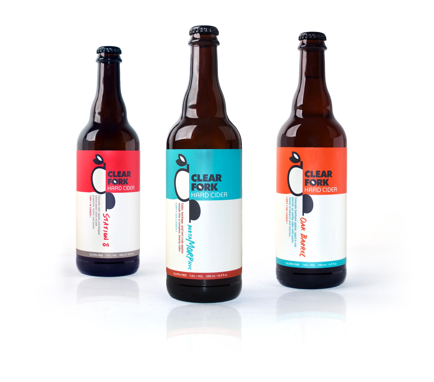
Clear Fork Cider is all about the apples, and wanted packaging that was simple, classic, but definitely ready to cut loose. Clear Fork pops off the shelf and represents the joy and good times that go into every batch. Look out “me too” brands, this high class hard cider is jumping off of the shelves.
AWARD WINNING! This design won Silver in 3D Packaging / Product at Art Directors Club Denver's 2017 Annual Show!


