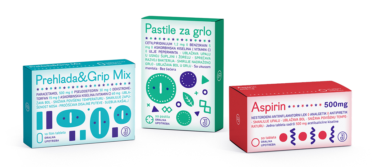
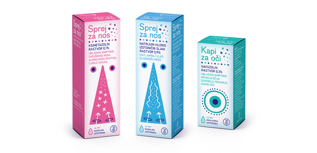
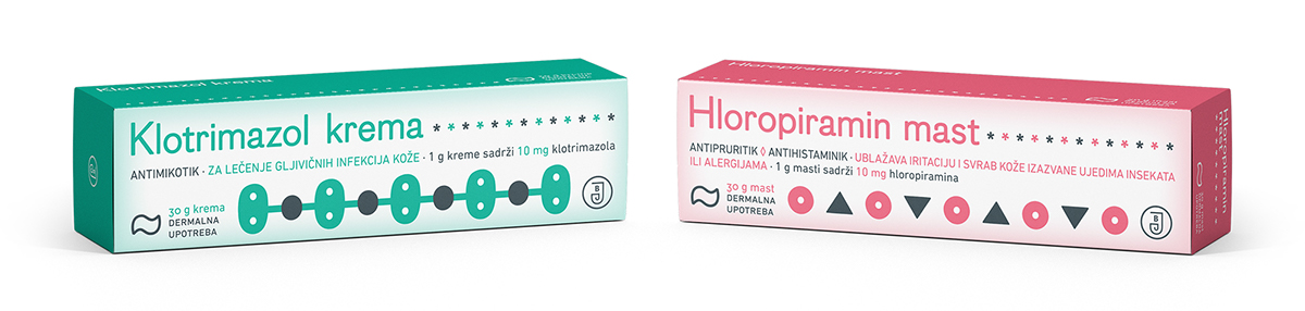
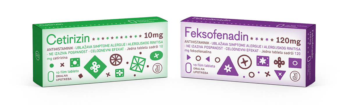
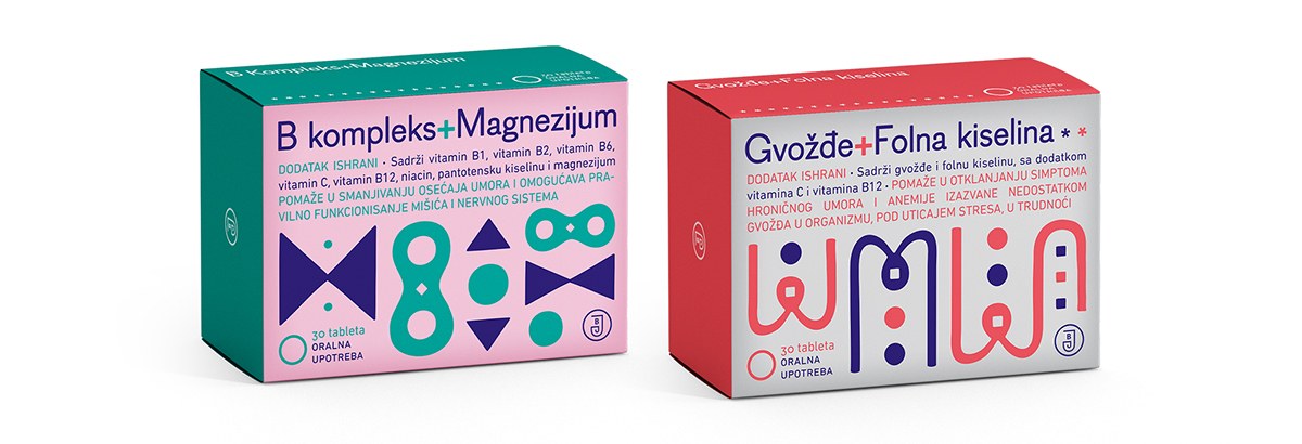
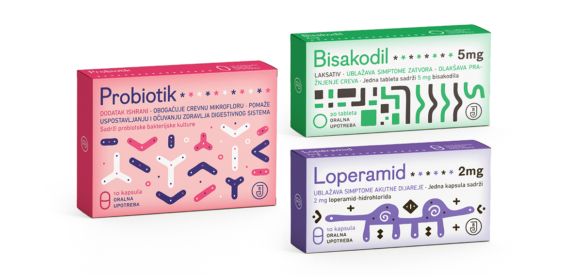
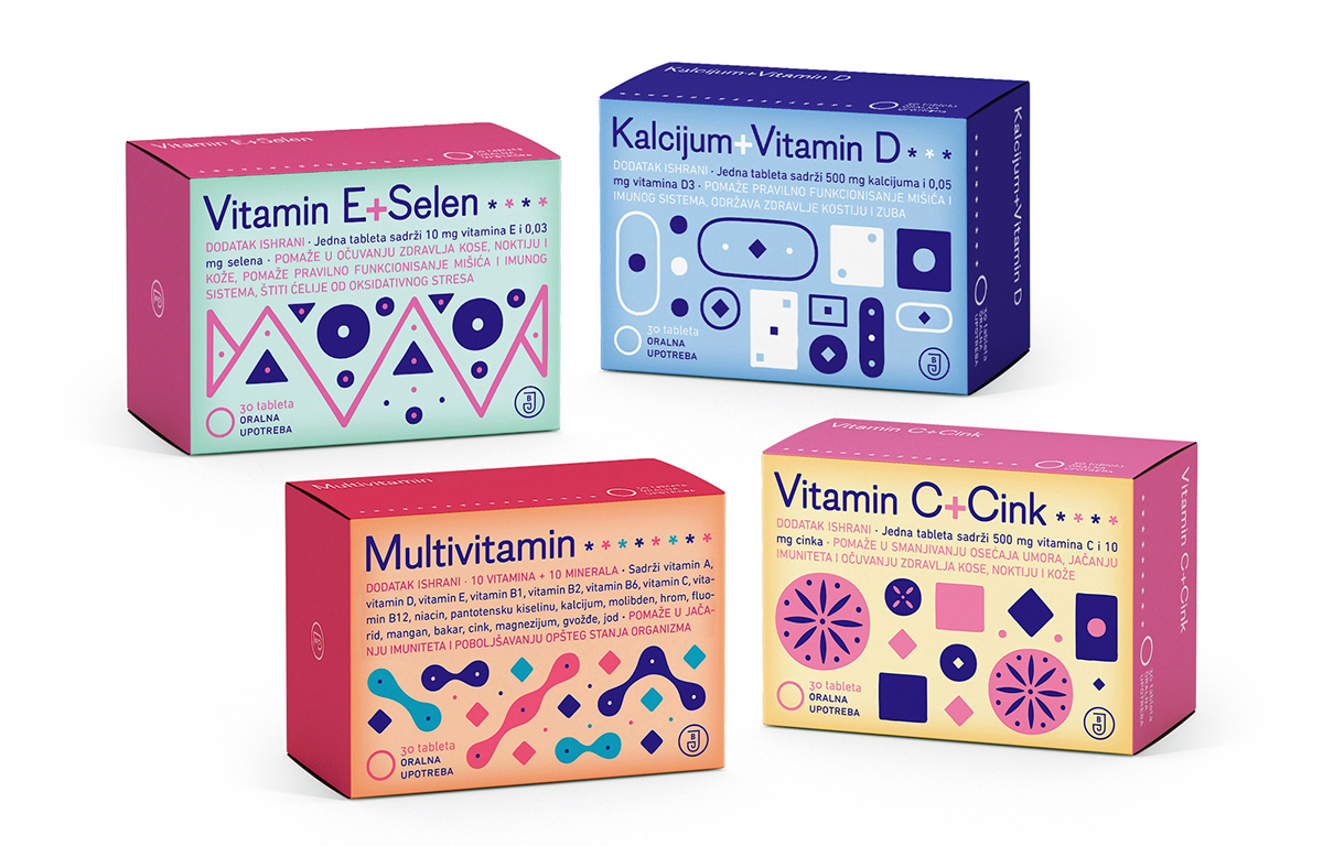
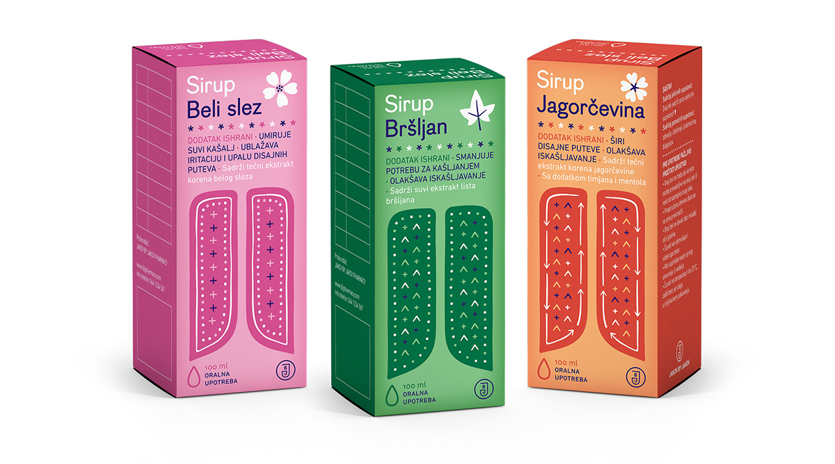
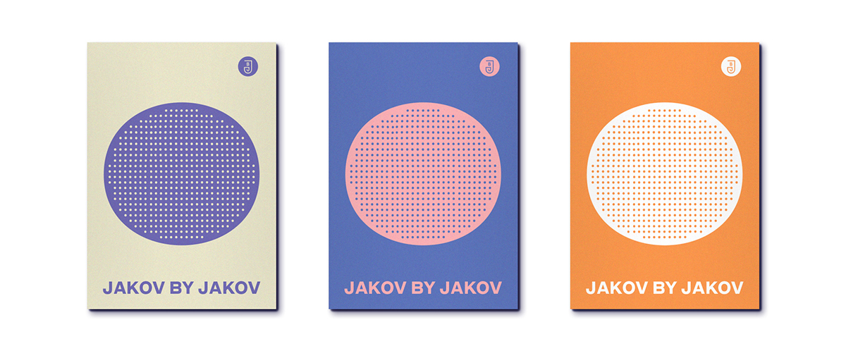
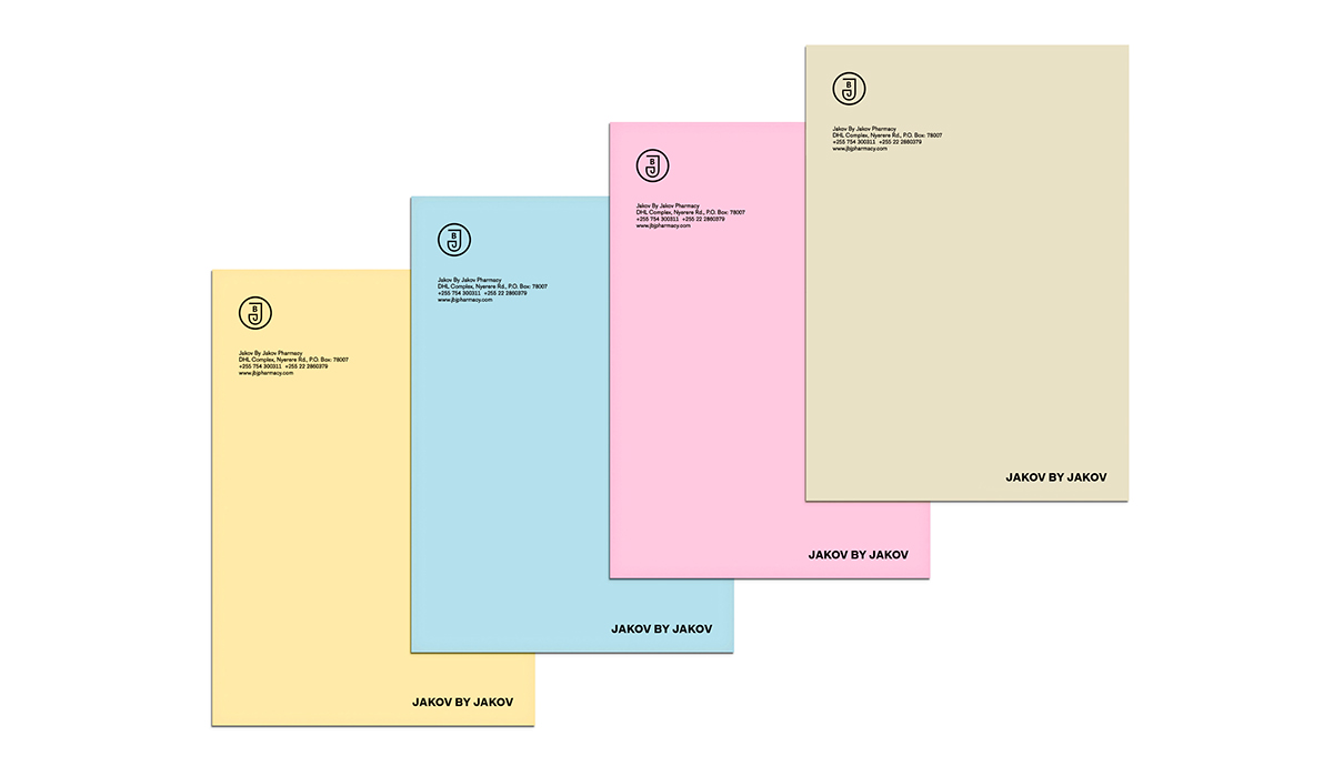
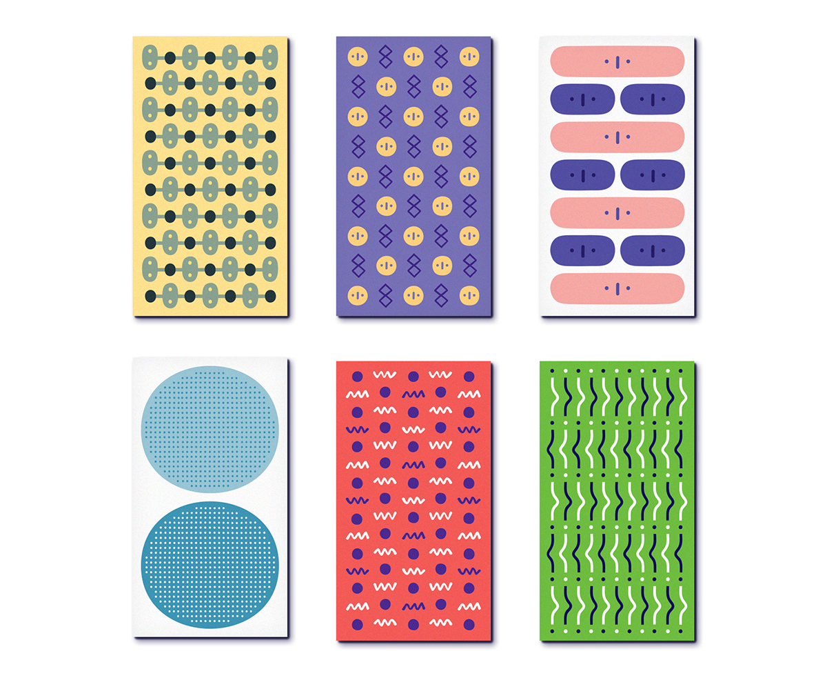
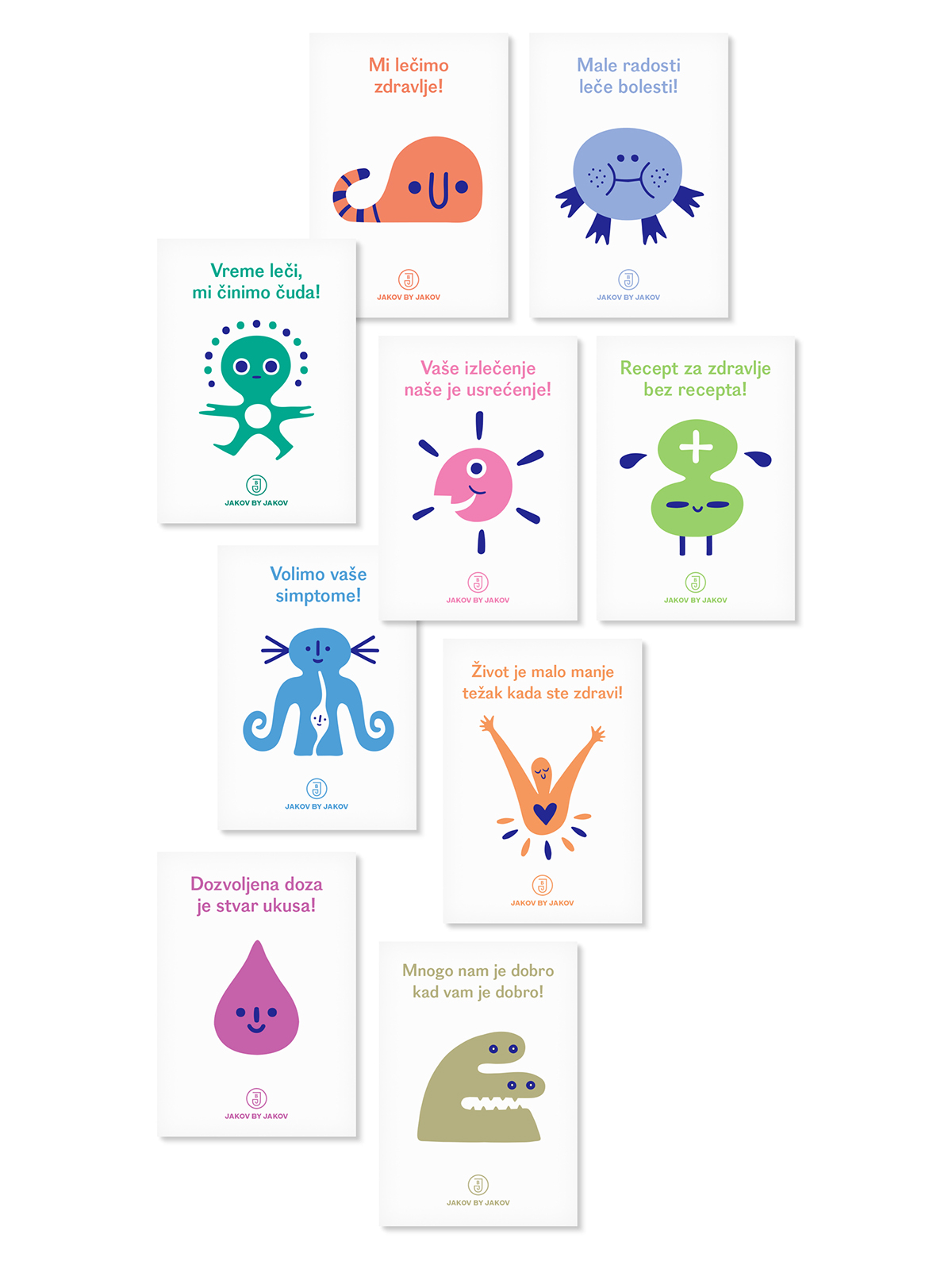
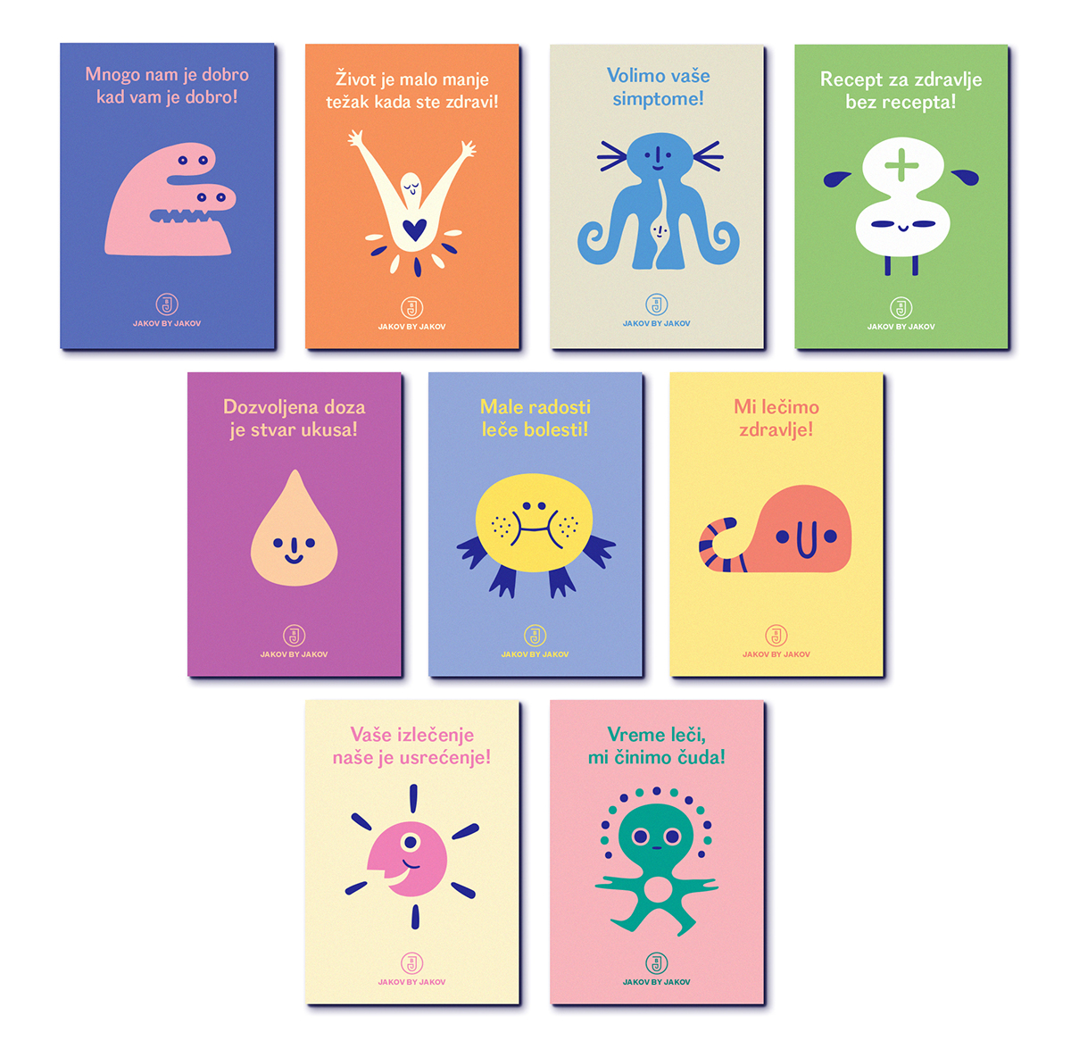
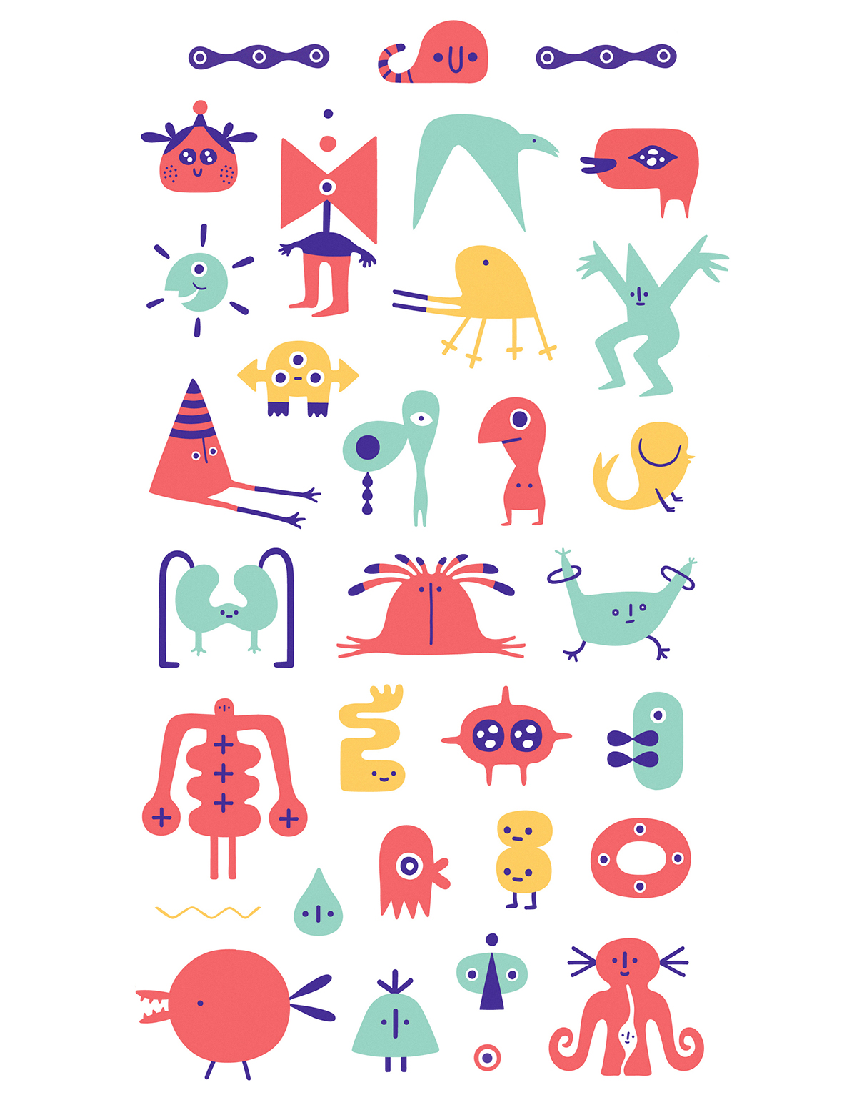
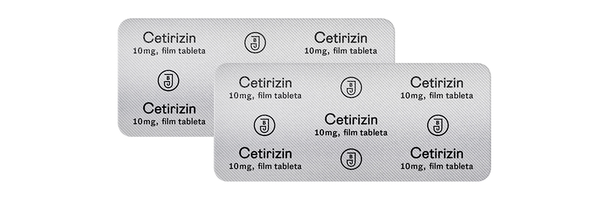
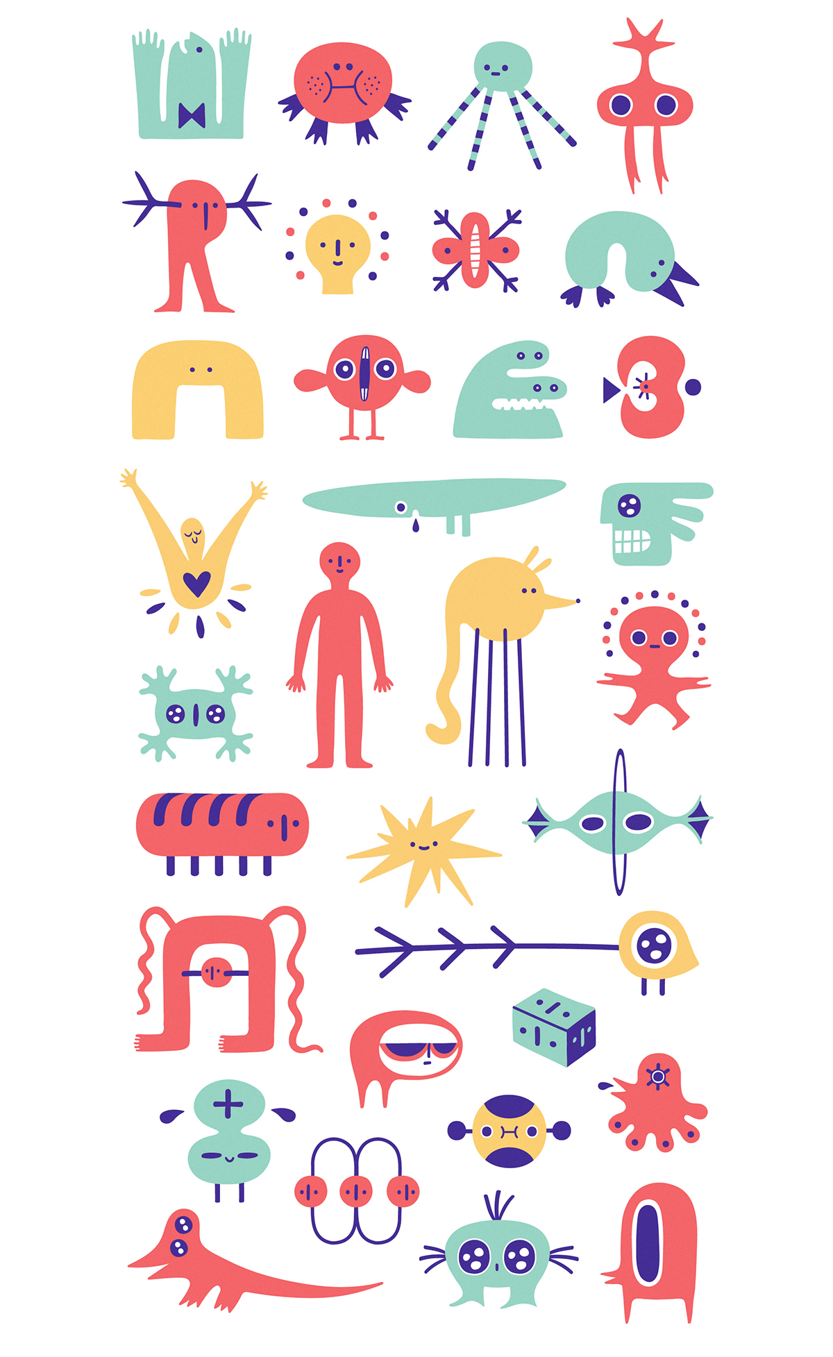
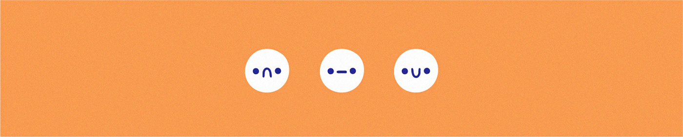
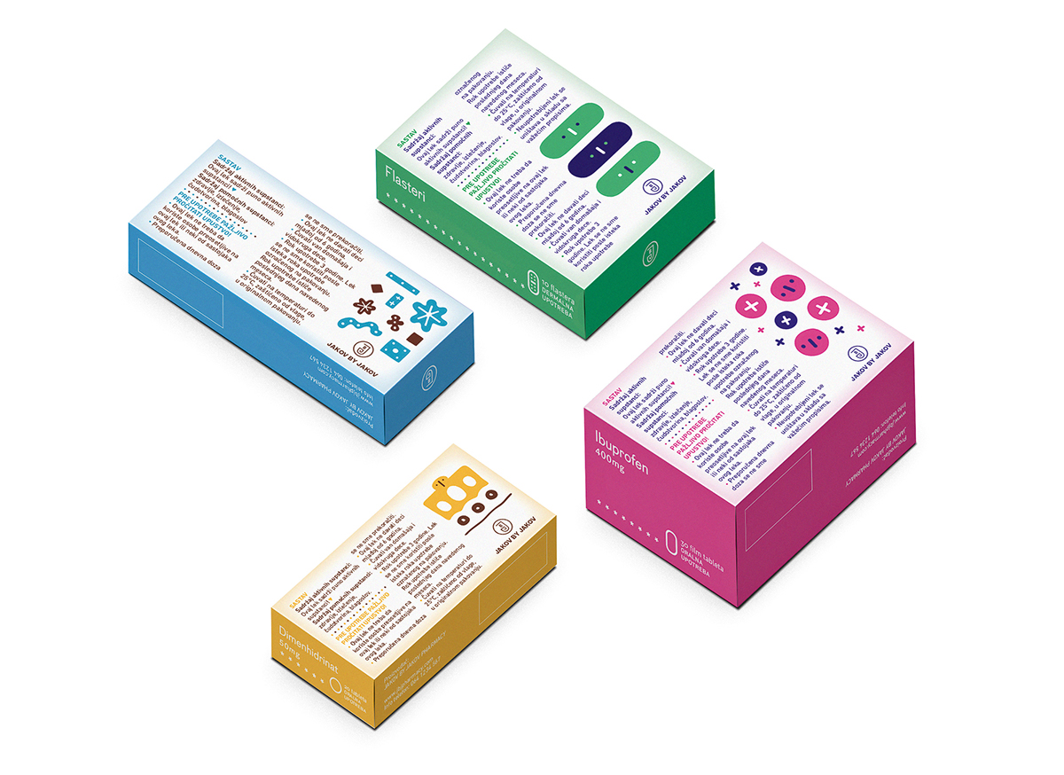
My master’s thesis project (2017/2018) went to great lenghts in order to create a new, distinctly colorful and cheerful look-and-feel for over-the-counter (OTC) medicine packaging and all sorts of accompanying visual communication devices. Everything from my approach to illustration and typography to the various ways the visuals adapt to different applications was my attempt to create a unique visual language. The main goal was to have the packaging serve as both a vital source of information for the consumer, and also as way to enrich the process of bying and using the relief-giving medicine inside the packaging with some much-needed colorful optimism.


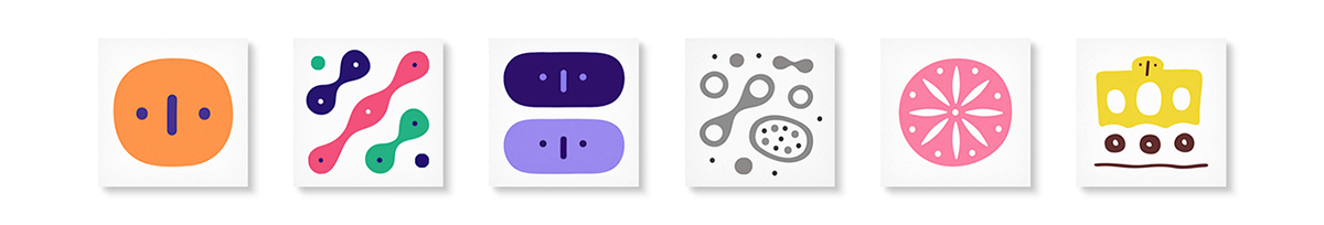
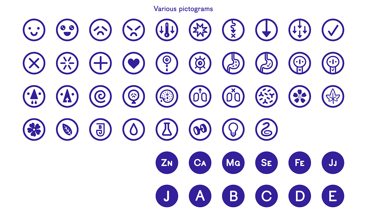
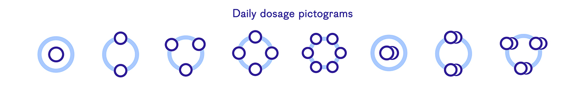
My goal was to create a consistently engaging and informative visual language with a heavy accent on eye-catching, playful and evocative illustrations and simple, easy-to-understand approach to typographical information.