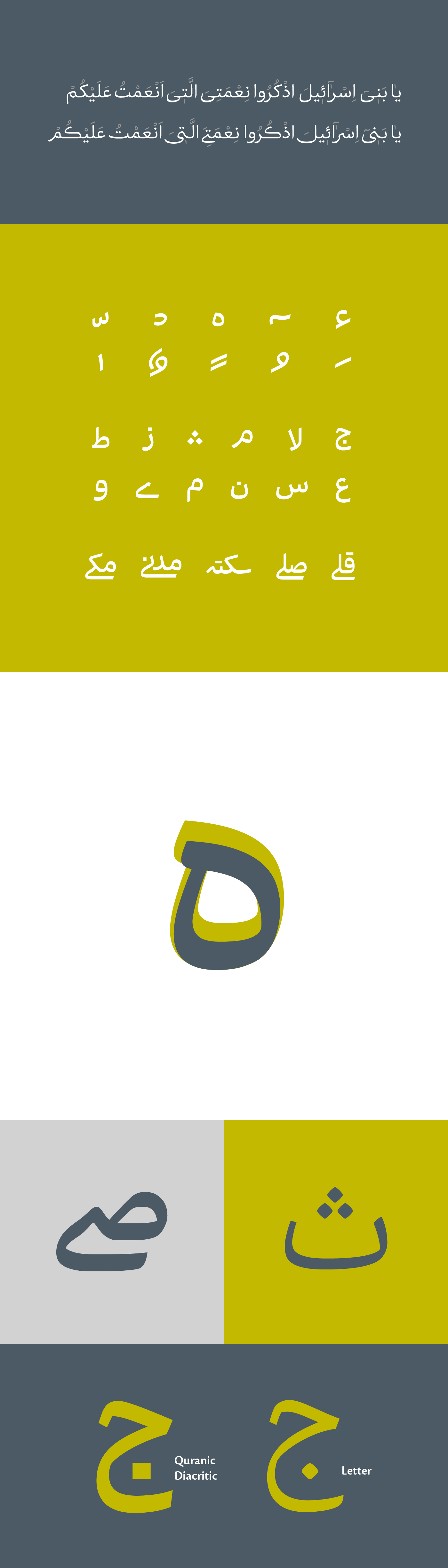
From the very first day of Quran revelation, sharing and publishing it was an important matter. It is very important to use a script that shows the formal and glorious feelings in God’s words, but meantime makes them seem lovely and warm. The script should not be including complex or sophisticated forms, should be easy to read, and help to increase the reading speed and comprehension.
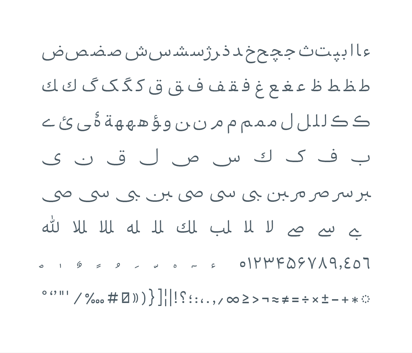
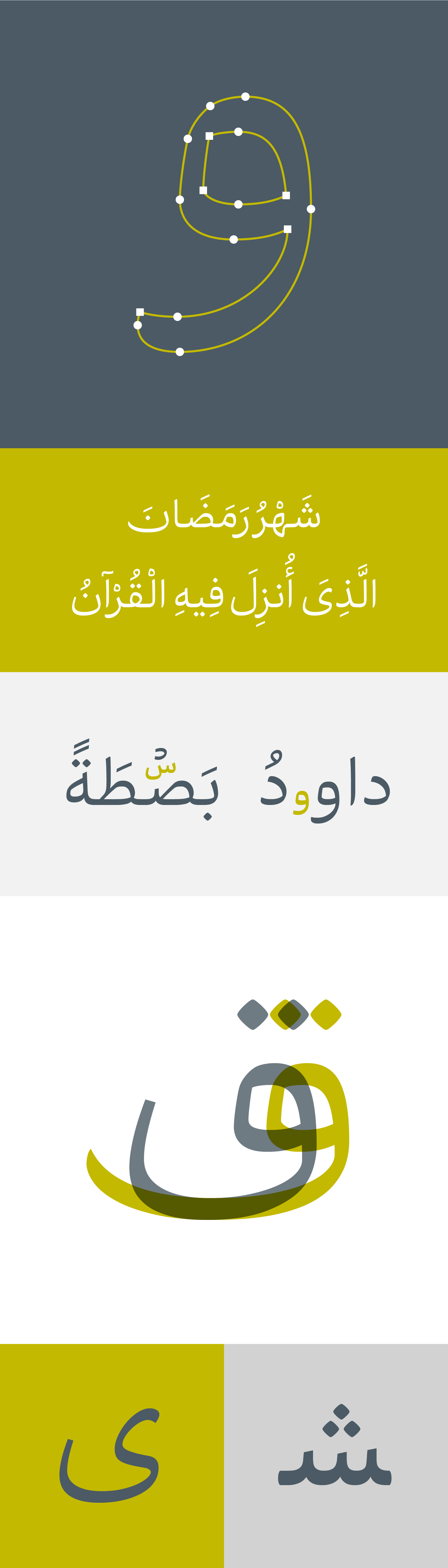
Vazeh has been designed to use in Quran’s text in order to keep its glory and share its concept among the new generations. That is why “legibility” was the most important part of designing this typeface. Having Iranian spirit inspired by Neyrizi Naskh script, high clarity and simplicity, good and fast understanding of the verses, are the other features of this typeface.
*Vazeh means clear
Vazeh typeface creating and designing process
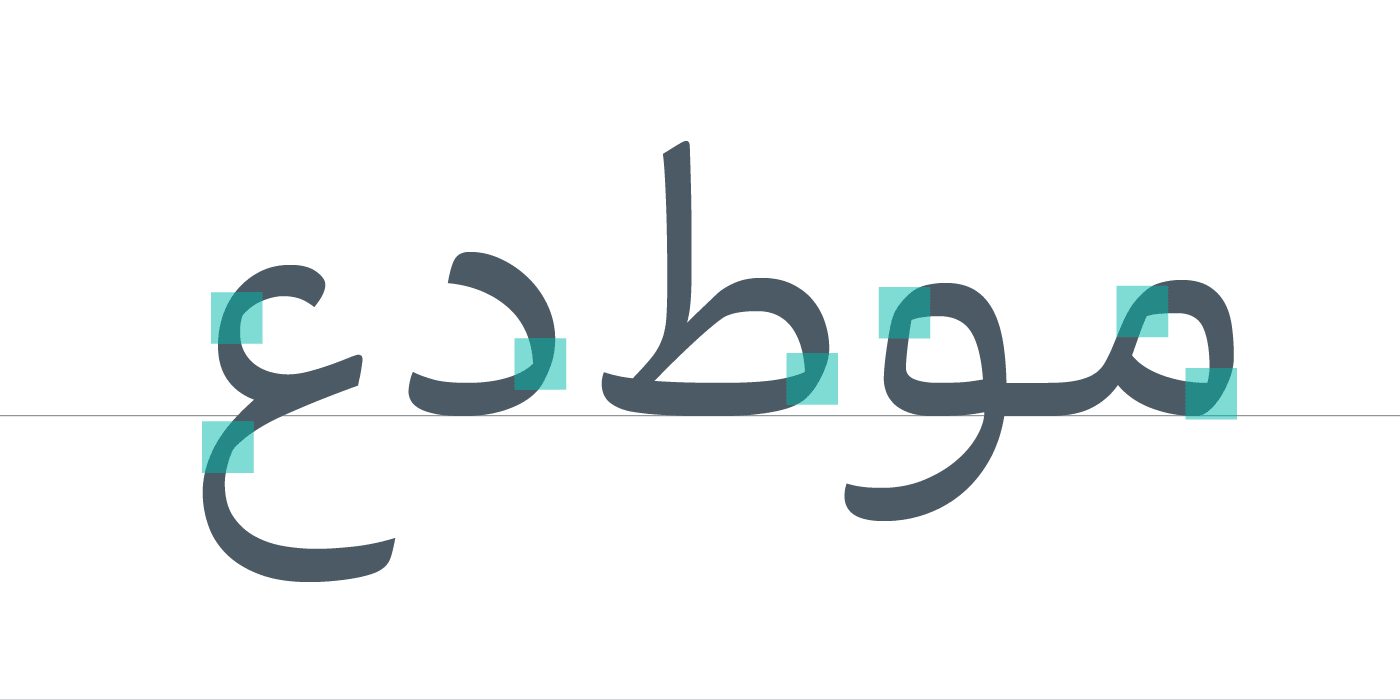
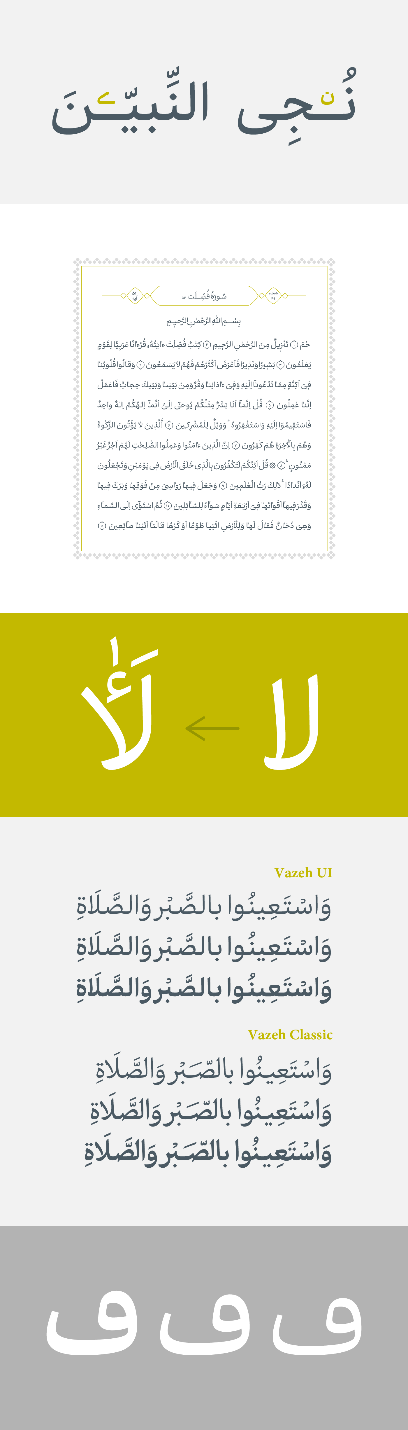
Before starting, the designing crew visited The Quran museum of Tehran and Mashhad, and studied and analyzed the scripts used in different Qurans. The very first etudes were drawn with a normal marker and calligraphy pen. After achieving the basic forms in letters, the words were studied, and some letters were selected to be carefully designed and drawn on tracing papers. Then the tracing papers were scanned and the letters were designed in vector with exact details. There were a lot of redesigning and editing on the computer during the design process.
This typeface has been designed in 2016 and the software process was done in 2017. Vazeh typeface family includes three weights of regular, semi-bold, and bold. Reza Bakhtiarifard and Omid Emamian are the co-designers of Vazeh typeface. Vazeh has been designed for Ofogh-e Rooydaad Company, and is already purchased.
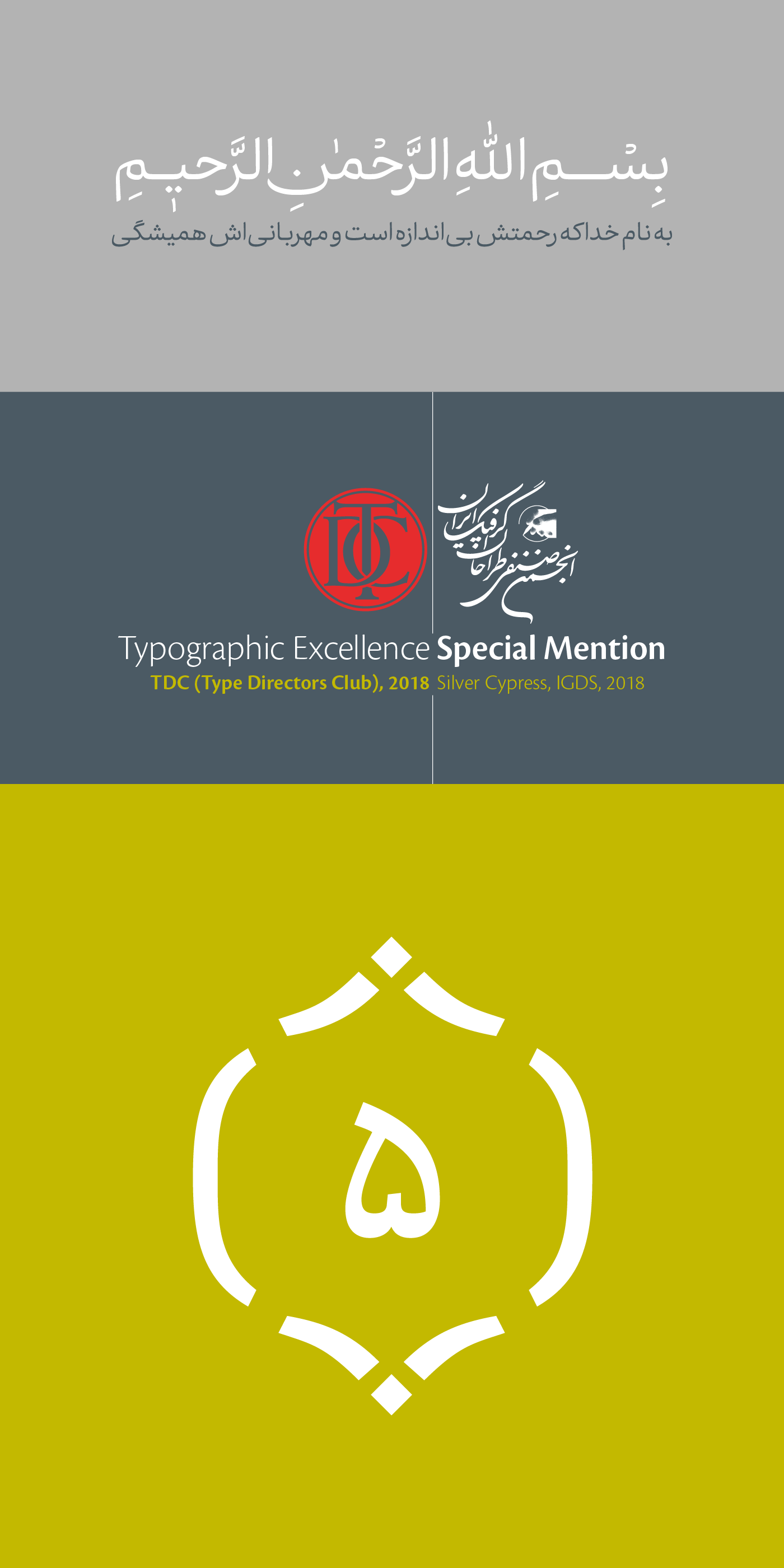
So far, Vazeh has been received two international honors:
• Special Mention in Silver Cypress ,Iranian Graphic Designers Society, in 2017
• Certificate of Typographic Excellence from Type Directors Club (TDC), which is the most valid international typeface certificate, in 2018.
• Certificate of Typographic Excellence from Type Directors Club (TDC), which is the most valid international typeface certificate, in 2018.
از نخستین روز نزول قرآن نشر و ترویج آن مسئلهی مهمی بوده است. در این مسیر، بسیار مهم است که خطوط بهکار گرفته شده رسمیت و شکوه کلام خداوند را حفظ کند اما در عین حال دوست داشتنی و صمیمی به نظر برسد؛ به سهولت خوانده شود، از نظر فرمی معما و پیچیدگی نداشته و به سرعتِ خواندن و فهم سریع کلمات کمک کند.
تایپفیس واضح برای استفاده در متن قرآن کریم و با سیاست آموزش و حفظ این کتاب مقدس و ترویج آن برای نسلهای جوان طراحی شده است. به همین منظور در این فونت «خوانایی» به عنوان یکی از مهمترین اصول طراحی، اهمیتی دوچندان یافت. از دیگر ویژگیهای آن میتوان به: القای روحیه و حس ایرانی با الهام از نسخ نیریزی، سادگی و وضوح بالا، همچنین قدرت انتقال و فهم سریع آیات اشاره کرد.
مراحل طراحی و شکلگیری تایپفیس واضح
پیش از شروع کار، گروه طراحی از موزههای قرآن تهران و مشهد بازدید کرده و به بررسی و تجزیه و تحلیل دستگاههای خطی اسفاده شده در قرآنهای مختلف پرداختند. سپس اتودهای اولیهی حروف، با ماژیک معمولی و ماژیک خوشنویسی انجام شد. پس از رسیدن به فرمهای پایه در حروف، نوشتهها بررسی شده و حروف مناسب انتخاب شدند تا بهطور دقیق، با مداد روی کاغذ پوستی رسامی شوند. در مرحلهی بعد، کاغذهای پوستی اسکن و با دقت بهصورت بُرداری اجرا شد. در طول کار، بازبینیها و رتوشهای بسیاری در کامپیوتر بر روی این تایپ اعمال شد.
این فونت در سال ۱۳۹۵ طراحی شد و مراحل نرمافزاری آن در سال ۱۳۹۶ پایان یافت. خانوادهی فونت واضح شامل ۳وزن عادی، نیمهبولد و بولد است. رضا بختیاری فرد و امید امامیان طراحان این تایپفیس هستند. واضح به سفارش شرکت افق رویداد طراحی و تولید شد و قابل خرید نیست.
تا امروز، تایپفیس واضح ۲ افتخار کسب کرده است
در سال ۹۷ موفق به دریافت نشان تایپوگرافی ممتاز از باشگاه طراحان تایپ امریکا شد که میتوان گفت معتبرترین گواهی بینالمللی طراحی تایپفیس است
در در سرو نقرهای ۹۶ در بخش طراحی تایپفیس شایستهی تقدیر شد
در در سرو نقرهای ۹۶ در بخش طراحی تایپفیس شایستهی تقدیر شد