


As the name suggests The Supper Club is a members only dinner club, where Invitees are treated to a personalised 'chef's table' gourmet dining experience. This concept was the trial for what would later become Taste Vinoteca.
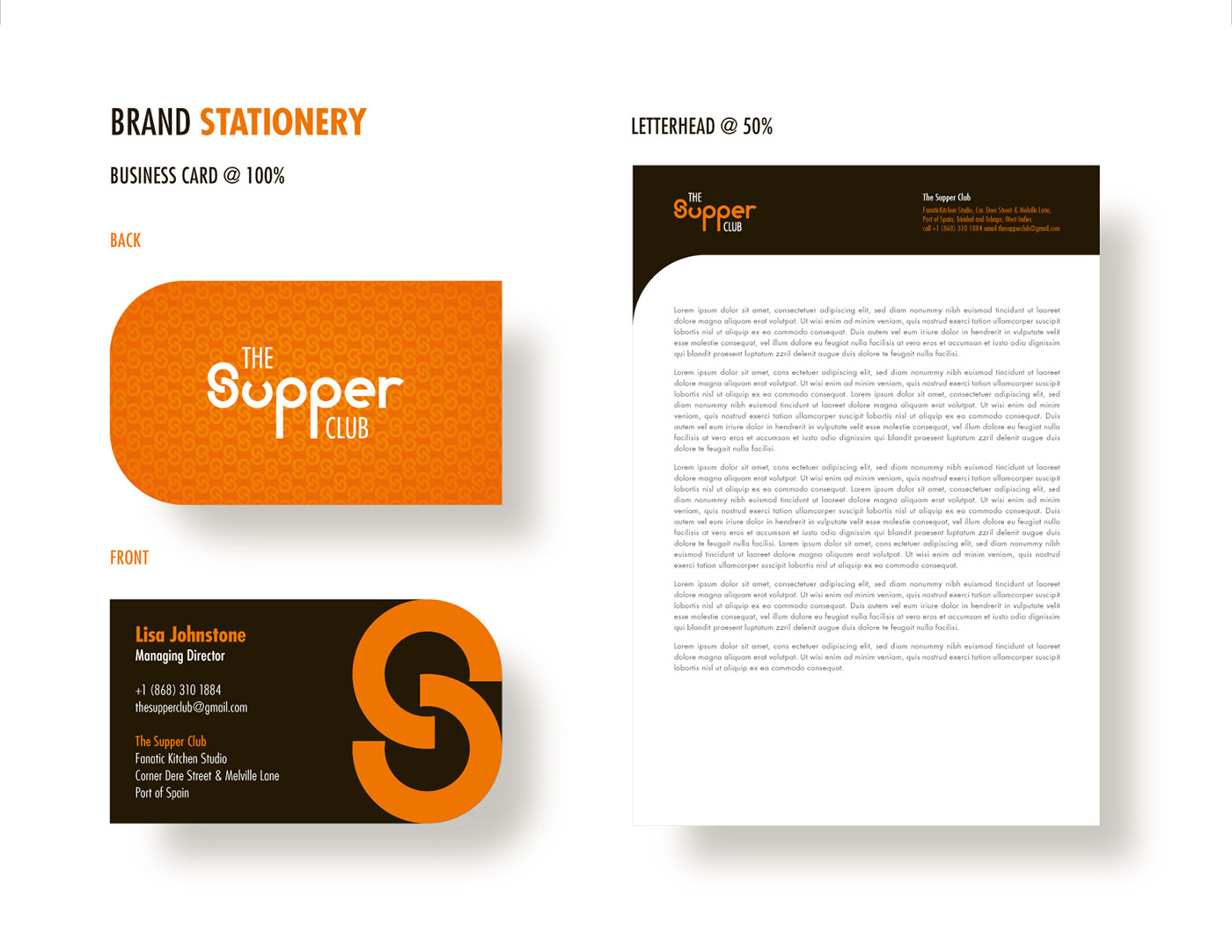
The task was to develop a brand identity that expressed the unique dining experience offered by the club. The client expressed their desire for the wordmark to be symbolic of the minimalist, modern aesthetic involved in the plating of each meal served and the atmosphere of the venue.
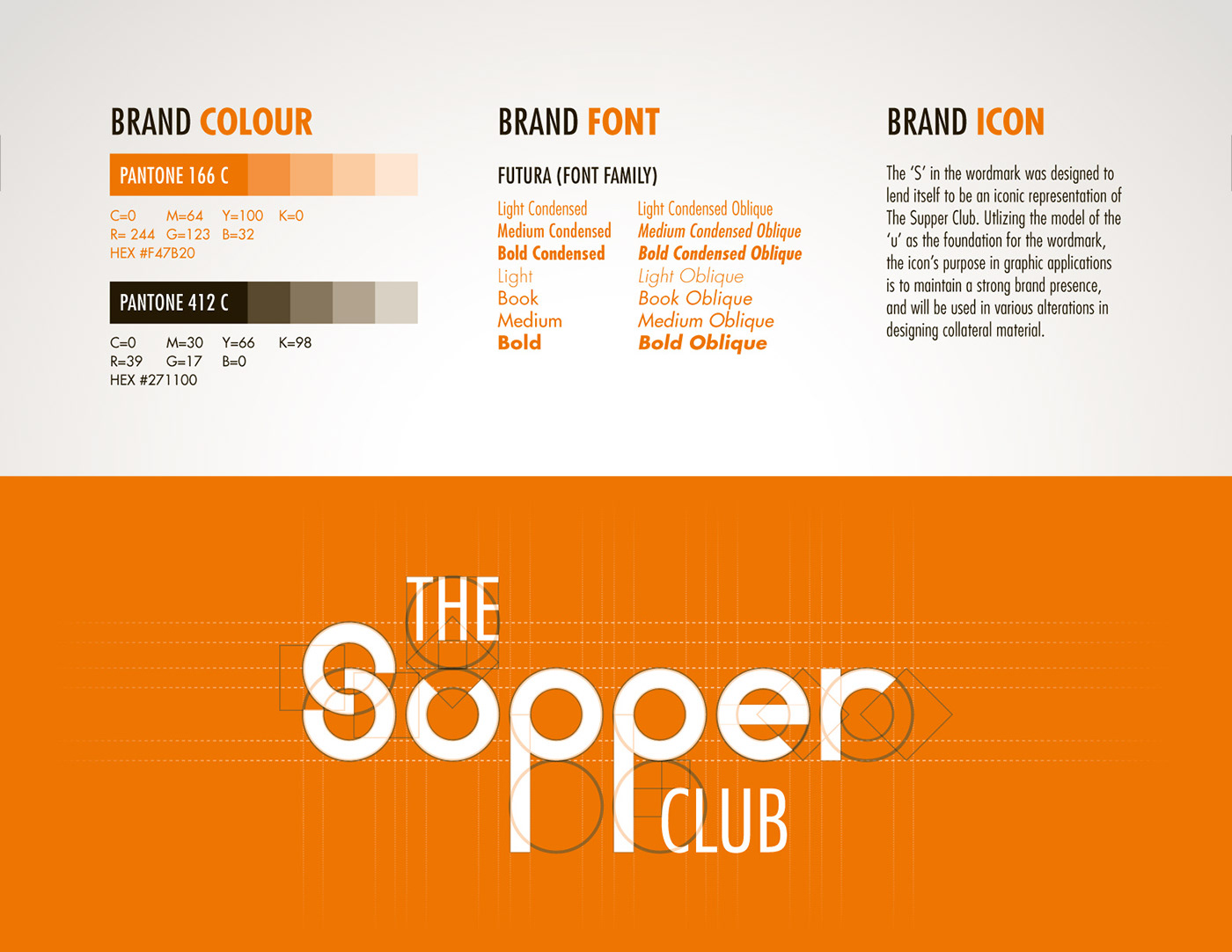
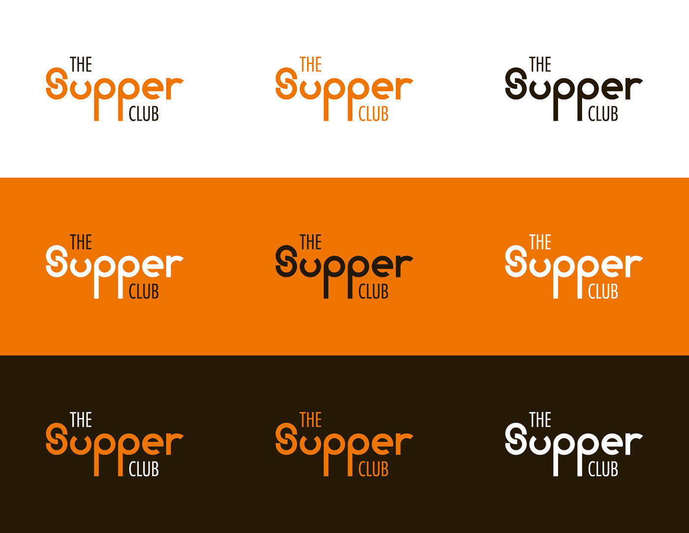
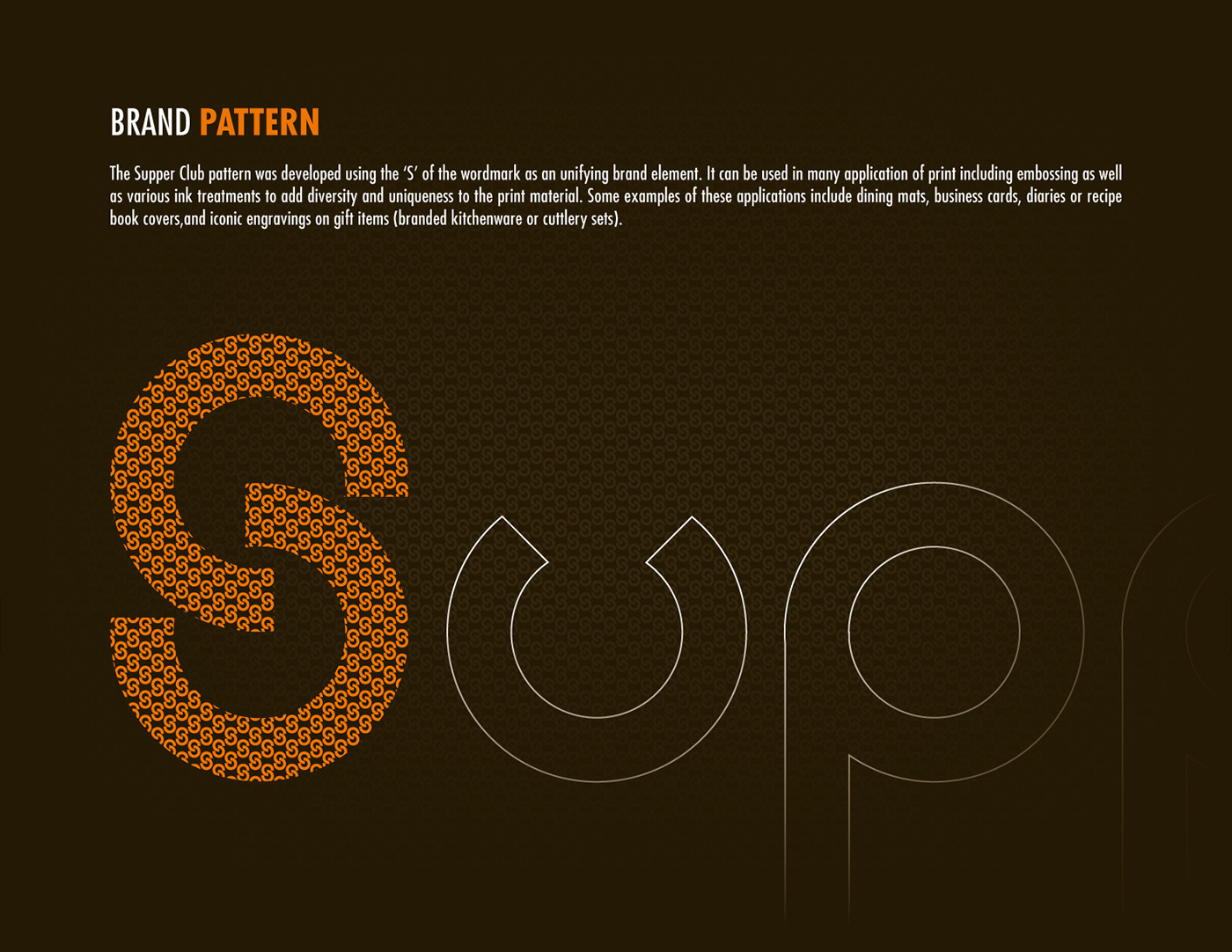
The result was a custom typographic design for the core label 'Supper'. It was developed through the use and manipulation of quadrilateral and circular shapes inspired by plating used. To complement this approach, the supporting typography chosen was the geometric sans-serif font family, Futura. The condensed typeface from the font family was used to finish the wordmark, symbolic of the intimacy of the setting and the pride that goes into preparing every bite.
The colour was predetermined, as it went well with the theme and also held personal significance to the client. I supported this requirement with colour psychology in mind – orange tones conveying warmth, community, creativity, and sense of adventure. These tones are also widely used in the hospitality industry for the feelings the tend to appeal to, drawing in interest from potential customers, and their desire for new experiences.
CLIENT
The Supper Club
CREATIVE DIRECTION / DESIGN
Jermold Compton
AGENCY
Are Network

T H A N K Y O U


