
The Background
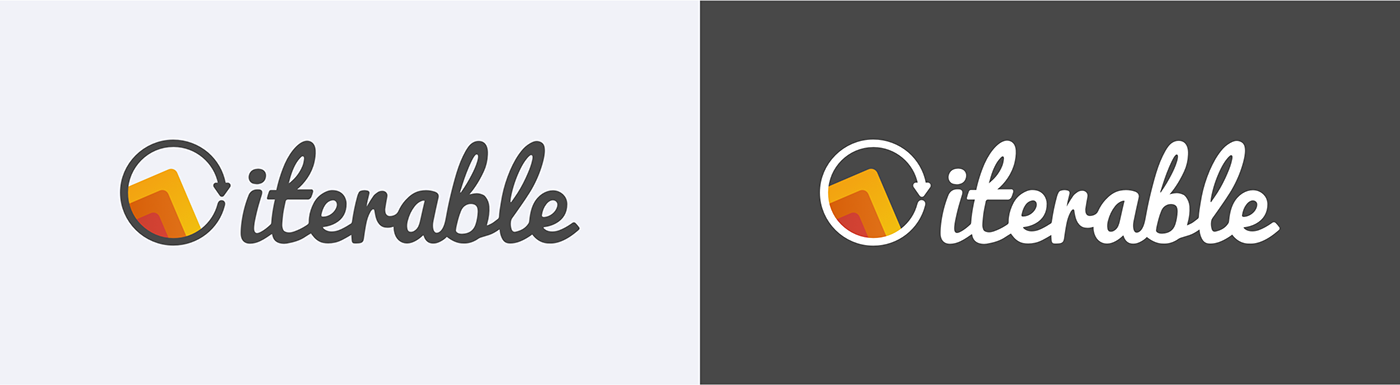
The visual look and feel of the old Iterable website was outdated. The word mark had
a bit of inaccuracy in shapes and lines and inconsistencies with the logo thickness.
Moreover, the logo sign had a lot of small details that caused visual noise.
Iterable's website design also deserved some refreshment,
since it was created in 2013.

Logo
Lots of users were already familiar with the Iterable brand, so our goal was
to keep it as close to the original brand look and feel yet make an evolutionary refresh.
We started iterating on the logo update first thing. We did a couple of experiments with the logo elements such as angle of the elements, corner roundness,
and other small details.

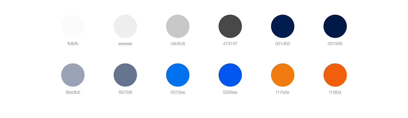
Primary Colors
The original Iterable logo had a few gradients and different shades of orange and yellow that we wanted to save (with small adjustments). Our branding team prepared a color palette to help interface designers maintain consistency across all of the brand items, including the website.
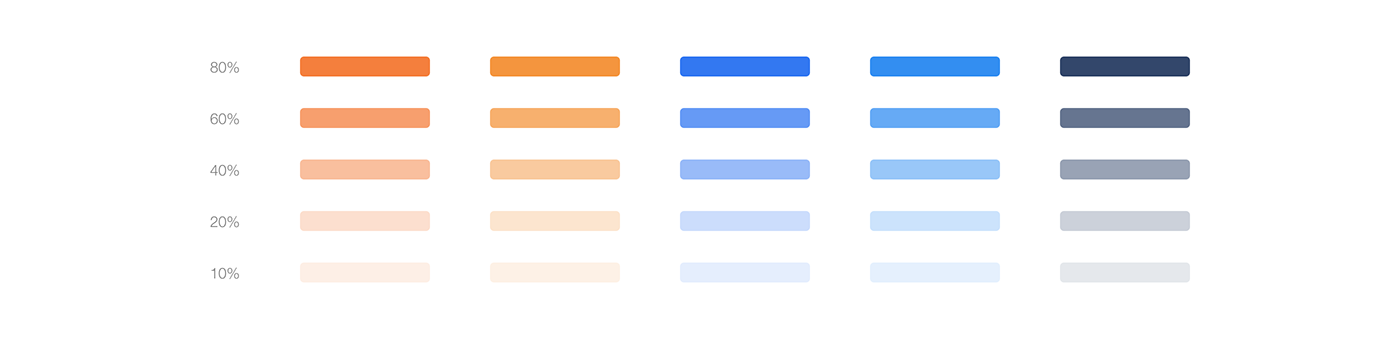
Gradients
As we mentioned, the original logo has its own gradients. Considering the current trends in user interface design, we discussed which tones could work well for UI elements such as buttons, etc. and added two gradients to the brand guide.

Illustration Colors
Coming back to the question of consistency, the branding team prepared a wider color palette to help our illustrators in future work. At this time we didn't have an idea what the illustration style should look like, so we created 25 different tones, including soft and vibrant options.
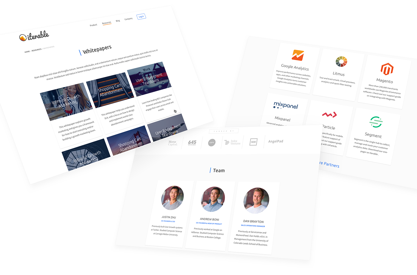
Header Evolution
When we started our work on the website interface, we made the decision to figure out what the header should look like. This element of the website is the first thing that our visitors will see. We had a lot of discussions and iterations of the header design to determine a general look and feel.
Font

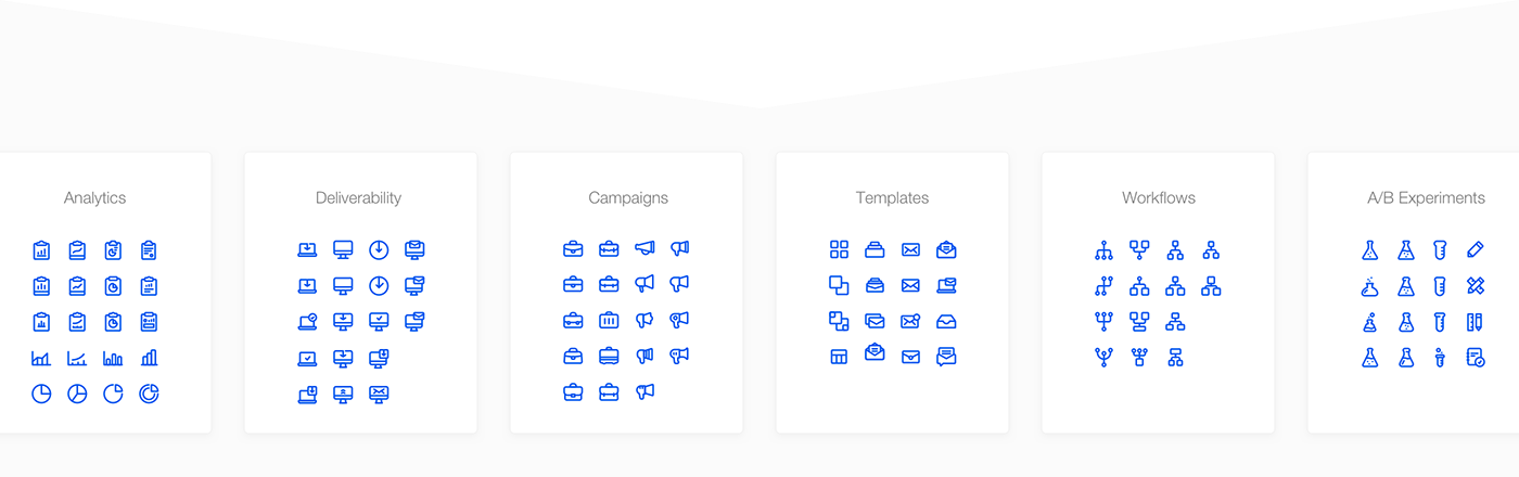
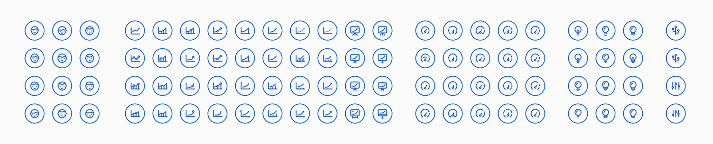
Icons
Brand Illustration
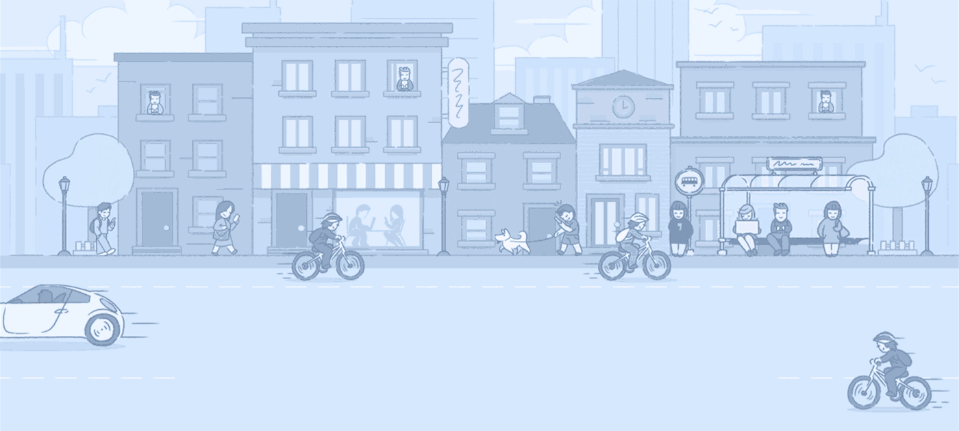
After joint discussions between our and Iterable's teams (who had a great experience in making websites that measurably work), we decided to humanise the brand and create a friendly and kind illustration for all user groups. As you can see in the illustration below, we've incorporated different ages and nationalities to make it feel natural and more diverse.

Eventually, we decided that this wasn't enough. Aside from just different personalities and characters, we also needed to incorporate a mascot that would live as a helper and service representative.

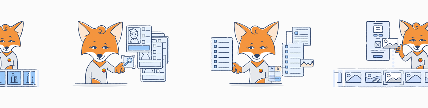
As soon as we got to this point, we had the idea to incorporate a fox as the service mascot.
Fast, smart and sometimes cunning (in a good way of course), a fox was a good fit.
We designed male and female fox mascot for different cases and illustrations.
We designed male and female fox mascot for different cases and illustrations.


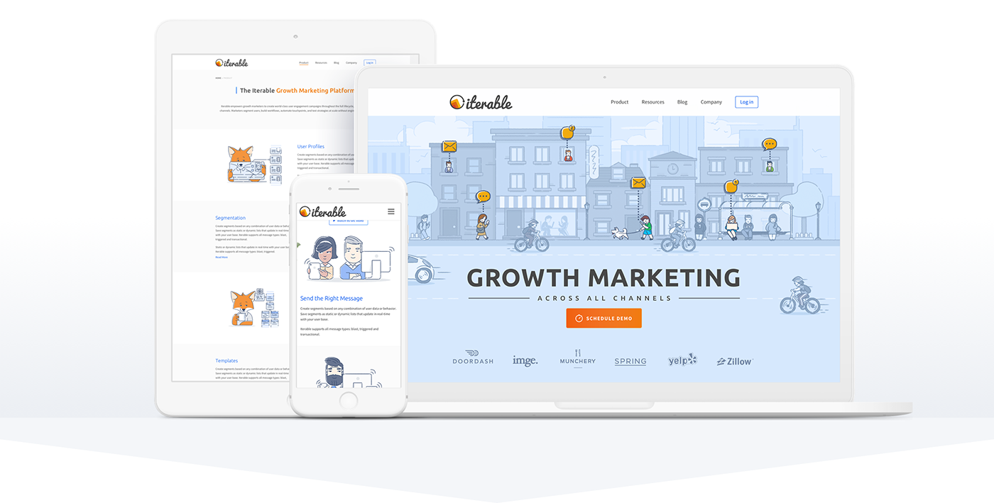
Outcome

65% increase in traffic
since redesign