Problem Definition
Design an app to improve the user experience of social media platforms
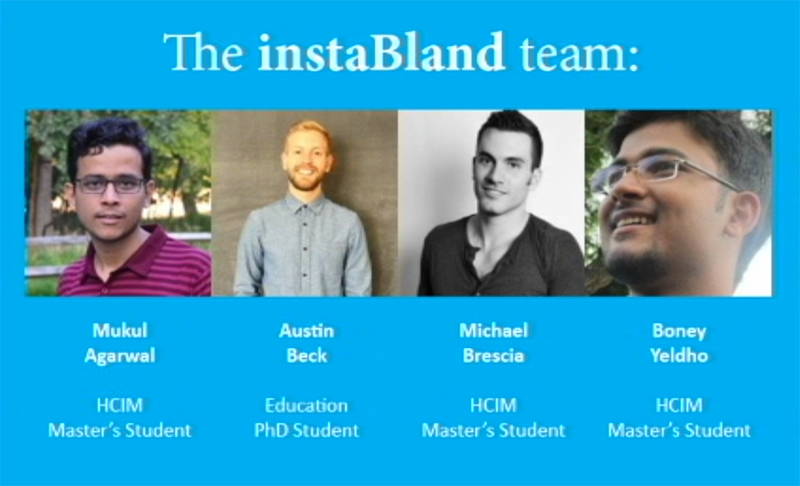
Role
User Research, Sketching, Prototyping
Initial Survey
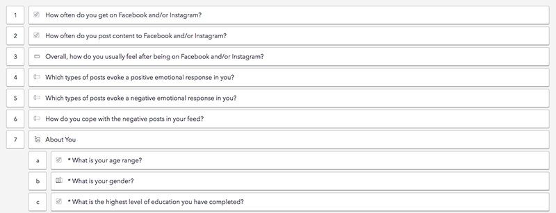
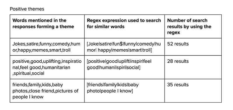
Survey Questions (112 recorded responses)
The survey included two important questions in addition to demographics and frequency of use questions:
1. Which types of posts evoke a positive emotional response in you?
2. Which types of posts evoke a negative emotional response in you?
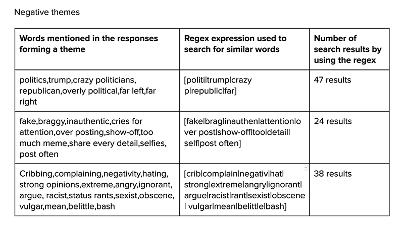
The responses varied from politics, instances of bragging, complaining for evoking negative emotions to inspirational posts, satire and family posts being the top posts that evoke a positive emotion response.
At the time of the survey in Spring 2016, it was election time which might have been a reason for high negativity associated with politics. The next most negative emotion was related to bragging, fake, show-off, instances where people post on social media about their accomplishments, success.
We wanted the user to have a positive experience on our social media platform. Based on the research the platform will have to discourage instances of bragging and promote humor and satire.
Brainstorming

We wanted to encourage people to post about bland moments, moments not about success or accomplishments. Most of our lives are spent doing mundane stuff. If people could be more cognizant about that, it will greatly affect their social media experience. Several ideas to accomplish this were explored:
1. Branding or marketing message of the platform: Hence the name InstaBland
2. "Not Bland" button to allow people to flag posts that detract from the core value of the platform
3. Expiration dates vs. Forever: We decided to let the posts expire after a while to reduce the adverse consequences of sharing posts in the later future
To increase the user engagement with the platform we included a "Bland" button that lets people appreciate posts by other people. We also wanted to discourage posts that evoked negative emotional responses in the user. We decided to include a "Not Bland" button so that the network of users can self correct what kinds of posts are being shared on the platform. This was a very contentious design choice among our group and the users that we talked to. One viewpoint was that "Not Bland" option is too similar to a "dislike" button which can lead to cyber bullying and all the negative consequences of the dislike button. Although we realized that the reason people are so polarized about the "dislike" button is because "dislike" word has developed a very strong negative identity over time. On the other hand the word "Not Bland" does not have an inherently negative connotation associated with it. In some instances "Not Bland" might be considered a positive comment.
We decided that the only way to determine if the "Not Bland" button would have a positive or negative result on users was to do usability testing. Since this feature cannot be tested in isolation with a single user or even a group of users, we decided that it could only be tested when the app had been released and a significant number of users (somewhere around thousands of users) were using it.
Concepts Explored

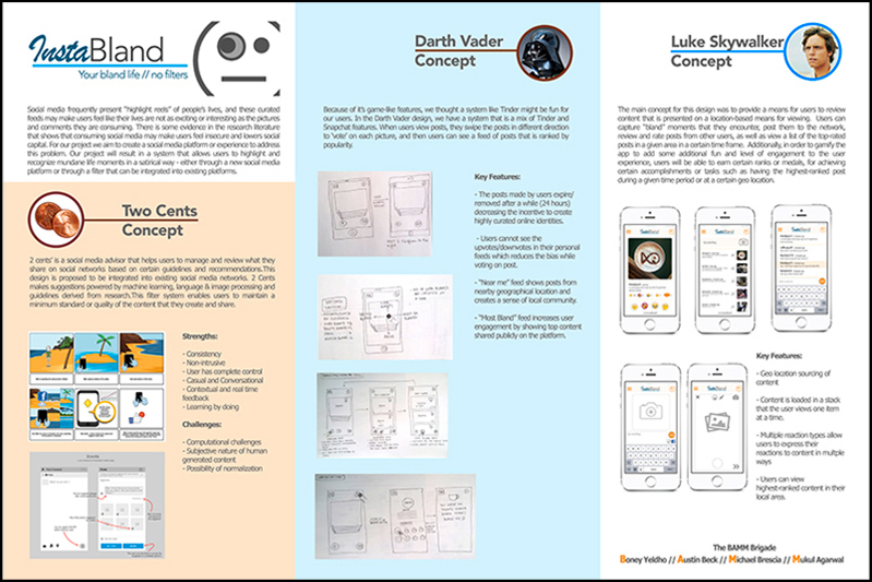
Poster for concepts
We explored multiple concepts. One of the ideas were to create a plug-in for existing social media networks that analyzes a user's post before posting and makes suggestions to reduce the negative emotion consequences on the people in their network. The idea was to make some guidelines and user natural language processing and image analysis to detect when these guidelines are being violated. We did not pursue this concept because making a set of guidelines was a difficult task and would require people (employees of the company) to think up of all the scenarios and write up all the rules that should be followed. This would be a gargantuan and complicated task because these guidelines will vary across cultures and geographical regions.
The other two concepts that we explored were similar in nature except for the interaction of the user with the posts. One concept explored the tinder like interaction of swiping posts up, left or right to respond with "Bland", "Not Bland" or "SupaBland" and the other concept was based more on using emojis, buttons for each of the emotion that the user wanted to convey.
We also explored the idea of showing posts near one's location instead of having "Friends". The idea behind this was to reduce the incentive that people get by posting about their successes as they know their friends are watching. If the audience of the platform changes from friends to anyone in the geographical vicinity the motivation for sharing posts also changes. This concept was taken from the social media platform "Yik Yak"
We created a poster with all these three concepts to get feedback from our target audience. People were very positive about the idea of a different social media platform where they can post about the normal, bland moments of their lives. So we decided to go ahead with the second concept or the "Darth Vader Concept".
Paper Prototyping

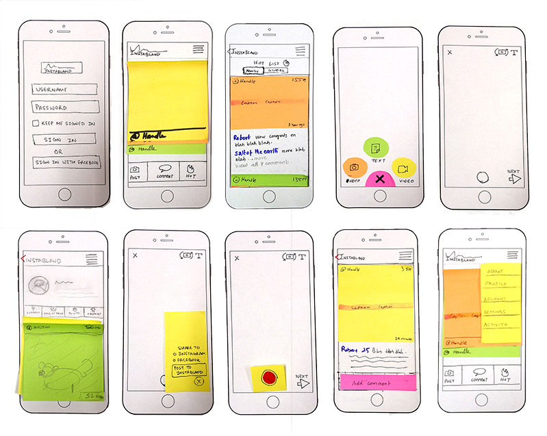
We created a paper prototype exploring all our ideas and took it to users. We got very rich feedback from the users about how to improve our designs. Usability problems identified:
1. Navigation inside the app: Lack of back buttons on screens
2. Feedback: Lack of feedback after important operations such as posting a photo, sharing on facebook
3. Conceptual Model: The users couldn't relate the number of points in their profile to the "Bland", "Not Bland", "SupaBland" responses by other users
4. Gamification: We realized that we hadn't put a lot of thought into the trophy system and how it will work
We were able to solve these problems after considerable brainstorming. Once these problems were solved we decided to go ahead by building a wireframe and an Interactive prototype.
Wireframing
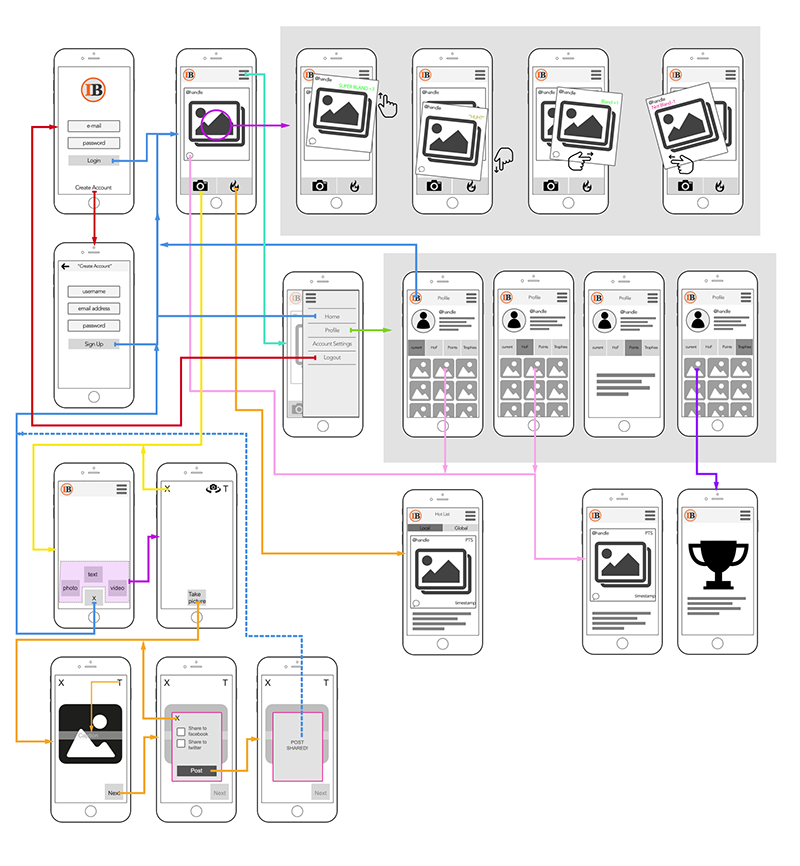
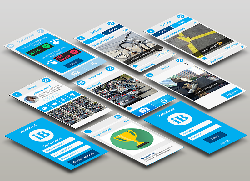
Interactive Prototype
Usability Testing
We conducted usability testing with 5 users using the Interactive prototype. We explored different usability testing methods: Silent Observation and Think Aloud Method to get varied feedback. Problems identified during these sessions were:
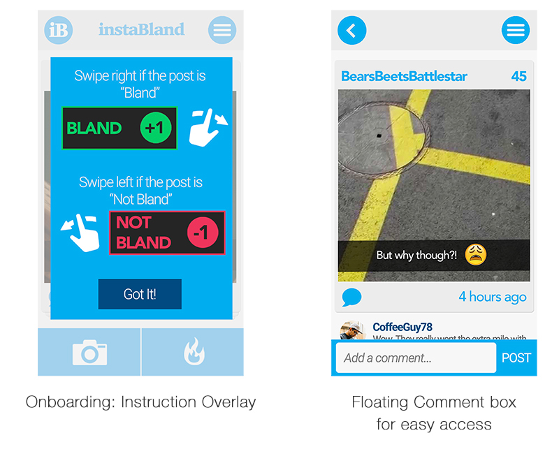
1. Lack of onboarding: Since the user were using this complex app for the first time, there was a need for a tutorial to explain different parts of the app to the user. Although our app had good discoverability in terms of features that could be identified by an existing social media user, we needed a way to introduce new users to the basic functionality of our app.
2. Comment functionality: The ability to comment on the posts was not easily discoverable by the user as the comment input text field was at the bottom of all the comments. The user had to scroll to the bottom of all the comments to make a new comment.
We took this feedback into account and created new screens to improve our final prototype.
Final Prototype