Bellyful is a way for restaurants and caterers to donate their excess food to local charities. The client, Dignity Meals, is a small Chicago based startup dedicated to ending world hunger. They approached Designlab with the idea of creating an app to connect food donors with local volunteers/charities. From my side, I focussed on the Indian target market.
Process
The project was conducted as an 80-hour design sprint. I followed a user-centered design process with 5 phases – Research, Experience Strategy, Interaction Design, Branding and UI Design.
Food wastage is a vast topic. So I invested more time during the Research phase, to better understand the parameters of food wastage and food security.
01 // Research
Understanding food wastage
I began with a preliminary investigation about food wastage and hunger, especially in India. One-third of the food produced globally is lost or wasted. We invest a lot of our planet’s resources – land, water, energy and labour – into producing food. When we waste it, we waste these resources too!
India ranks 7th in the world in terms of overall food waste. We also rank 63rd among the 88 countries in Global Hunger Index with 20 crore Indians sleeping hungry on any given night. But this problem has not gone unnoticed. Apart from the Govt's efforts, various food banks and charities have also sprung up in Indian cities.
Focussing my enquiry
Once I had a better understanding of food wastage, I searched for answers to definitive questions like,
1) Who are the main sources of excess food?
2) What are the organisations that work to alleviate hunger?
3) How does the present food donation system work?
An extensive literature review revealed notable food banks and charities in India. Through online videos and interviews, I understood how they operated on a day-to-day basis. To understand a food donor’s perspective, I interviewed Mr. Rajasekhar of Hotel Akshaya, Chidambaram. As a hotel owner who had donated food in the past, he was able to give me critical information on the challenges of storing, transporting and donating food.
Key Research Takeaways

02 // Experience Strategy
I began by outlining how Bellyful's donation system would work. I referred to existing models used by services like Copia, Food Cowboy and Food Bank Singapore.

Creating an ecosystem
Based on findings from the research phase, I envisioned the app's prospective ecosystem. It outlines different levels of function along with the stakeholders involved. For the MVP, I focussed on the primary function.

Guiding Principles
Considering the app's primary and long term functions, I defined the guiding principles for the user experience.

Personas
Throughout the strategy phase, it was clear to me that the app would need 2 different interfaces - one for the donor and one for the charity. Before outlining specific features for each of them, I had to understand their individual contexts and goals. So, using the data from my research, I developed 2 personas.

Primary Persona – Food donor

Secondary Persona – Donation recipient
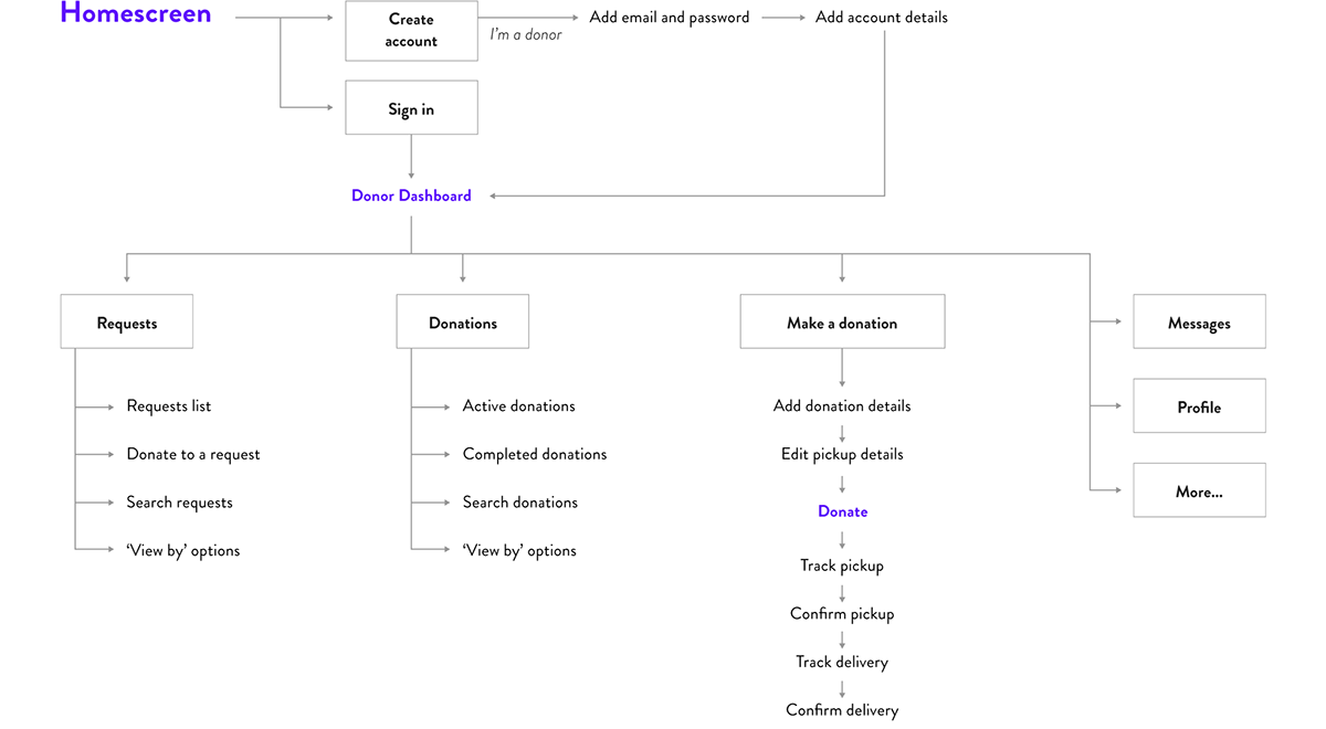
Application Map
After determining how the key tasks would flow, I began organising the app's content and features. Given the project's limited timeframe, I decided to focus on the donor’s experience first. So I created an application map for the donor's interface. The map starts with the sign in/sign up screens and moves on to a dashboard. I tried out different ways to sort and display the dashboard's content, especially the top-level navigation. It had to be clear and quickly accessible.
03 // Interaction Design
Wireframing and testing
Before sketching out wireframes, I researched existing patterns for sign up screens, dashboards and mobile forms. My research showed that donors usually donate food at the end of a busy workday. They want to invest the least amount of time and thought into making a donation. So the app had to use patterns and microcopy that they were familiar with.
Working step-by-step, I created wireframes for (1) Creating an account, (2) The donor dashboard (3) Adding a new donation and (4) Donation pickup and delivery. Using Invision, I created a mid-fidelity interactive prototype of the wireframes. Testing sessions revealed areas that needed improvement – notably the dashboard walkthrough and the 'Add new donation' button. Based on feedback from user testing, I further iterated and improved my wireframes. The final version is shown below,

04 // Branding
Bellyful's logo has to resonate equally with donors and charities. So, instead of making it about donation or accepting charity, I focussed on the general happiness, satisfaction and energy that good food gives. After trying out a lot of ideas, I decided on a gently curving 'B' with a spoon laid over it's 'Belly', so to speak. Along with a playful wordmark, the entire logo conveys a sense of positive purpose.

05 // UI Design
Inspired by the brand's message, I designed the UI to be fresh and positive. The brand's vivid gradients are balanced by a generous use of white space. I also designed a set of icons to make the navigation and form-filling easier. The colours and iconography have been applied carefully to draw the donor's eye towards calls-to-action and relevant content.


Next Steps
With this project, I learned quickly that certain tradeoffs were inevitable. I was constantly working to make sure both donors and charities satisfied their goals. The project has a good start now! The donor's key screens have been conceptualised, tested and refined. The immediate next step is designing the donor's sign in/sign up screens. This will be followed by wireframes and UI for the charity's interface.


