


“Everything we do is music.” —John Cage
Use music to create an emotional, engaged and stimulated response for a series of design vehicles that will support an artist and album launch of your choice.
view final here: https://www.behance.net/gallery/44900151/Project-3-Music-Final

In this album, I feel Coldplay covers the themes of Innovation, Science, and Art. This was also the album I feel where the band started forming the style they use today in terms of aesthetics, which really bright, and colorful subjects with soft or monochrome backgrounds. I'd like to somehow combine aspects of water color painting, along with marks that symbolize technology.


I couldn't quite fully get my ideas on paper, but I at first wanted to experiment on simplistic designs, some having the water color aspect as the main focus, then some having the text as the main focus. I wanted to somehow make it look clean and messy at the same time.


Going with a more handwritten font as to look more organic; maybe an artist or a scientist jotting down thoughts on a piece they were working on.

The original watercolor edit I did of the band in Photoshop. I used a black and white photo of them as a base then deleted it for the paints to show through. In the animation, I wanted them to appear on the poster a la "ink bleed"

This is the initial front piece for the album jacket before the final edit. I call him Mr. Robot. Similarly in Coldplay's Music Video for 'Talk', they are a band of scientists exploring a new planet where they befriend a giant robot who is lost and broken.
Besides the themes of innovation, science and art, a thing I noticed throughout the whole album of X&Y is the mention of broken things within people (loved ones) or oneself and the need or attempt to help fix what is broken.


When I jumped right into it, I came up with this first draft with minion pro as a placeholder before finding the perfect font. After fighting with myself, giving it more thought and showing my progress as well as listening to more Coldplay, with a little help I realized that not only was the simplistic style I initially wanted not going to work, (unless i'd inconspicuously added images and marks you could barely even see because of the requirements) BUT it was oddly enough way too "Coldplay" of me to do.
The point was to have yourself and what the album means to you show through this project, and although I felt like I was heading the right direction, having this be a very important album in my life, I needed to push this messy/clean concept a bit more, otherwise I'd be doing myself a disservice. It was getting there.

I wanted to test the font I chose by typing the lyrics to one of their songs called Talk. Another good step taken!
This is a piece I made to practice/test the "ink bleed" effect.

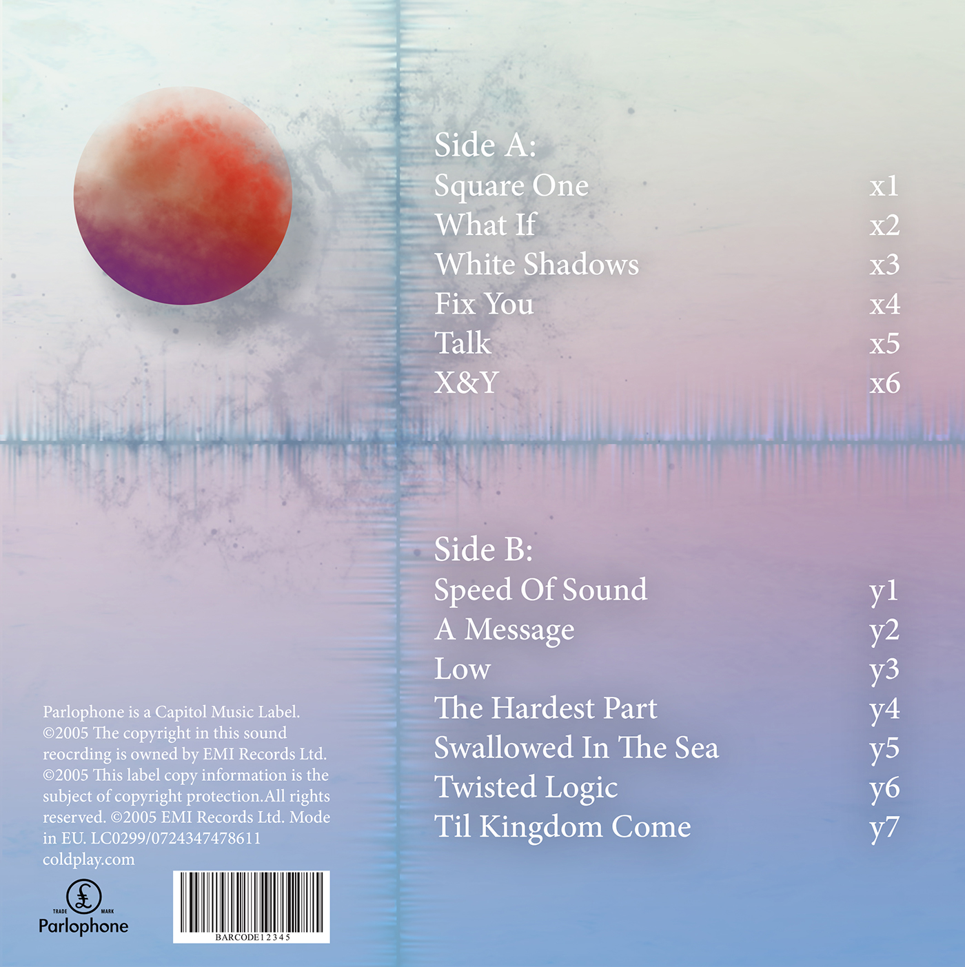
Vinyl Record

The song lists are placed at a slope, and I tried to incorporate science, art and technology with my marks and brushes I used. I added sound-waves forming an x and y axis to break up space.

Album Mock up


Still of the animated poster
Moving poster


