CNN Money site redesign
ZAAZ, November 2010 - June 2011
ZAAZ, November 2010 - June 2011
The Challenge: ZAAZ was tasked with redesigning the aging CNN Money web site, which hadn't had a full redesign since the late 90s. Since that time, additional content had accreted and the brands of Fortune and Money magazine had been shoehorned into the existing structure (the CNN Money brand is a partnership between CNN, Fortune Magazine, and Money Magazine). Everything was cluttered and disorganized. Even so, CNN Money was one of the top financial news sites in the world, and any design intervention would need to preserve or improve on its traffic, ad revenue, and search ranking.
What I did: I led the ZAAZ team as Creative Director and lead UX consultant, working with multiple stakeholders across Time Warner to craft a new look, structure, and flow for the CNN Money, Fortune, and Money sites.
What I did: I led the ZAAZ team as Creative Director and lead UX consultant, working with multiple stakeholders across Time Warner to craft a new look, structure, and flow for the CNN Money, Fortune, and Money sites.
Our approach: Through CNN Money's extensive market research and analytics, we took the time to gain a deep understanding of their customers and content use patterns. Additionally, we met with various stakeholders to analyze the CNN Money brand and its unique relationship to the three parent brands. From there, we designed a visual center that was true to all three parent brands while communicating the unique value of CNN Money. Simultaneously, I led a content strategy effort to inventory, analyze, and restructure the site's information architecture according to user needs and mental models. Our navigation taxonomy was then tested using an online card sort and subsequently refined. We then brought the visual center and information architecture together into an interactive prototype, which we progressively tested and improved during 5 rounds of rapid, iterative usability testing. Throughout the process, we stayed in close contact with stakeholders from across the organization, including social, IT, content management, advertising, and product management.
The result: The new site boasts an updated design that blends Fortune's bold, clean, typography and infographics with CNN and Money Magazine's round corners and blends. The co-branded expansive flyout header navigation allows users to preview featured content across each area of the site without leaving their current page. Article listings and details pages use a consistent format for metadata, improving findability and increasing engagement. Ad units work with, not against the layout. And an expanding Market Tracker gives the repeat visitor an engaging means of quickly navigating financial data while providing an additional sponsorship opportunity.
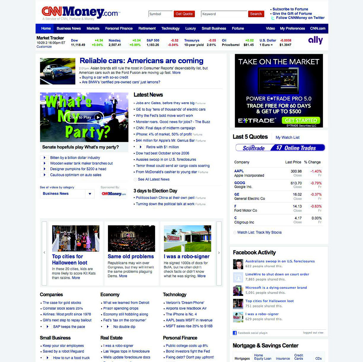
The old CNN Money site, before our redesign
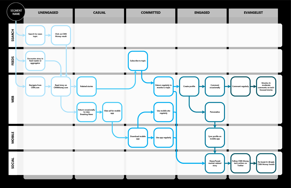
Customer Journey map for one of several target audiences, planning out engagement path to turn a casual user into an advocate.
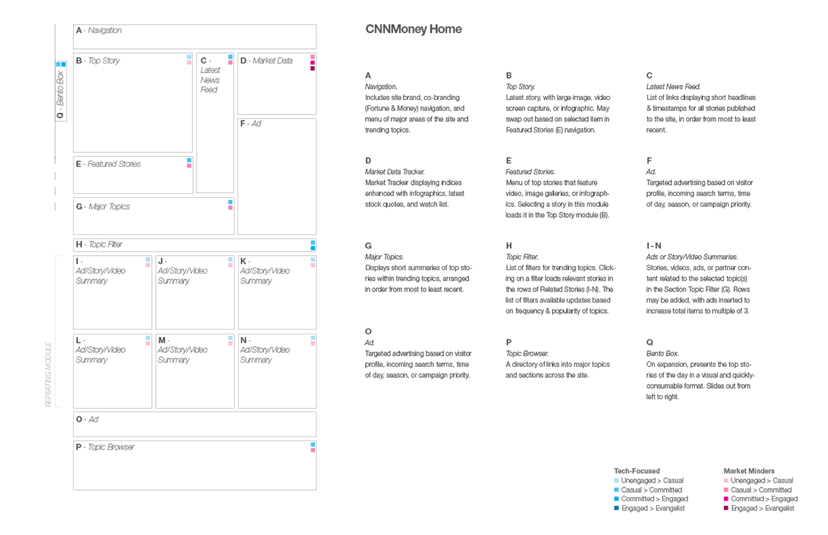
Template wireframe planning out structure of page and strategy behind each content area.

Navigation wireframe - purposefully kept low-fidelity to focus the conversation on the interaction model and content structure.

An early design comp (visual designer: Kevin Bauer), showing proposed interactive Market Tracker, alternative navigation structure, and proposed topic filtering mechanism.
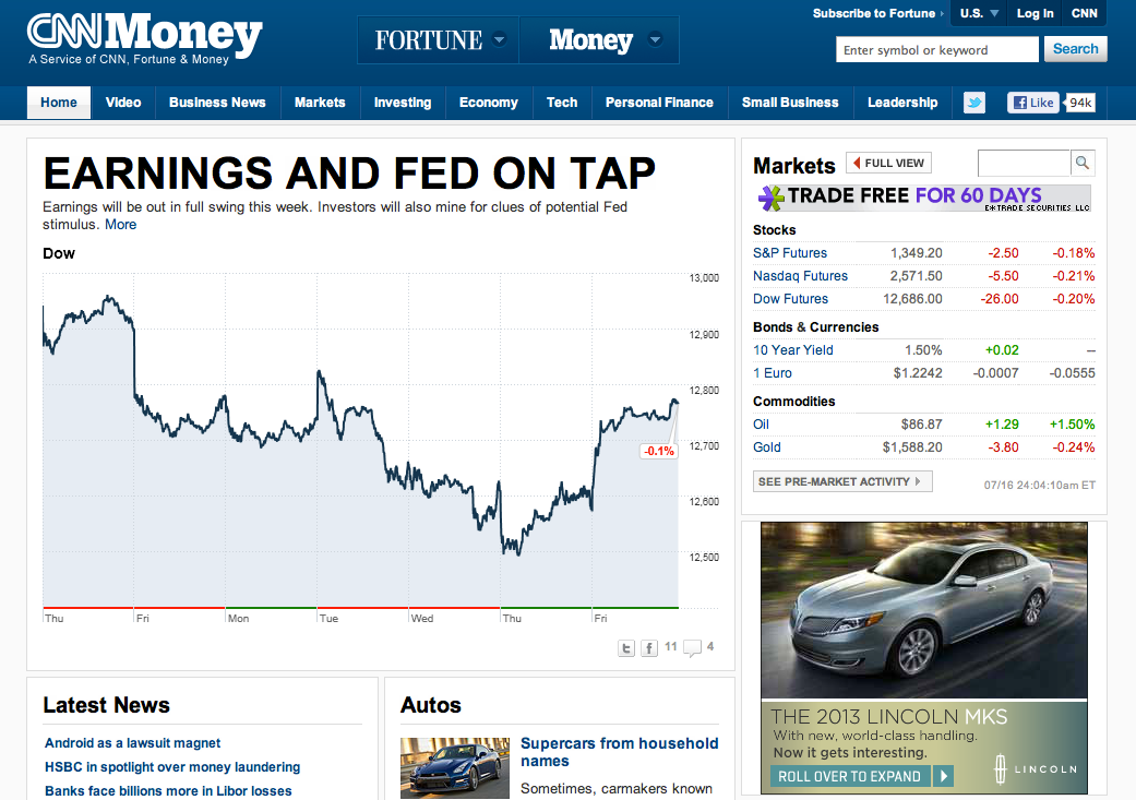
The site, over a year after the launch of the redesign.


