Original design provided by client.

My redesign. I wanted a thin font for "spend less" because of the words' message. I went with the font for "Donate more" because it was friendly/fun, and I didn't want it to sound demanding. The images (a small shopping cart over a bigger gift box) are also meant to communicate the message the words dictate.

Original design provided by client.
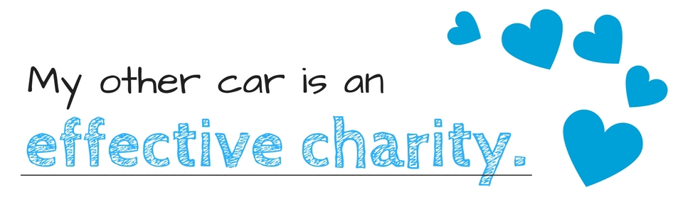
My redesign with image changed to heart by client request. The fonts are chosen because they're friendly and look hand-made, green, and--thus--environmentally friendly. This shade of blue was chosen because it resembles the client's brand colors.

Original design provided by client.

My redesign with changes in wording by client request.

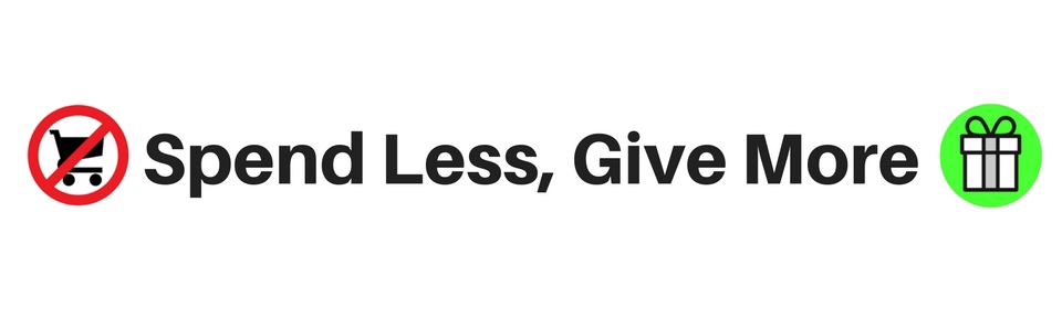
Original design provided by client.

My first redesign with images chosen by me. I intended for "not my car" to draw in the reader.

My final redesign. I later changed the design to make sure the images could be seen from afar since this is intended to be a bumper sticker.


