


Museum Branding
Akron Art Museum
Akron Art Museum
The Akron Art Museum wanted some ideas for rebranding their organization.
We created a comprehensive identity program.
We created a comprehensive identity program.

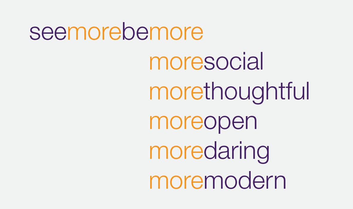
We started with a messaging concept: see more be more:
In addition to capturing the attitude of the organization and its collections, see more be more is also a fun play on the phrase see and be seen, reflecting the role of the museum in the social life of the city.
In addition to capturing the attitude of the organization and its collections, see more be more is also a fun play on the phrase see and be seen, reflecting the role of the museum in the social life of the city.

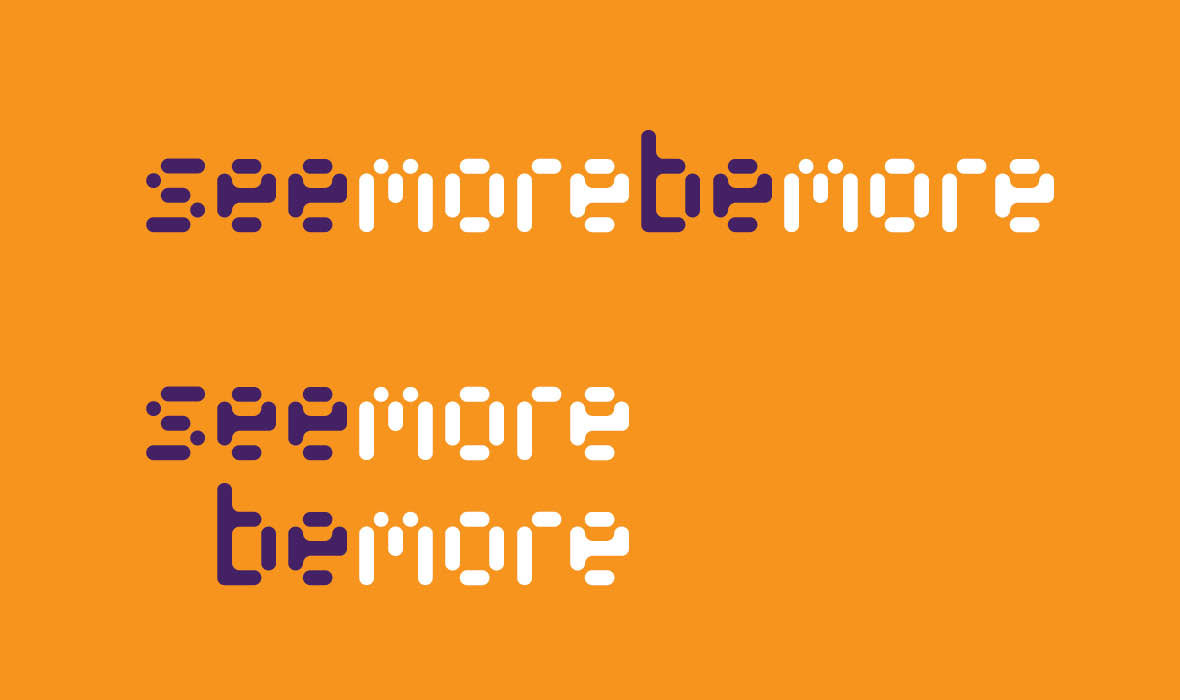
Messaging Lockup
Punch by Thirstype: R1
Corresponds to stencil quality of museum logo
Two versions: horizontal and stacked
Punch by Thirstype: R1
Corresponds to stencil quality of museum logo
Two versions: horizontal and stacked
Messaging Lockup
Punch by Thirstype: R1
Corresponds to stencil quality of museum logo
Two versions: horizontal and stacked
Punch by Thirstype: R1
Corresponds to stencil quality of museum logo
Two versions: horizontal and stacked

Logo Revisions
We liked the stencil feel of the mark and how it reflects the shape of the building as well as incorporates the letterforms A-A-M, but the type treatment felt dated.
We removed the old type from the side, making the mark feel more iconic. We also wanted to increase the website’s prominence in people’s minds, so we added the URL beneath it, thus communicating both the museum’s name and web address in one element.

Text Font and Style
Helvetic Neue: 45 Light
The point size varies but the leading is fixed for type on covers and in intro blocks within a document or application.
Helvetic Neue: 45 Light
The point size varies but the leading is fixed for type on covers and in intro blocks within a document or application.
Headings
Helvetic Neue: 45 Light
We begin the heading with “/” in reference to the URL of the related web page. The “/” also plays off of the angles in the logo mark.
Helvetic Neue: 45 Light
We begin the heading with “/” in reference to the URL of the related web page. The “/” also plays off of the angles in the logo mark.
Keys
Punch by Thirstype: R1
These graphic keys serve as shorthand guides to content.
Punch by Thirstype: R1
These graphic keys serve as shorthand guides to content.
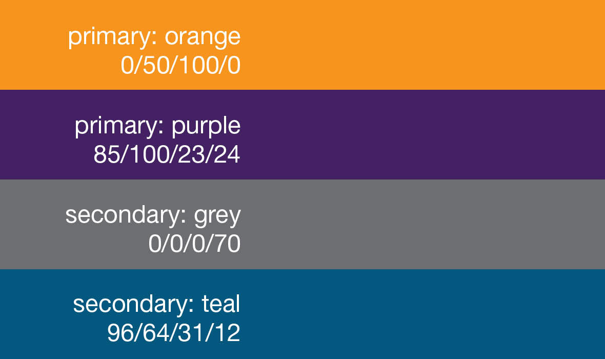
Color Palette

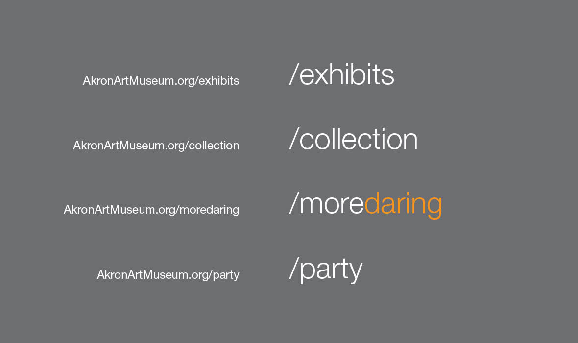
Layout One
Here is a layout for printed materials which have a good chunk of text content. In this case, it is used to talk about Exhibits.
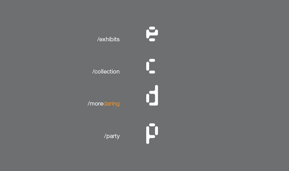
The header is “/exhibits”
There is a horizontal space to highlight artwork featured in the exhibit.
The key is a large “e,” over the opening date of the exhibit.
Body copy runs justified from the left edge to the right edge of the piece.
The footer includes the tagline to the left and the logo to the right.
Here is a layout for printed materials which have a good chunk of text content. In this case, it is used to talk about Exhibits.
The header is “/exhibits”
There is a horizontal space to highlight artwork featured in the exhibit.
The key is a large “e,” over the opening date of the exhibit.
Body copy runs justified from the left edge to the right edge of the piece.
The footer includes the tagline to the left and the logo to the right.

Layout Two
Here is a layout for printed materials which have a smaller chunk of text content. In this case, it is used to talk about the Collection.
The header is “/collection”
There is a horizontal space to highlight artwork in the collection.
The key is a large “c,” over “more modern,” an answer to the idea posed by “see more be more.”
Body copy runs in a block justified left and right.
The footer includes the tagline to the left and the logo to the right.

Layout Three
Here is a layout for featuring the art without any corresponding text. It is best used as an image piece for the museum and for covers of publications.
The header is “/moredaring,” conveying both the personality of the piece showcased, as well as a personality attribute of the museum and its patrons.
The key is a large “d” for daring (this would vary depending on attribute).
The footer includes the tagline to the left and the logo to the right.

Event Invitation
Time to party.
The header is “/party”
The key is a large “p” over “more social,” an answer to the idea posed by “see more be more.”
The email address for parties is bemoresocial@akronartmuseum.org, a perfect call-to-action.
Time to party.
The header is “/party”
The key is a large “p” over “more social,” an answer to the idea posed by “see more be more.”
The email address for parties is bemoresocial@akronartmuseum.org, a perfect call-to-action.
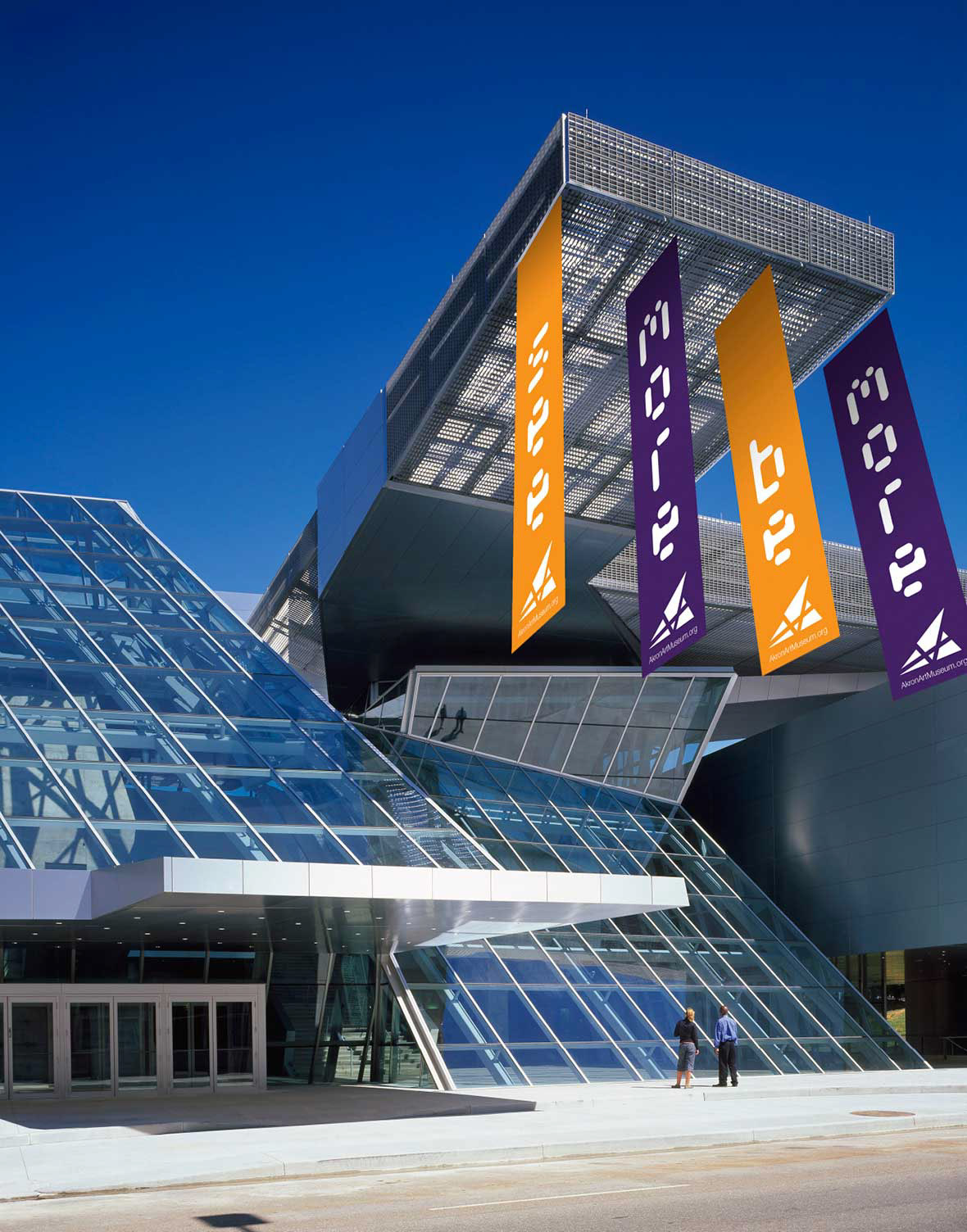
Exterior Banners, Solid

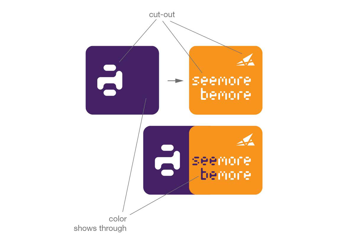
Exterior Banners, Cutout

Interior Banner

Membership Cards
Three Levels
Three Levels
Membership Card Construction
Front
Front

Membership Card Construction
Back
Back
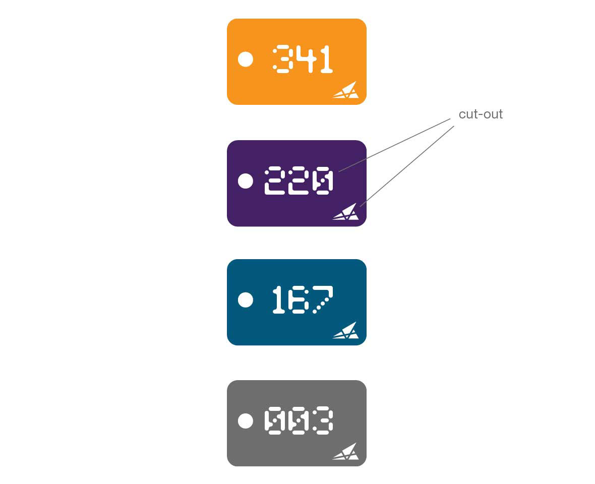
Coatcheck Tag

Tee Shirt


