
I N T R O D U C T I O N
Ikea furniture: it’s (relatively) cheap, it’s (relatively) chic, and it’s (relatively) easy to assemble. Ok, maybe not the last one, but the first two have made it incredibly popular in homes and offices throughout the world. The problem is it’s not very personalized. After all, the brand has succeeded because of its minimalist, mass-appeal aesthetic.
Panyl helps Ikea owners customize their furniture and inject their personality into their home and office.
With a product so closely tied — but not actually affiliated with — another brand, Panyl had difficulty establishing their own identity. We established the value of Panyl by showing how even the most basic Ikea furniture could be given life and color with a simple Panyl application. Once we were able to show how Panyl can make trendy, mass-produced bookcases, dressers, and cabinets look unique, we could focus on building on building a robust, interactive e-commerce platform powered by Shopify.
We answered the question we knew customers were asking in the only way we know how — head on. When a user arrives on the site, the first thing they need to know is exactly what Panyl is and how it works. Our hero header made that clear

P R O D U C T V I S U A L I Z E R S
No design comes without a specific set of challenges. The biggest challenge on this project was designing a product page that had an interactive visualizer for users to see how they could customize their Ikea furniture, along with an easy-to-use checkout element that didn’t get buried lower on the page. After many iterations of the product customizer we came up with a solution that wasn’t overly complicated by the number of different options offered but still remained user-friendly.
Beyond just designing a piece of furniture, each item was customizable down to its specific elements. So a dresser could have a different color for each drawer, or a bed frame that looked different from every angle. We added each element shown in the visualizer in a ‘cart preview’ so the user can easily review and change the items in their cart.

T H E D E S I G N
We created a clean aesthetic with hints of bold primary colors taken directly from the products. We also included subtle nods to the Panyl brand: folded corners on elements, simple but striking geometric shapes, and subtle background patterns.

W A Y S T O S H O P
More than just users who were looking to customize specific Ikea furniture, we wanted to appeal to a broader group of DIY-driven consumers who would be inspired by the endless possibilities offered by Panyl before they made their furniture purchase.
An important part of making sure consumers were inspired while they shopped was to show the product in the context of how it would be used. So instead of setting up the navigation structure for users to find specific products, we organized the site by room. If you’re looking for design ideas, you’re not going to find them in a sterile product photos, you’re going to find them by seeing what others are doing and being influenced by others. The products are displayed to remind the user more of a mood-board than menu, like a high-end catalog with creativity on every page.

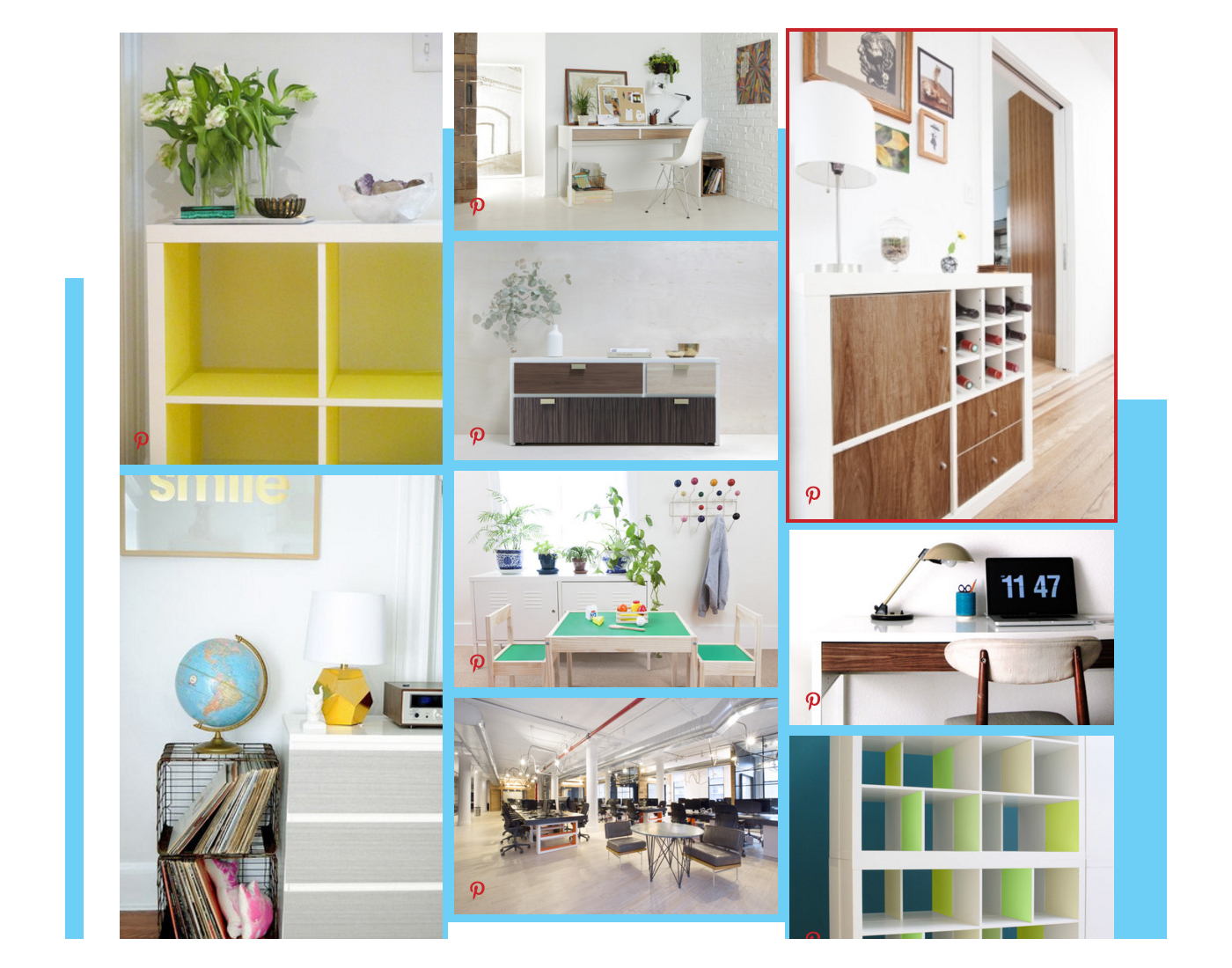
L I F E S Y T L E P H O T O S
We came up with different ways to feature styled photos of Panyl products in the real world – the page headers, and a multi-functional feed on the homepage featuring blog posts, how-tos, and photos from Pinterest. We also added another level of functionality to the product pages with integrated how-tos and FAQs. In addition to that, lifestyle photos are featured second on the homepage in each room category, to further show off the product in its natural setting.
P R O J E C T T A K E A W A Y S
In order to keep from getting tunnel vision on a project, you need to look at the bigger picture and not get stuck on each individual problem that needs to be solved. It’s easy for a complex section of a site to get all of the attention and for the finer details and less sexy areas to fall short. The main features of this website went through many iterations, some of which were thrown out because they over-complicated the experience. This forced us to keep reworking to make sure each feature fit together in the best way and within the constraints of the platform.
Good design is simplification and constantly asking yourself, “What can we remove?” Adding on layers of complexity and flair may seem like the best option in a redesign but can actually move you further away from the best solution for the users.

