
I N T R O D U C T I O N
A big site isn’t always complex and a little site isn’t always simple. We determine the complexity of a project by the information architecture and how the messaging can be conveyed to the user in a way that’s easy to understand. Then we get to work. When we first took on the challenge of building a new site for Allied Reliability Group, global leaders in the condition monitoring sector, we had to first organize the way information was presented.
Before we could open any Photoshop files, write any code, or run any usability testing, we needed to consolidate the five (!) different brand sites — each with its own domain — and create one coherent experience. That meant understanding the variety of services they offered and getting to know exactly who their audience was.

S O L V I N G T H E F I R S T P R O B L E M F I R S T
Allied’s business spans a number of fields and specialties, providing both services and products to customers depending on the job. The disjointed collection of sites created a disconnected experience and users were left to navigate a puzzle in order to find the important information regarding the services Allied provided. This created a significant user experience issue: visitors were unable to progress through the site easily (this could account for the very high 80 percent bounce/exit rate) and a lack of calls to action created very few chances for Allied to generate a proper lead.
Our first task was to combine the five different sites into one core platform that users could navigate. Once we had that solved, we could focus on branding, design, lead generation, and the rest of the project.
W A L K I N G I N T H E U S E R S’ S H O E S
Having vertical experience is great, but we still have to do our homework. It was critical to the project -- and to building the structure we needed to have in place -- to conduct a thorough discovery phase.
Based on user personas, which we developed by combining client data, interviews, and behavior analytics, we determined the optical flow for user journeys. Then, we placed CTAs and other useful pieces of content throughout the site to align with points along the journey that required specific interaction. We also mapped out where the journeys ended and made sure there was a form or other CTA directing the user’s next steps and preventing them from exiting the page without capturing a lead.
To determine the navigation for the site -- and how we would organize the information we were displaying from across five previous sites, we looked at how users prioritized the information they were looking for. Then, we consolidated content from the sometimes overlapping and redundant positions on the previous sites (some information was repeated because it couldn’t be counted on that a user would visit each
individual site. Now, under a single domain, we could group similar content, streamlining the site architecture and making research more convenient for users.

B R A N D E D E L E M E N T S


H O W U S E R S R E C I E V E C O N T E N T
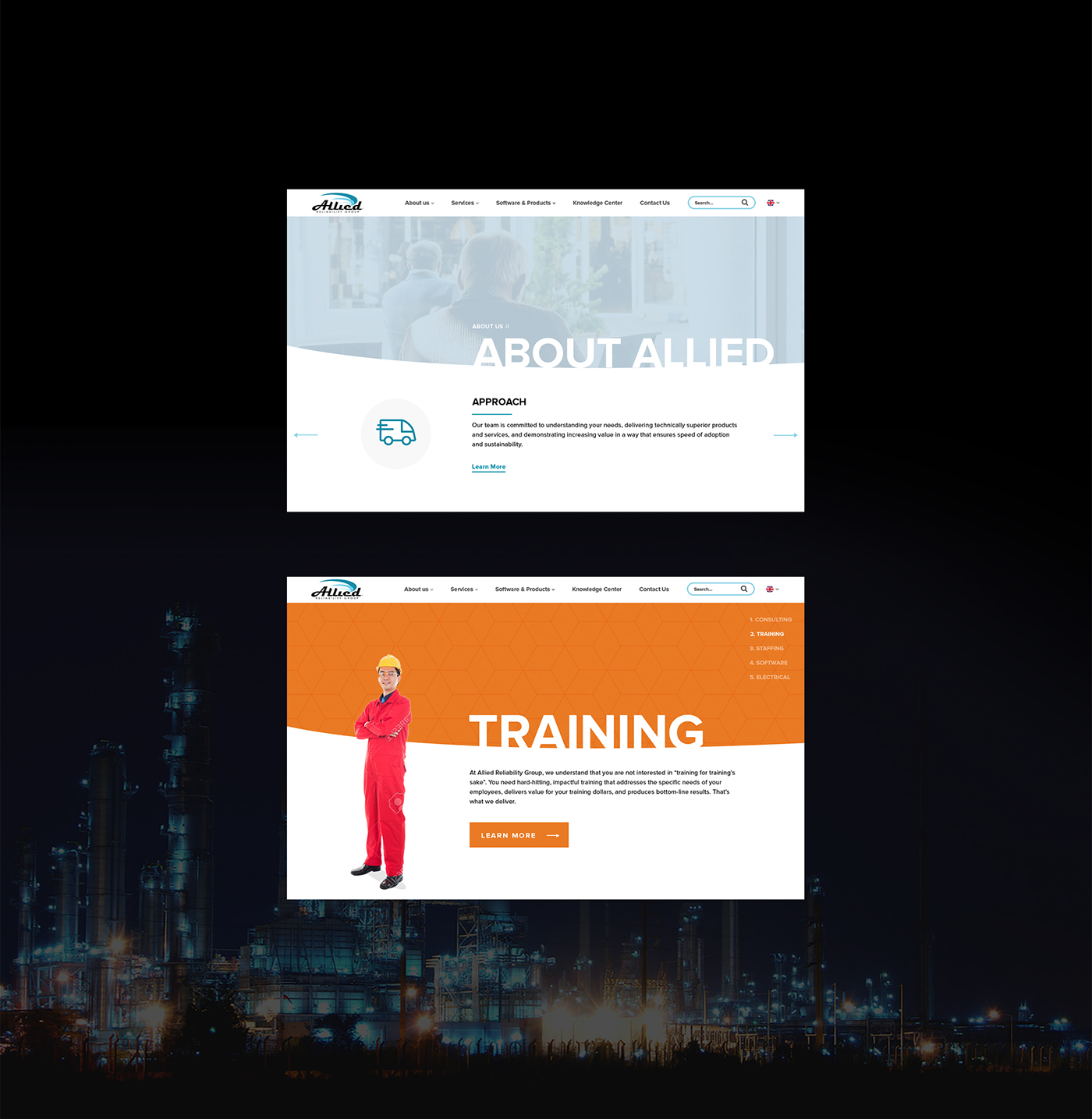
The old sites had good intentions: they were trying to be as informative as possible, but they ended up overwhelming the user. We wanted to create a subtle element that would hold a lot of content without showing it all at once.
We experimented with a few options, ranging from double column layouts to accordions the user could control. After a few iterations of design, we settled on using sliders and accordions to display content in a neat and concise method.
P R O J E C T T A K E A W A Y S
Design Evolves
One thing you have to realize when designing is that it will always be changing. Throughout the design phase you will have to make changes to the project to meet deadlines or because they didn’t turn out the way you planned.
Functionality Before Perfection
It’s easy to get caught up in the pixels, but trying to be pixel-perfect will hurt your project. Recognizing what and when to focus on was key to help us finish this project in a tight deadline. Once we were able to get Allied’s message across is when we would shift focus to getting the pixels perfect.


