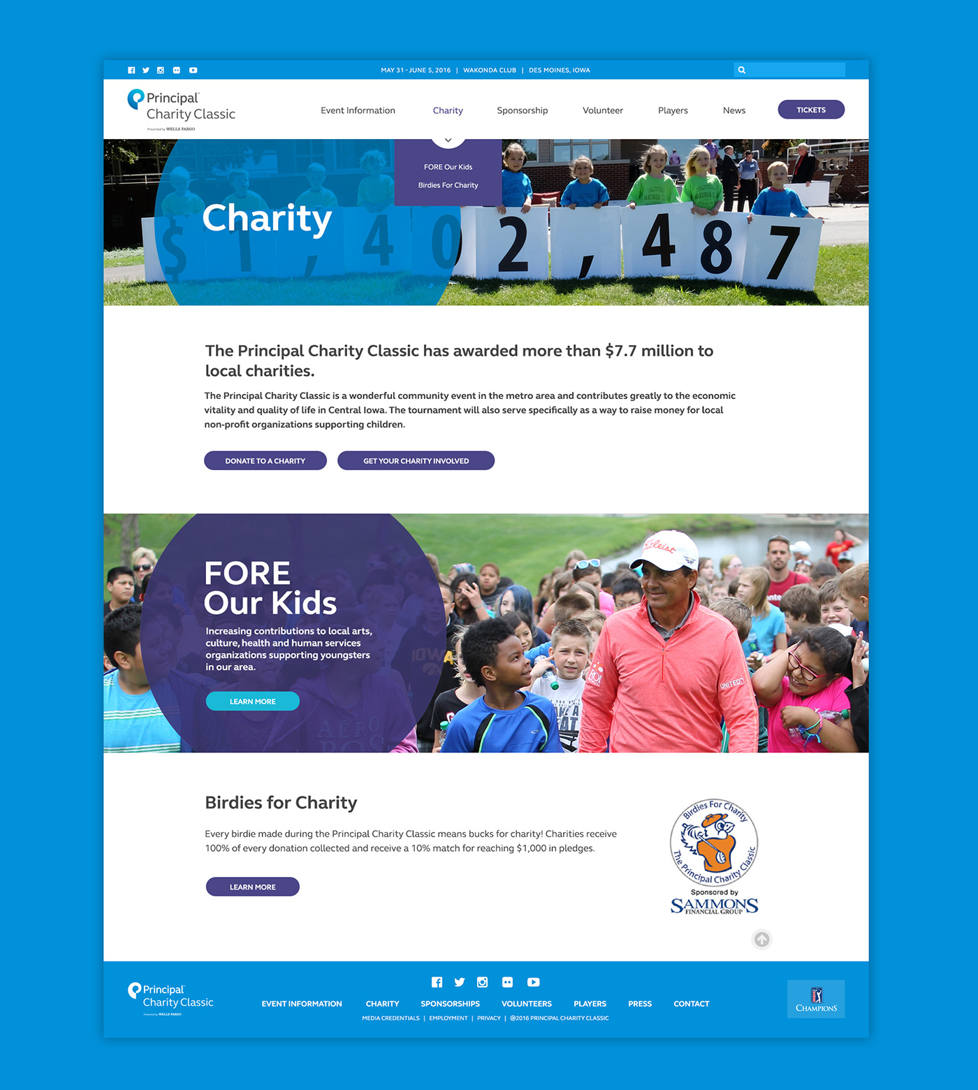
G/O Digital was approached by Principal to create a new website for The Principal Charity Classic, their annual golf tournament in Des Moines Iowa. Having just been through an extensive rebrand, Principal wanted to incorporate their new look into the site, while also creating something unique to stand apart from the corporate website.
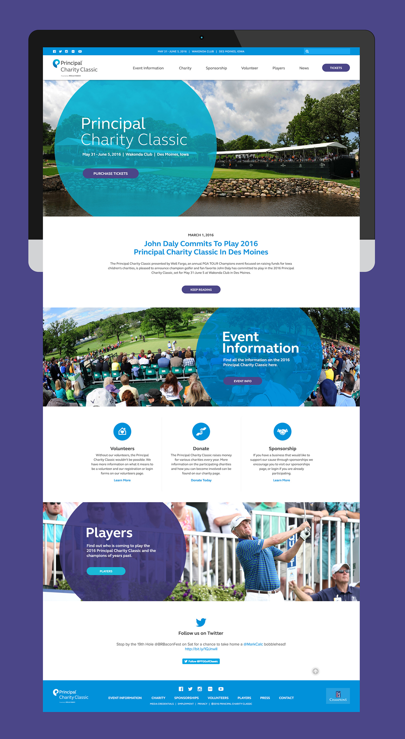
My approach to this project was to create a clean, streamlined site that presented information in a clear and consistent manner. To achieve this, I designed a consistent structure across all pages into which the content could be placed and easily consumed through repetition and familiarity. Each top-level menu item has a landing page which presents an overview for the category, and includes relevant links and calls-to-action to conversion pages.
Users can also make use of the drop downs to reach child-level pages from anywhere on the site.
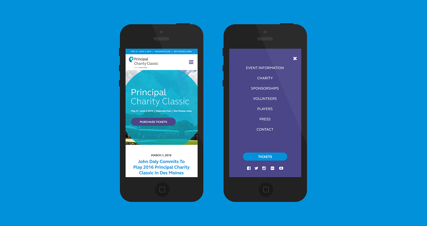
As with any site, ease-of-use on mobile devices was crucial. My first step in ensuring a mobile-friendly site is to design the desktop version from a mobile-first perspective. The Principal Charity Classic site is designed with an abundance of clean white space and a restrained number of columns, which eases the transition into a single column on mobile devices.
To ensure a pleasant navigation experience on the mobile site, I designed a full page mobile menu which swiftly animates onto the screen. Using a full-page menu takes advantage of ever increasing mobile screen sizes to display navigation items with plenty of padding, reducing the number of misclicks due to too little spacing.
As with most of my mobile sites, I placed the navicon on the right side so that it can easily be reached with one hand on larger mobile screens.

Brand recognition on the site was an important factor to Principal. A common element in Principal's new brand standards was a semi-transparent circle overlaid on photography, which I used consistently throughout the site.
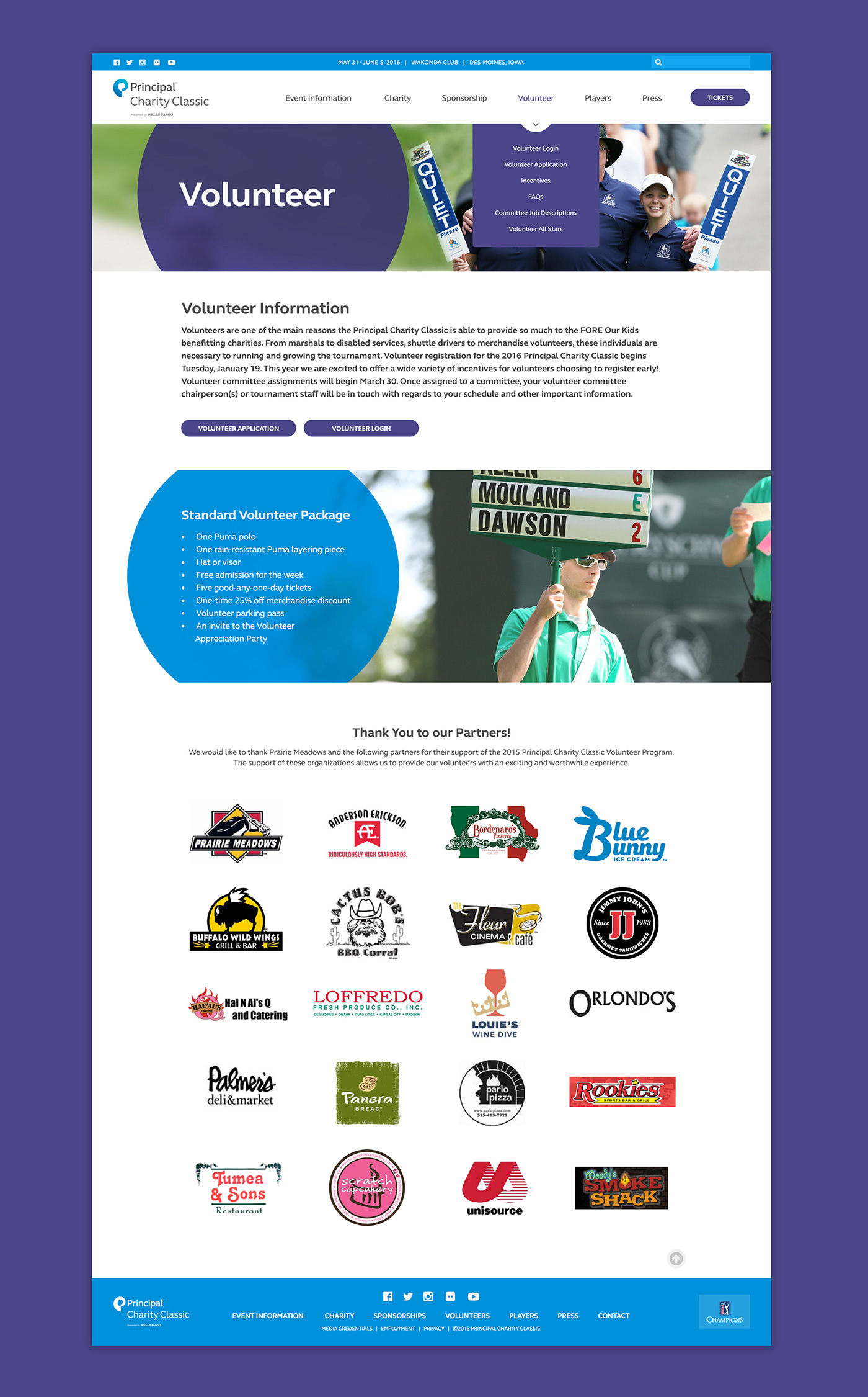
I created contrast and flow by alternating high resolution, full width images with clean, white paragraph sections. This keeps the page balanced and the eye moving.