
Initial meetings with stakeholders determined that the visual design should be clean, simple and modern. We settled on a translucent "frosted glass" style and simple greyscale UI elements. Ease of maintenance by department staff was also critical, so wordpress was selected as the platform.
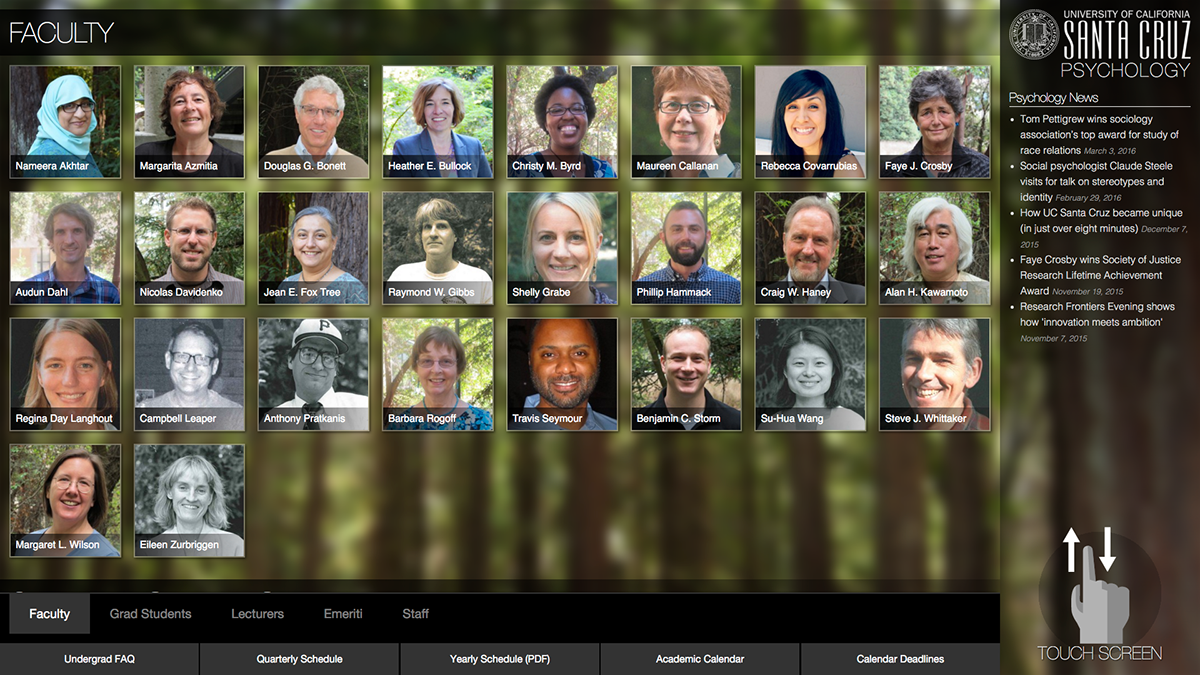
The most important function of the kiosk was to provide a visual directory of faculty, staff and students, so this was featured as the most prominent element. Branding and an RSS news feed were added to the right sidebar, and additional features are accessible through a bottom navigation menu. A prominent "touch screen" indicator was added due to user testing revealing that it was not always obvious to users that the directory can be navigated through the touch and scroll interface.

Touch scrolling is the primary mode of interaction, with a bottom menu serving as a secondary means of navigation to auto-scroll through directory categories and provide a visual indicator of the current location in the directory.

A modal dialog was used to display existing content from the university-wide directory and other department websites. This approach provided multiple benefits including reduced staff effort by avoiding duplication of content from maintaining a separate directory, and keeping the user experience consistent by keeping the interaction within the kiosk UI rather than exiting to a separate web browser.


