The gift-giving prompt was the first design prompt I encountered as part of the DESIGNATION immersion phase. The gift-giving prompt is a fairly open ended design challenge, developed at the Stanford d School. Originally developed as a 90 minute exercise, ours was more fleshed out—and the goal was to develop to research and develop a mobile app that solves some of the problems associated with gift-giving.
The Gift-Giving Project is 90-minute (plus debrief) fast-paced project though a full design cycle. Students pair up to interview each other, come to a point-of-view of how they might design for their partner, ideate, and prototype a new solution to "redesign the gift-giving experience" for their partner.
This was my true design project. Athough in the virtual phase of the program we had been tasked with developing an app called "Local Guide" off of existing interview material, this was my first end-to-end design project involving researching, interviewing, prototyping and testing.
• • • • •
Our first task was to develop an interview script, since we had to interview two people by the next day. In this case, working from a prompt like "gift-giving" (which is universal to the human experience), made interviewing slightly easier, our pool of candidates was pretty large and we didn't have to screen much. I'll admit that recruiting people for interviews is probably most painful part of the UX process, so in this sense this was a friendly prompt.
One trick our instructor had given us to get interviewees walking was to ask them to tell you a story. It not only gets them talking about something unique to them, but it's a great way to ease into the more rigoroous interview questins. Usually you can riff off of their responses in the direction you want the interview to go.
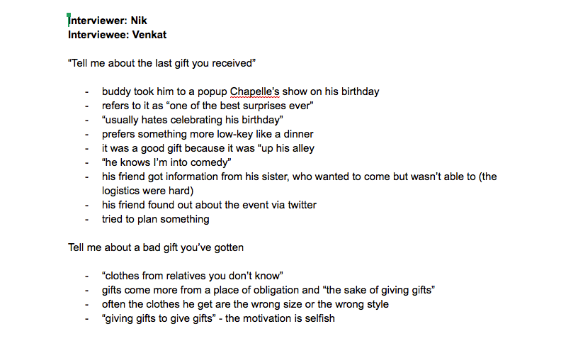
"Tell me a story about the last gift you gave"
Most of the questions we had scripted centered around the gifting process—the channels and methods that people use—and what their pain points were. I chose to interview one of my teammates as a kind of practice run. The interview went pretty well, but one mistake I made was to take notes in a notebook. When I went back to look at my notes, I noticed that there were a ton of gaps in the sentences and thoughts, and that transcribing them took much longer than I wanted.
For my second interview, I used facetime to interview one of my friends remotely. I used facetime and propped my phone up on my laptop while I took notes. Although the setup was slightly clumsy the interview went well, and my notes ended up being pretty detailed. One thing this taught me about interviewing was that you should lways take notes on the computer. Your notes will better, and there's no transcriibing.
These were notes I initially took in my notebook. Although they look pretty decent, typing them up was a pain in the ass. I also could have been smoother in the way I led the interview from question to question.
Although I like to start with domain research before going into interviews, in this project we kind of did the reverse. The bulk of our domain and competitive reseach came after our first interviews. I'm not sure if this was an advantage or a disadvantage, but it did mean that we had time to discuss our interviews before jumping into the competitive analysis.
Discussing our first interviews, we found a couple of pain points, but among them, choosing the right gift was universally challenging. For most people, the prospect of trying to translate what you know about someone into a meaningful gift is painful. For this reason, our competitive analysis focused on the gift-choosing stage of the process.
Choosing the right gift was univerally challenging
And athough we had initially focused on ecommerce sites and big retailers, those interviews helped us realize that those sites just cover part of the gift-buying process. Gifting is an entire ecosystem—much bigger than just Amazon and Best Buy. Thinking about gift-giving as process, we were able to come up with a much broader list of "competitors" (which is to say platforms) that appear in different stages of the gifting process:
- gift inspiration: buzzfeed lists "top gifts for dads", santa wishlists
- gift-planning: calendars, google calendar, facebook reminders,
- gift researching: cross-channel buying, price comparison sites, online reviews
- gift buying: online vs brick and mortar, gift-cards and cash, intangible gifts,
- gift-giving: hand-delivering a wrapped gift, shipping a gift, or experiencing something together
- post gift-giving: returns, exchanges, regifting, gift cards for cash

Google drive and google sheets are definitely the best way to collaborate on competitive analyses. I've also used them for rough journay maps
Along with the interviewing and comepetitive analysis we were tasked with creating a survey. Although i think surveys can be good for anwering certain attitudinal questions, in this case we weren't sure how we were going to use it to further our design process. Atlhough I'm not sure it was a mistake, we ended up not actually sending out survey. Next time around, this is obviosly something I would want to do differently.
Nevertheless, focusing our energies on the interviewing and competitive analysis allowed us plenty of time to do our affinity diagramming. Because this was our first time doing a proper affinity diagram, we followed a slightly different format than in other projects. Because gifting is a multi-stage process, we decided to cluster our interview findings (and pain points) onto a timeline, based on the different stages in the gift-giving process—covering everything from the initial "trigger" to the gifting followup. This allowed us to think about pain points in the different stages of the gifting process, and to develope our current-state journey map later on.

Its hard to see here, but this tracks the "gifting process"—from the initial occasion (at left), to thinking about the person, the occasion, the relation, and potential gift ideas (the ideation phase) to the gift browsing, researching and buying phases, to the final the actual gifting occasion.

This isn't the best photograph, but it shows us trying to condense the gifting process into six steps: trigger, know, choose,exchange and followup. It also discuses some of the key goals involved in gift-giving: (1) giving a thoughtful gift, (2) proving that you're a good friend, (3) appearing competent and (4) finding the right thing with a minimum of effort.
As we were affinity diagramming (combining insights from our interviews, the domain research we had done, and our own experiences as gift-givers), a couple of key patterns emerged:
The first was decision fatigue. Most of the people we interviewed could tell you at least one story of when they had a general idea of what they wanted to get (maybe a necklace), and faced an overwhelming number of options to choose from. Decision fatigue seemed to be especially bad when they were buying in an unfamiliar domain (ie, a man buying makeup).
The second was thoughtfulness. Because the larger goal behind giving gifts is to strengthen emotional bonds and relationships, it's important that the gifts you gave have an element of thoughtfulness. Being thoughtful means you will not only give them a better gift, but it also signals that you know and care about the person you're buying the gift for, which is the ultimate social goal of giving gifts.
The third was forgetting. One of the things that made gift-giving really painful was the fact that a lot of us forget certain occasions (birthdays, holidays, anniversaries) and we end up giving ourselves too little time to pick out a gift. Depending on how emotionally invested someone is, what their budget is, and how much time they're willing to spend, they'll pick different strategies to cope with the time pressure.
The fourth was the importance of process. This is related to forgetting, but buying a gift last minute tends to lead to feeling of guilt for the buyer—even if the gift is really excellent. Internally, it feels like you haven't given enough thought to what to buy someone, like you don't care about them enough to put in the time. And with such short notice, it's hard to feel truly confident in your ultimate choice of gift.
From these patterns, we were able to build out two personas to help us with our design process: Delia, and Herbert. Both are characterized by forgetfulness—but they differ in their responses to that forgetfulness.
Delia, who is more thoughtul, is driven by a mix of fear and guilt; she doesn't want to disappoint her friends—who have given her thoughtful gifts in the past—with a lackluster gift in return. For her, it's really important that she finds a good gift, but it's equally important that her gift-choosing process feels thorough, authentic and thoughtful. Even if she finds a knockout gift in a pinch, she'll regret not giving herself more time; the process will have been tainted.

Herbert, on the other hand, is your classic "dad gifter." He tend to forget birthdays and holidays, and even when he remembers, he doesn't give himself enought time to fully pick. Herbet does his Christmas shopping, for example, on the 23rd.
For Herbert, gift-giving isn't really a pleasurable activity—it's something you have to do, and comes from a place of obligation more than anything else. He approaches it more like a chore than an opportunity to communicate love and thoughtfulness. It's not that he doesn't care, but it's more that gifting doesn't occupy a hugely important place in his life. He wants to be efficient in his process. He's prone to buying the same thing, year after year.
It's funny, but Herbert is [I think] a really great persona. Although he's so archetypal as to almost fall on the side of being stereotypical, he's a persona that everyone on my team could relate to. The aunt who buys you sweaters that don't fit, the dad that buys you tools for Christmas, and a book by that author he loves.

Herbert: the classic dad-gifter who might buy you sweaters and tools for Christmas.
We were asked to build out a current-state journey map for our main persona. Although our team loved Herbert the persona, we seemed more intent on focusing on Delia's problems, since the giving of thoughtful gifts seemed to be universally challenging—only for Delia, it was an especially painful process since guilt and anxiety were sort of built into the process. It's kind of like designing for an edge case: if you can help Delia find a thoughtful gift, chances are you can help anyone.
Now, I just want to come clean and say that personas and journey maps are probably my least favorite deliverable in these design sprints. Although I think our personas and journey maps are pretty complete in this design project (because we were able to fill in some of the gaps based on personal experience), generally speaking personas—and especially journey maps—require good deal of research to be accurate.
Ideally, I think journey maps are good for ironing out specifc service design problems; they're like process diagrams on steroids, and they take a lot of time to create. There also great for communicating specific design problems to clients. But internally, journey maps are not my favorite deliverable, and I don't think this one added a lot of value to our insights

Our team used google sheets to build out a "rough cut" of our journey map content. This was then ported over into Sketch, where one of my more visually minded teammates built out this more refined map.
So for Delia—and even to some extent, Herbert—buying thoughtful gifts seemed to be the salient challenge. Although we would approach it in different ways, it was the problem we as a team decided to tackle. We were able to create a problem statement that gets at the core of this issue:
Problem Statement
Translating what we know about our love ones into thoughtful, memorable gifts is a rare and coveted skill. How can we bring it to the masses?
This was my first fime developing a problem statement. I think this was a good first-run effort, but if I had to go back, I would make this more Delia-specific. This problem statement addresses the question of memorability and thoughtfulness in gifts, but it does little to address Delia's anxiety around gift-giving, or her forgetfulness. In some ways, there problems were almost more central to her struggles as a gift-giver.
We also developed a set of design principles—drawn from our personas and problem statement—that would guide the development of our mobile application. I'll admit, I have a hard time with design principles. I think I'm someone who is often led more by instinct than guidelines. Committing myself to a set of external design principles was fairly challenging.
Design Principles
(1) Flexible: the product will adapt to the user's input, time, budget and domain knowledge
(2) Pragmatic: the product will be a gift-giving tool, not an end in and of itself
(3) Magical: the product will use anticipatory design and significantly advanted technology to create wonder and joy
(4) Gravity: the product will bring people close by tracking important experiences over the course of their relationship
(5) Sommelier: the product will be a tactful, expert curator
(6) Festive: the design will celebrate gift-giving and change according to the occasion
(7) Intelligent: the design will make simple, smart solutions of out large, complex data
Design principles might be the hardest UX deliverables ever invented, simply because they play such a pivotal role in the design process. There is this a very challenging treadeoff between specificity and flexibility. As much as you want your design principles to be specific, there is always the risk that you develop them from specific features that you have in mind. This can make them less versatile later on. The design principle "Sommelier," for example, brings to mind suggestion and recommendation engines, but I'm not sure it's useful outside of that.
• • • • •
WIth our guiding principles in hand, it was time to ideate and think of different application ideas. To some extent this process involves fogetting the work on design principles you've just done, and thinking as outside of the box as you can. I generally tend to vet the ideas I come up with against the design principles and problem statement later, to see if they fit.
When we were spitballing, we came up with a number of different ideas. Some of them were pretty trite (a few too many concepts involving tinder-style swiping), but the idea was to cover a lot of ground. Although we didn't do crazy 8's we did do a few excercises where we wrote down ideas on paper, passed them to our other team members and let them build off of those.
Generally though, my best strategy for coming up with ideas has always involved time. I like to write down feature ideas as they come to me in a notebook or a google document. This allows them to gestate, and lets me return to them later to vet them for quality and adherence to the problem statement. This project had a pretty short timeframe, so my collection of potential feature ideas is nowhere as robust as I wanted it to be. But some of the ideas I personally came up with included:
(1) hire people based on gender, age, interests to help you shop
(2) App to help you write down instances when people tell you what they like (that you can come back to)
(3) Crowdsource gift ideas via social media
(4) a gift-curation and gift-idea list aggregator
(5) an interest-scraper, that would build ideas from their social media accounts
Overall, I tossed around a lot of ideas, but none of them seemed to stick to me. From my competitive research, I knew that there were a lot of sites trying to tell you what you should buy—lists, engines, amazon—based on the age/gender/interests of the recipient. But I didn't find any of them particularly robust. It isn't like a dating site, where you're inputting a lot of personal information up front about what you. If you need help buying a gift for someone, you probably don't know enough about them to give any algorithm enought to work. Because you know you're working from pretty limited information, these engines are hard to trust. How do you know that the algorithm is right?
But there's a bigger problem: part of the reason we give gifts is selfish; we want to feel like we've made an effort. Plugging someone's interests into a machine and getting a gift suggestion involves very littler personal investment, and even if it helps you nail the ultimate gift—you will feel a little guilty taking that kind of shortcut. For Delia, this kind of guilt reaction would be especially strong. Having an app suggest what to buy might be convenient, but it will never feel authentic.
Having an app suggest what to buy might be convenient, but it will never feel authentic.
Thinking about recommendation engines (and how they're not really all that) led me to reevaluate my problem statement. The more I thought about this problem of thoughtul gifting, the more I realized it's grounded in a deeper problem: forgetfulness.
Birthdays and other special occasions catch Delia off guard. Giving her more time to make her decision will make the process to feel thorough and complete. This will also help curb her anxiety—she will have had more time to decide what kind of gift would be appropriate. In short, more time = less anxiety.
It's also grounded in ignorance: Delia doesn't do a good job of paying attention to her friends' interests and needs. To really make her a more thoughtful gifter, she's going to need some help paying attention to her friends. This will give her more confidence when it comes time to buy gifts for them later on.
This is why—although I was initally drawn to creating some kind of gift recommendation engine—I realized I wanted to focus more on Delia's forgetfulness. This was in part, a decision I made to "design for myself," since I hate recommendation engines. Instead, I thought about an app that would be structured like a calendar—with reminders and notifications to give Delia more time to think about her gift choices for her friends.
My app idea also helped Delia track of her freinds' interests, since it gives her the ability to tag friends in her gifting calendar with interests. The app can then use these tags and offer gifting suggestions in case she draws a blank. With these two core features in mind, I set about building a prototype in Axure, using a lot of dynamic panels and a single main screen.

The app is structured into three main screens: a calendar, a list of people, and a list of occasions
The app is very simple, and it's structured into three main screens (I generally try do design apps in a "snapchat" like way. Although it takes some intial onboarding to conquer the discoverability issue, it makes for a very elegant interface. The pages in my app included a:
(1) Calendar: this is kind of like an at-a-glance news feed where all of your upcoming gifting obligations appear. They show dates to be accurate show up
(2) People: You can import all of your contacts via facebook, and then decide if they're gift-worthy, by setting them to either active or inactive (ie, do they appear on your calendar). You can set variable reminders based on their relative importance in your life: if you're buying a gift for someone you love, you might get a reminder a month in advance. If you're just sending an acquantance a friendly birthday hello, you might get a same-day reminder. This was done to try to mimic our mental models of gifting. You can also tag people with interests, and based on the combination of their interests and the occasion (birthday, wedding, etc), it will generate gift ideas via amazon.
(3) Occasions: Occasions are either one-off or recurring events that you can create and add attendees to. Common events like holidays get custom iconography integrated automatically. Occasions can be entered manually, or imported (using the right technology) from your Google calnedar. Based on the number of attendees, rough importance of those attendees (do they get gifts on their birthdays), and the holiday, it will generate a default reminder taking those into consideration. For a full-family christmas, for example, the reminders might start six weeks in advance.
Unfortunately, there was only room for one round of prototyping and one round of usability testing before we moved to high fidelity. Although I totally neglected onboarding (which was a major flaw), I would say that the overall results were good: My app did pretty well on the NPM scale (people said they would use it), and people liked the level of detail and the interface.
However, people didn't really understand was what the concept initally was. Onboarding would have solved this (I think), but you never know. Testers also didn't love the tagging and gift-suggestions idea, since it seemed like an afterthought
Taking the user feedback into my final design, I decided to scrap the tagging and amazon gift-suggestions entirely. I realized that it didn't really help with Delia's thoughtfulness problem, and that giving Delia more time to think out a gift herself would probably lead to a better overall outcome. Therefore, I decided purely to focus on this idea of a "gift-giving command center." The final concepts is like a superpowered gifting calendar where you could organize and plan for all of your major gifting occasions.
There was unfortunately no second round of testing or wireframing, but I did make changes to the core structure when it came time to do the visual design. We started the design process making style tiles (pictured below). This was y first time doing them, and I quickly learned that I'm someone who enjoys adding more detail to mine, and mocking up key screens. One mistake I made was making my style tiles too similar (which is generally best practice when working with clients). They do, however, share bright colorful palettes and the kind of whimsical, fun feel I was after. Because this app had fairly basic functionality I realized that the designand look/feel of the app would be pretty central to its design. I wanted to get away from the complex and utilitarian feel that Google Calendar offers. Ideally this would be a hyper-focused, bespoke gifting app.

This style tile borrows some interface elements and palette choices from Airbnb. I also hand-lettered the logotype, and drew the main logo as a vector

This style tile feels like 80's miami clothing meet's spongebob; it's somewhere between sponebob and miami vice, childish and sexy.
Feedback from my instructor (who in this case, served as the client and creative director) was mixed. Although he criticized them for being ultimately too similar, he did like the first one. I took what was successful about that style tile, and set about building high fidelity screens with the functionality I envisioned. In this case, I only managed to cover the key screens (and not the core flow), but I think this gets at 80% of what the app can do.

Although I really only managed the key screens (and not any serious flows), I'm pretty happy with the end product. In the end I designed an app that isn't really a crutch or a life hack; it acrually makes people into better, more organized gifters. Because they are more aware of gifting occasions, they have more time to plan, and generally feel less anxious. This means they will pay more attention to the people in their life, and their interests; better gifts and a more pleasurable experience.
I learned a bouple of things from this project:
(1) Journey Maps are hard. Honestly, I think for anything other than a pretty narrowly-defined existing product, you shouldnt use a journey map. For concept-validation stage design projects like this, it's going to be overkill and overly speculative.
(2) Protypes should be broad and shallow. Although there is value in building prototypes that are fairly detailed and specific, I think getting too visually detailed with my app actually held it back. It meant I made fewer screens, and wasn't able to sover the depth and full scale of the flows I was prototyping. This held things back.
(3) Don't forget about onboarding. Onboarding is one of the most overlooked parts of the design process, but I think it's so key in making an app easy to use and intuitive. So often it feels like a detail, and afterthought—and to some extent it is. But it can do wonders for the usability of your product.
