WTH is this?
RunRun is the name given to the enterprise social network developed by Flux IT, the IT company we work for; a tool born inside the company and built to its own employees.
This social network had a main aim since the day the challenge was faced: RunRun would be one of the key artifacts the company would use to improve its internal communication performance. One smart decision the team took at that time was to build a project from scratch by embracing a human-centered philosophy and methodology. One of the options considered at that time was paying for an enterprise social network already available (Yammer was one of the top names).
By doing research in immersion stages, the team first arrived to the conclusion that a digital tool would be a good way to improve the company's IC. Moreover, the team relized that a tool designed in a collaborative way would create a sense of belonging for most of the workers that were part of the process from early stages.
RunRun has had improvements along the way and luckily today is being used and loved by most of the employees. It has also reached many of its core objectives: be the tool that allows employees from different buildings meet in a virtual space; know and care about others; use an empathetic horizontal communication style when sharing corporate messages, create a sense of belonging to the company's culture and values and allow employees have a pleasant time at work, between others.
Today RunRun is the place where fluxers say hi to employees who are having their first day at Flux IT, say goodbye to the ones who leave; congratulate others for relevant accomplishments; know about the company's vision, values, and any kind of news; build social knowledge by sharing information or giving help to other fluxers as well as find a corporate virtual space where having fun.
The initiative
By paying attention to the way fluxers use RunRun (we are graphic designers working for the same company so we are fluxers too), we decided to take 7 days to develop a new version of RunRun desktop by creating sketches and mockups for two of the main sections a social network commonly has: homepage and user profiles. This work was done in the efforts to create in little time a catchy strategy to get everyone's attention and through this be part of a bigger team to make this new version real.
We found inspiration in popular social networks such as Yammer, Facebook, LinkedIn, Twitter, and we even got inspired by some Tinder features. The proposal took into account the following premises:
RunRun 3 will be smarter;
RunRun 3 will be more collaborative;
RunRun 3 will be more communicative;
RunRun 3 will be fancy, young, playful and optimistic.
We are sharing our prototypes and decisions below.
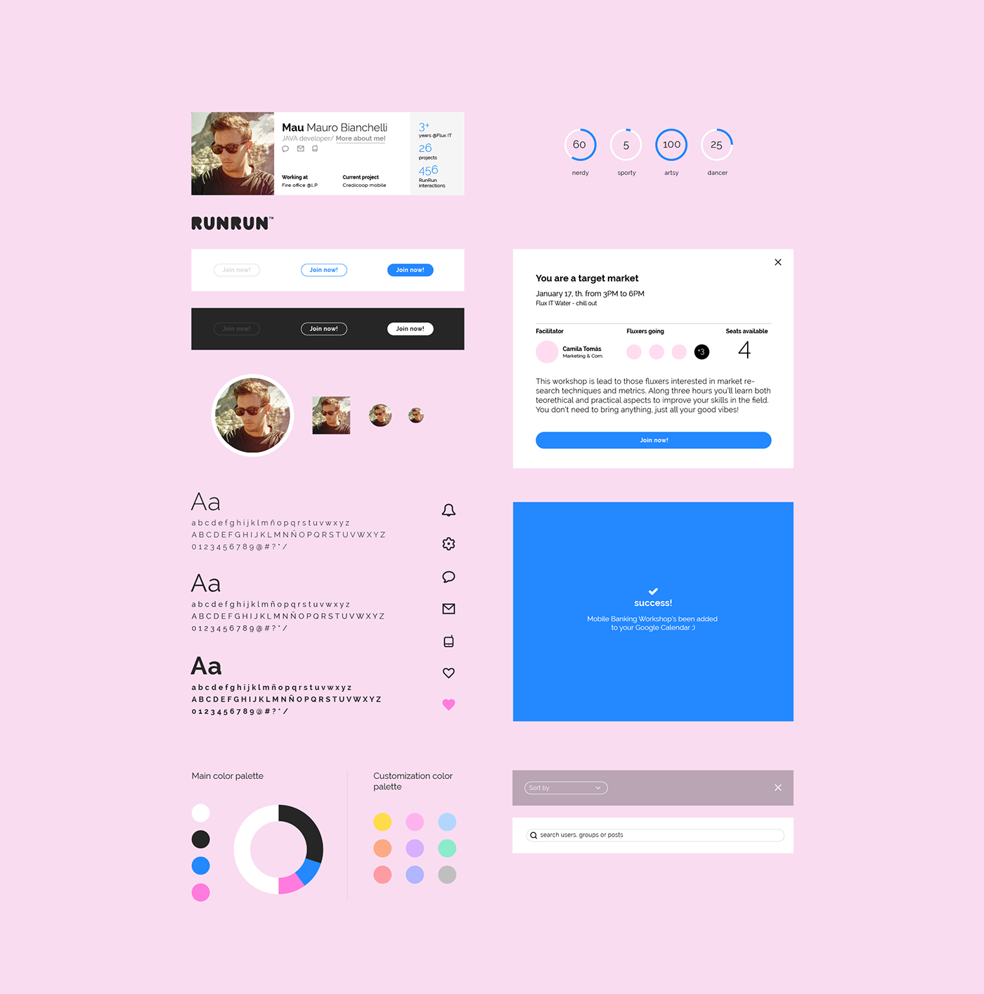
Style tiles/ UI comps
We decided to build a set of flat UI components and a flexible color palette. Although there is a set of 4 main colors, the new version consider customization options by using an extended color scheme.
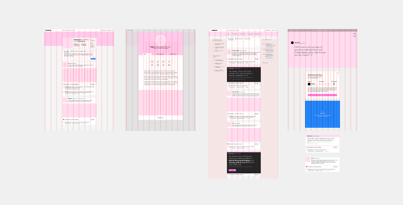
Homapage ("The aisle")
Departments's posts and fluxers's posts share the same body and both kind of communications are differentiated by using different UI visual styles. Posts published by fluxers look like other widely well known social networks whereas posts published by departments show a different visual execution: Departments have been considered by us as "super users", so users who send communications from these will have the chance to create posts with a higher level of visual hierarchy.
Super users not only will have the chance to create stronger visual posts but also create posts with more functionalities: they will be able to use different font-variants, insert buttons and forms, etc. Users who are interested in seeing only super user posts, will be able to do it by selecting one of the filters in the blue top bar.
This proposal will also allow users to have in mind their day of work by showing Google Calendar meetings at the homepage right side (many fluxers log in to RunRun every morning when they reach the office ).
Users will also have the chance to create "memes" directly from RunRun. It's really common for fluxers sharing visual posts or comments and the most of them are related to troll other co-workers in a friendly way.

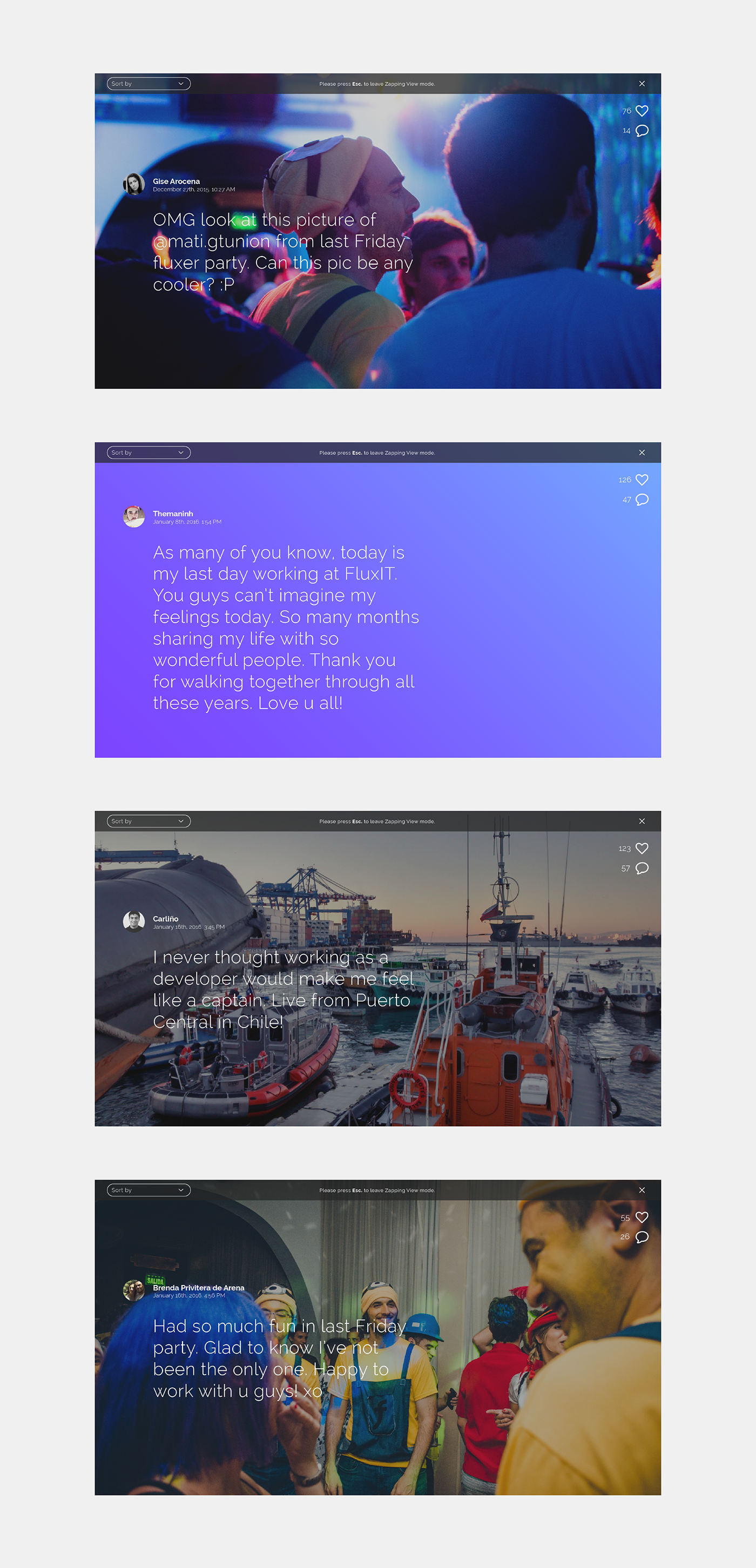
Zapping view
Many fluxers use RunRun while having lunch and during the breaks just to clear up their minds. This functionality will allow users to enter a full screen view where they will be able to look at the most popular RunRun posts in a fancy way for their amusement.
User profiles
Finding inspiration in linked In, Facebook and Twitter, this section will allow users to customize their profiles by using a set of images on the top. User profile cards will contain a picture uploaded by users themselves and a corporate picture uploaded by the system. This detail is important as RunRun will allow users easily know the way other co-workers look in case they haven't met in person. Corporate profile pictures will ensure the employee's face is always visible.
Users will be also able to give feedback when they're visiting their co-workers profiles. Last year the company embraced a Collaborative Feedback philosophy and this functionality will allow fluxers to give meaningful feedback to their mates along the year. Users who receive feedback will decide whether make the messages visible or not.

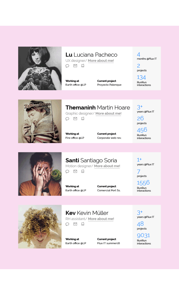
More about everyone
"More about me" was thought as a super-card that shows up to allow fluxers learn more about their co-workers's lives. One of Flux IT's brand positioning pillars is focused on human value, ensuring all the stuff work in a friendly environment where people genuinely care about each other. These super-cards try from their genesis to attend this brand pillar in a human, social way. These cards also provide room to allow users create their projects' storyline inside the company.


Mobile Approach
RunRun 3 will consider its mobile version by attending at the main actions making focus on real time actions. Here below we're showing some key screens.

Strategy to share this initiative inside the company
We're sharing this project today. As we said it before, we are using these prototypes as a trigger to promote the internal social network redesign. So the way we decided to do this is making it social, by posting the following video demonstration on the current RunRun version. The prototypes showed here mock real users activity to get them immerse in the proposal. The video was also created in a friendly and informal way and it expects to get the attention of the staff. Wish us luck!
Credits
Project developed by Martín Hoare & Santiago Soria working at Flux IT
RunRun original logo was designed by Estudio D. This project shows a redesigned version of the original logo.
Music in video demo belongs to the adorable Japanese group Lullatone
Junk food BG texture was taken from this weirdly interesting article


