This was a successful Social media ad which used Facebook's 20% text rule limitation - this is a limitation where Facebook does not allow ads with more than 20% of an ad to be consisting of text. This limitation is certainly a challenge but the results can still be on-point and eyecatching.

Don't worry, there is nothing wrong with your eye-sight!
These mini-banners were intentially designed to be askew as evidence and research suggested that banners in odd shapes stood out against other online page content. Popping out so dramatically made them much more noticeable to the user.

For the same reasons, this ad was also designed to 'pop', making use of the illusion that the poker chips were leaving the frame of the ad.

These eye-catching beauties are flash animated banners used for online marketing.
To see these animated please visit:
These were also created as gif animated banners.

I've created an imaginary travel company called 'Timewise Holidays', designed to target busy or career-focused adults. The marketing tactic is to gently remind busy people that making time for holidays is incredibly beneficial for well-being and for spending quality time with loved ones - it literally can be time spent wisely.

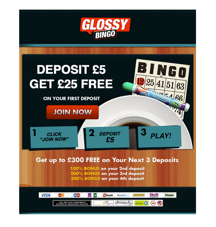
A Landing page design - a good example of a between-pages landing page providing useful and tempting information to attract customers.

These are Mailer designs using basic gamification and a sense of interaction to attract more clicks. The digital design is made first and then sliced and put into an html table where the HTML and CSS may be edited in order for this email creative to work perfectly across all email clients. This is a very image-heavy email design but everything has still be designed to load with appropriate and critical information so that even in the event that images may not load the email is still readable and usable.

This is a Mailer design. The digital design is made first and then this is sliced and put into an html table where the HTML and CSS may be edited in order to display and work perfectly across all email clients.

A successful online ad for SuperFreeBingo.com. This design was reused and repurposed many times across other ads and banners due to it's vibrancy and high click-rate.

This is a great example of some of the A/B testing used for this ad. This was the most successful colour palette but also slight changes of text and offers was used to gather information about what attracts the most clicks.


