Turkish Airlines Euroleague Final Four 2016 Berlin / Case Study
Design and development of the rejected Turkish Airlines Euroleague Final Four 2016 emblem.
_____
The Brief
The Final Four should be perceived by fans as an unmissable experience, full of entertainment and passion. Logo should communicate basketball in some way, mixed with characteristic elements of the host city. The Turkish Airlines Euroleague Final Four emblem needs to reflect the link between basketball and the host city. Furtermore the emblem should be perceived as a positive sign that provokes people to join and participate in a great experience, the celebration of European Basketball.
The Final Four should be perceived by fans as an unmissable experience, full of entertainment and passion. Logo should communicate basketball in some way, mixed with characteristic elements of the host city. The Turkish Airlines Euroleague Final Four emblem needs to reflect the link between basketball and the host city. Furtermore the emblem should be perceived as a positive sign that provokes people to join and participate in a great experience, the celebration of European Basketball.
The task
Connect Final Four and Basketball with Berlin’s unique cultural history. The Bauhaus.
Connect Final Four and Basketball with Berlin’s unique cultural history. The Bauhaus.
The solution
The presented design solution is a mixture of the following key elements, shaped all toghether into a meaningful, modern, playful, powerful and colourful symbol, that intrigues the viewer to get involved with the games.
The presented design solution is a mixture of the following key elements, shaped all toghether into a meaningful, modern, playful, powerful and colourful symbol, that intrigues the viewer to get involved with the games.
Emblem Elements and Symbolisms:
The Euroleague Trophy
The Basketball Basic Form
The Bauhaus
The Gestalt Effect
The Bauhaus typography
Berlin’s landmark: The Alex Tower
The Euroleague Trophy
The Basketball Basic Form
The Bauhaus
The Gestalt Effect
The Bauhaus typography
Berlin’s landmark: The Alex Tower


The Ispiration
The Trophy
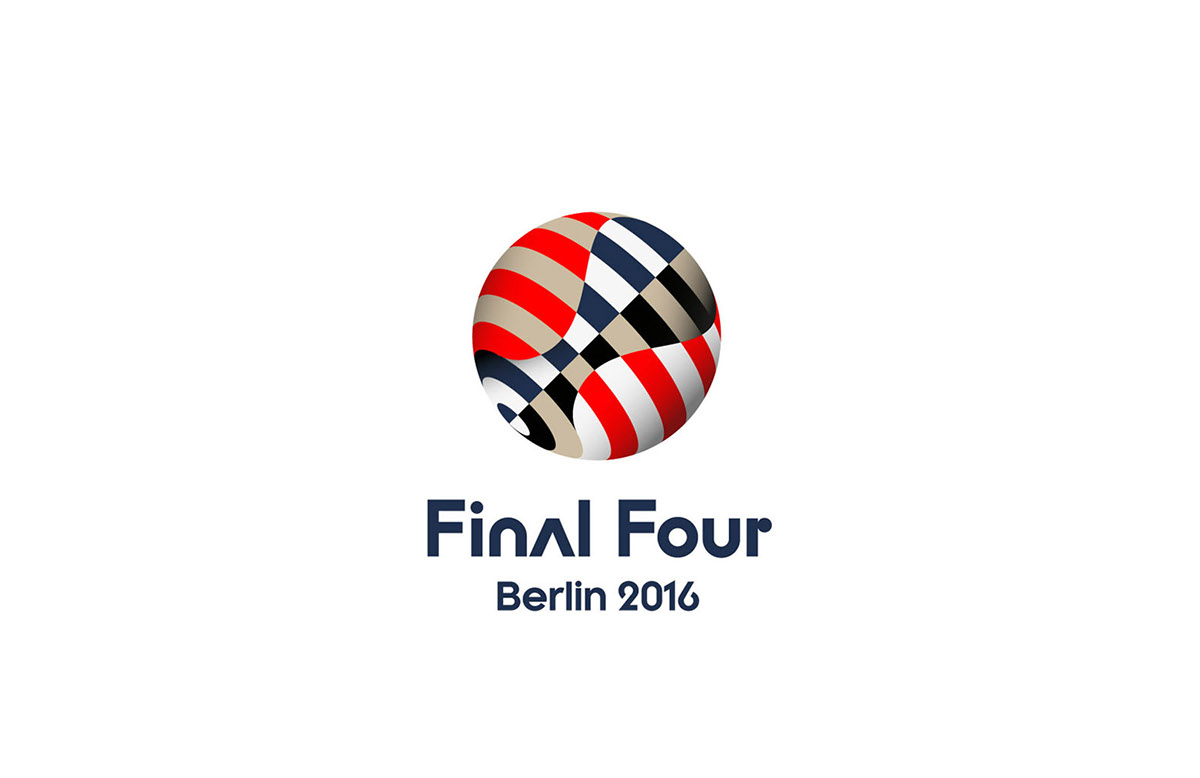
In the centre frame of the emblem we place the trophy, a dominant visual appearance intentionally located in the heart of it, creating a three dimensional effect. The trophy represents excellence and victory accomplished by cooperation and team spirit. It stands for giving one’s best on the field, combining a strong body, mind and will. The trophy represents the canvas of strategy and victory. It’s the final goal for all participating teams and the reward for the winning one. This element is visually positioned on a basketball, allowing this two core objects to be combined in a balanced whole. It is created in the same perspective as the one seen when the winning team holds the trophy high, celebrating victory. The idea represents and developes the values of basketball, the shared ambition and the generated expectations.
The Final Four should be perceived by fans as an unmissable experience, as a celebration full of entertainment and passion. For this reason the emblem is designed to be vibrant and festive. Its colourful appeal reflects entertainment, drama, passion and joy. Furthermore, the trophy also emphasises on the importance of the Final Four and the high end quality of Euroleague Basketball. The centre placed trophy is a representative of the organisation’s standards because it communicates excellence and trust in the event, leaving a memorable and long lasting impact to basketball fans.
The Bauhaus
Berlin is worldwide famous for the bauhaus movement. The bauhaus philosophy stamped its own century and this one too. It has a profound influence upon subsequent developments in art, architecture, graphic design, interior design, fashion, industrial design, and typography. Walter Gropius, the father of bauhaus, was born in Berlin and secured the city’s reputation as a centre of modern and postmodern art. The design innovations commonly associated with Gropius and the Bauhaus in general, are strongly connected with Berlin’s history, as told by the city itself. The most important influence on Bauhaus was modernism. The German zeitgeist had turned from emotional Expressionism to the matter-of-fact New Objectivity. Our proposal is inspired by the bauhaus principles, applying a human scale approach using the simplification of forms. The suggested emblem follows the bauhaus design principles, as this movement has deeply affected Berlin’ s history and identity. Furthemore, the applied concept has obvious points of contact with the gestalt philosophy and applications.

Geometry and Colors
The Alex Tower
“Fernsehturm Berlin” has become one of the most prominent symbols of the country and it is among the best known sights in Berlin. This modern landmark is visible from all over Berlin. Taking into consideration the Berlin Tower characteristics, we are inspired by the existing colours of the antenna and the geometry of the sphere, reinforcing the connection between Final Four and the host City.
“Fernsehturm Berlin” has become one of the most prominent symbols of the country and it is among the best known sights in Berlin. This modern landmark is visible from all over Berlin. Taking into consideration the Berlin Tower characteristics, we are inspired by the existing colours of the antenna and the geometry of the sphere, reinforcing the connection between Final Four and the host City.

The Gestalt
The Gestalt effect is summarised by the idea that the whole is greater than the sum of its parts. The suggested emblem is consisted of three major ideas the bauhaus, the trophy and the basketball.

Typography
Inspired by the official Bauhaus Archive typeface, we reinvent this unique typeset and create a new lettering to amplify and support the appeal and the concept philosophy of the emblem.


