

IDENTITY DESIGN
The breif was to create a sharp, neat, bold and appealing logo for the DJ. It has to be unique and of the kinf that can be remembered for long, yet not losing the aesthetics and sharpness of the DJ industry.

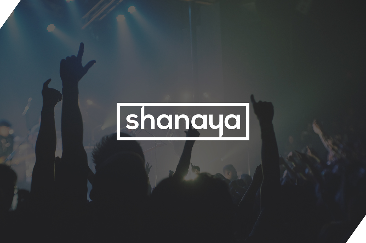
Logo Sample - 1
The Minimal Blade
The logo mark itself is made such that, it, with it's balanced state and minimal appearance looks
interesting, modern, stable and bold. The H and Y inversion with the blade cut
makes it sharp and dynamic.


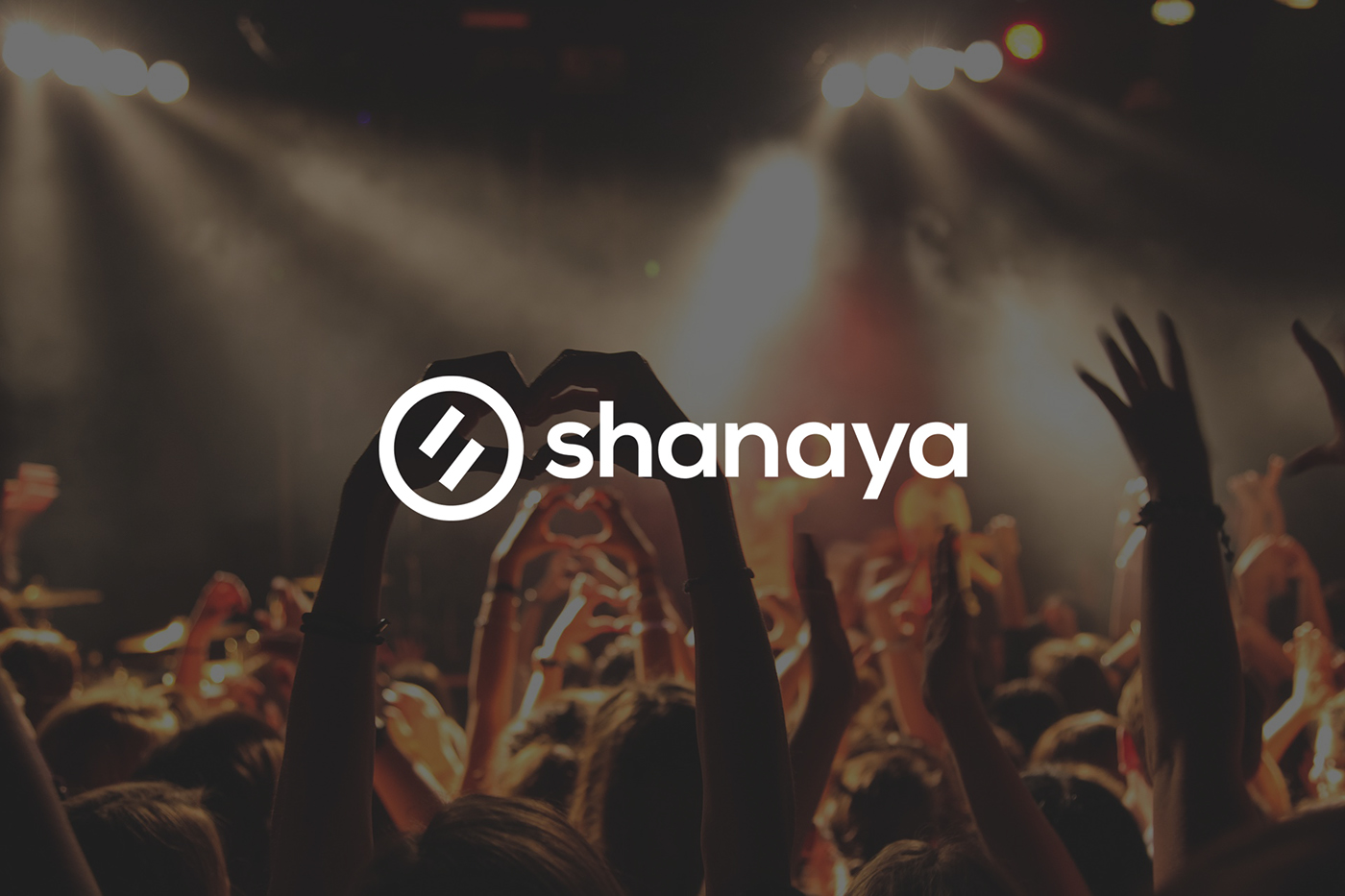
Logo Sample - 2
The Addictive Disc
The logo takes a neat turn forming the shape of a disc, showing an
equality signature which makes the letter S.

Logo Sample - 3
The Light Fever
The logo tries to put all the energy of lights and sound in the centre making the form
of a balanced type yet keeping the flash alive.


Logo Sample - 4
The Edgy Drop
The logo mark tries to represent a wave-from of music beats in an edgy manner forming the letter S.
If you look closely, you'll find it to be also an exclamation mark,
or as we will like to call it, The S-clamation Mark.
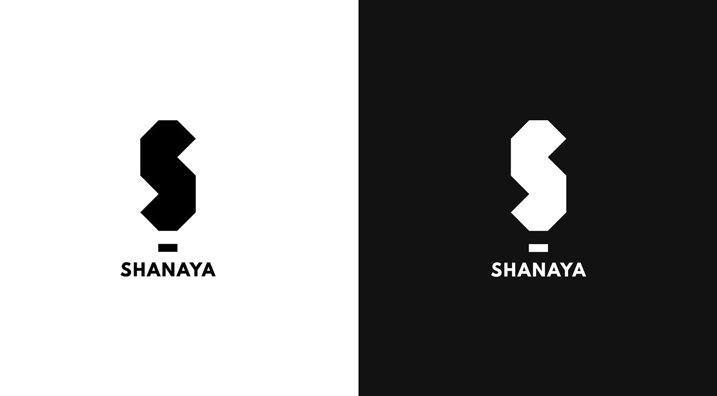

Logo Sample - 5 (Selected)
The Original Beat
This brings the originality of a DJ logo. The type is sharp and leaves a lasting mark on the viewer.
The applications for the same are wide.


Like what you saw?
Click the Appreciate Button & Follow :)


