
The Bavarian Roasting Company is a small manufacturer of premium coffee. They started with just three coffees because they think it‘s better to create less, but do it perfectly. They not only offer an exceptional coffee experience to other businesses, but also to customers at their local café, located in the very center of their medieval hometown, where they are known as Café Baroco.
We wanted to capture their philosophy but also play with their catchy nickname. We developed a dual system consisting of a long and a short version of their nickname. The two versions are connected by the same typeface but also, and more importantly, by three dots, one for each of the three coffees they started with. In the long version, the dots abbreviate the full company name, making the origin of the nickname obvious. In the short version, they transform into ellipses, stating: we started small, but there is a lot more to come.
Another design element (and further connection) is made by the ESTd lettering, which is set at a 90 degree angle and graphically acts as a counterweight in order to balance the main logos. Conceptually, the logos and the ESTd lettering span a rectangle in which content can be laid out arbitrarily. We decided to go with a simple 2-column layout for the most part and extend the layout only if necessary. In rare instances, where it is not possible to display both parts of the logo, we show only one of the main logos (see coffee cups). This system is easy to understand and easy to apply, yet flexible enough for years to come.
Klim‘s Tiempos (Headline and Text) is the one and only typeface we use. It is wonderful: modern and elegant with a timeless touch to it. It works equally well for headlines and for copy text and builds the visual foundation of the whole identity.
Our main color is Pantone Cool Gray 11 U. It is timeless and elegant. The secondary colors are Pantone Orange 021 U and Pantone Blue 072 U. The orange emits freshness and has a strong association with food. The blue feels chic but unobtrusive.

Business cards.
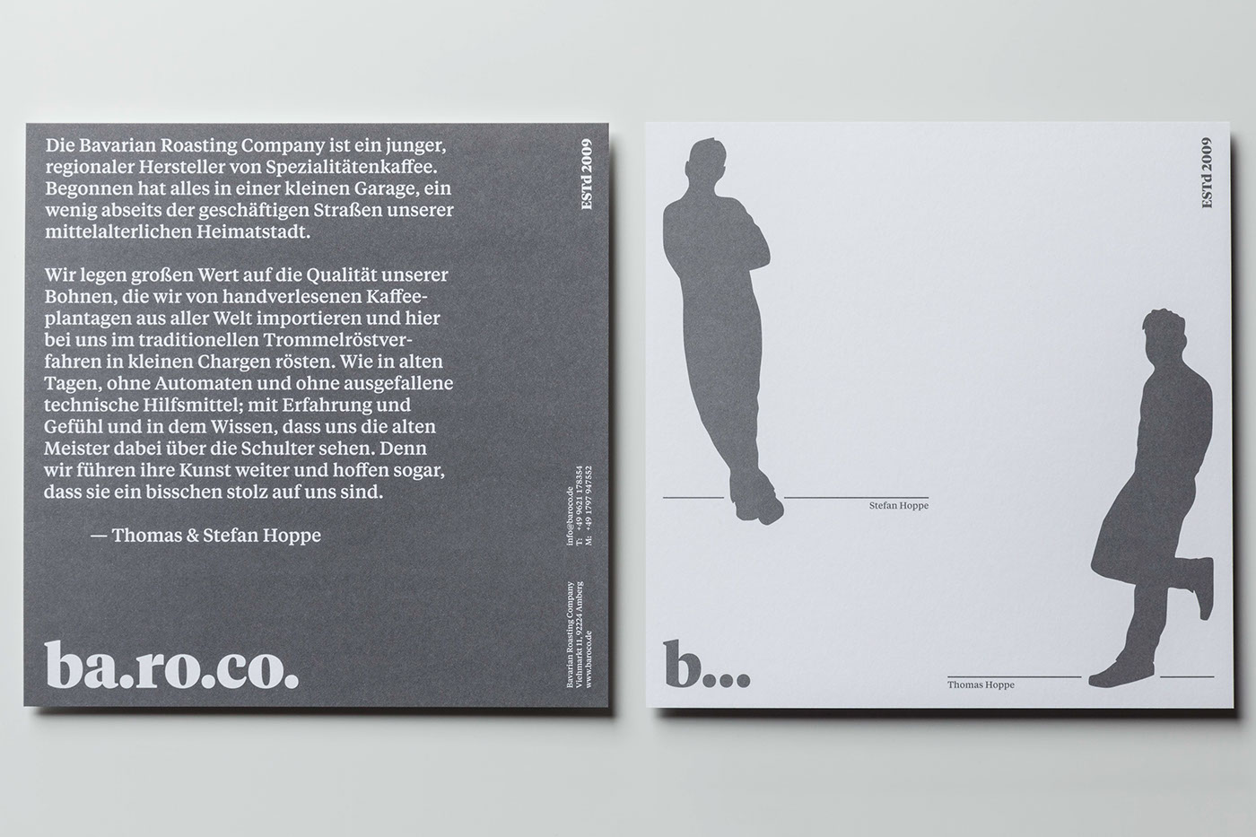
Introduction of the company and its founders.

Letterhead.

Stamps.

Front side of the menu. The colors of the back side are reversed (blue text on white background).

Coupons (orange). The cover (gray) is optional.

Sugar.

Cappuccino cup (blue version).

Saucer for cappuccino cup (blue version).

Coffee cups (orange version).

Coffee bag (1 kg).

Coffee bags (0.5 kg).

Take-away bag.
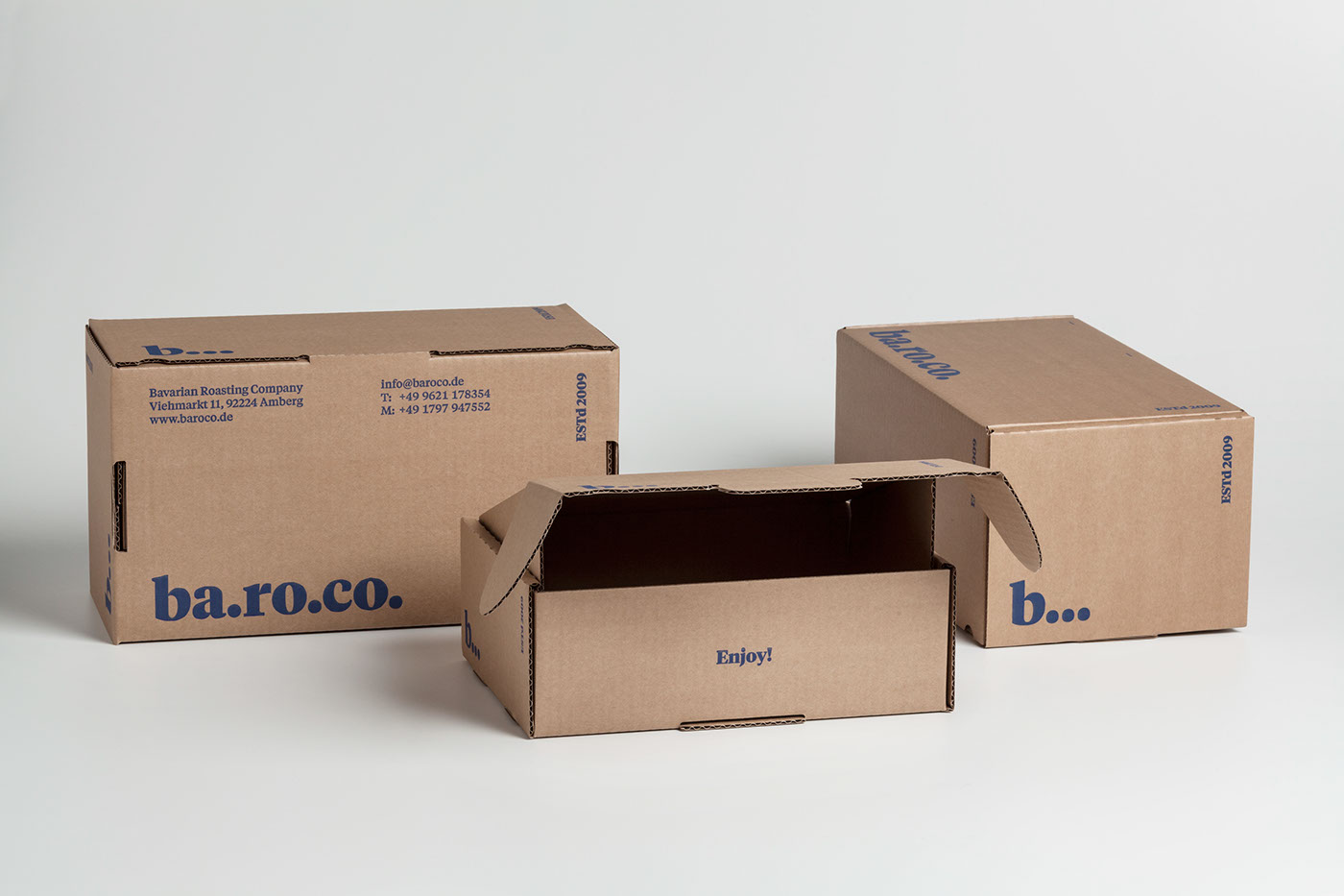
Shipping boxes.

Menu w/ sugar on top.

Menu, sugar and cups combined.

Coffee shelf.
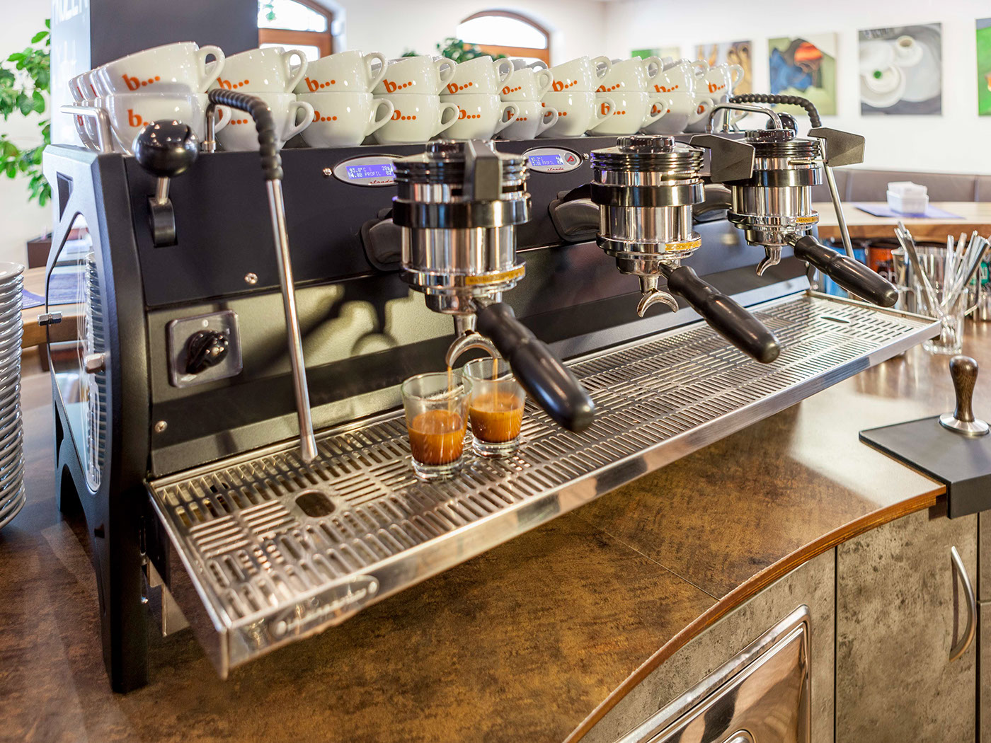
Coffee machine (La Marzocco Strada) w/ coffee cups on top.

Pedestrian display. From afar, people will see an arrow pointing in the direction of the café. As they come close, the arrow transforms into a selection of coffee beverages.


