
THE BRANDING OF PUERTO RICO FC
x
It's been a while since my last soccer related project (Miami MLS). This is a new project I’ve been working on for a couple of weeks, and that at the risk of sounding like a bad parent choosing between kids, might be my favorite, not only because of its über cool factor, but also because of how it happened, what it represents not only to me as a Designer and soccer/football lover but also to a beautiful island and its energetic, proud and supportive people. Oh, and of course, because I got to meet and work with an amazing client and group of people I can now call friends :) Today I want to share the process behind the design and branding of Carmelo Anthony’s (yup, that NBA Carmelo) Puerto Rico official NASL soccer team, Puerto Rico FC.
If you read or glanced through my Miami MLS project, you already know about my passion for Design, and for the beautiful game. Soccer has always played an important role in my life, and lately, I can happily say it has become a prominent part of my professional career :) This was/is a massive project. A project any agency would love to work on. And a project that through hard work, sacrifice, and professionalism – and GREAT clients, I was able to own from beginning to end.
Yup! Diego: 1 – Agencies: 0
Yup! Diego: 1 – Agencies: 0

Now, before I get into the story behind this project, let me explain to those of you who are not familiar with US soccer leagues what the NASL is. The North American Soccer League (NASL) is a professional men’s soccer league with teams in the United States, Canada, and Puerto Rico. It is sanctioned by the United States Soccer Federation (U.S. Soccer) as the Division II league in the American league system, under Major League Soccer (MLS).
Remember when Pelé joined the Cosmos and played here in the States? Well, that was the NASL.
Remember when Pelé joined the Cosmos and played here in the States? Well, that was the NASL.

Like most projects, things begin with a simple email or call, and although most tend be a little secretive, this one was pretty clear and promptly captured my undivided attention. After all, it is not everyday that you get the opportunity to meet and work with an eight time All-Star, and three-time Olympic US Team NBA iconic player like Melo.
In case you’ve never watched professional or Olympic basketball, this is Carmelo Anthony…
In case you’ve never watched professional or Olympic basketball, this is Carmelo Anthony…

If you are familiar with the design/branding process, you know that the next step usually involves many, many meetings. Some of them fun, some of them not so much, but all of them helpful. I honestly enjoy meetings with clients. You not only get to learn more about the company/product you are working with, you also get to know them n a personal level, which often is as helpful – if not more – as all the data provided. Being a big NBA fan, ‘meetings with Carmelo’ were more icing on the cake. And yes, in case you were wondering, they were long and productive, but when you work with a great client and team, you get to enjoy every minute of them. And also sometimes interrupted by Nike or Jordan calls. Which I never minded – Who would!?

After a couple of calls, emails and video conferences, it was time for research, conceptualizing and sketching ideas. As I usually do with all my projects, I did a lot of research – and I truly mean a lot – about the NASL, rival teams, previous Puerto Rico teams including the late Puerto Rico Islanders, and lots of Puerto Rican culture and history through books, photos from previous visits, internet and through great friends who without knowing why I was suddenly so interested in the island, did not hesitate to help me and share so much priceless information. Thank you again, Linna!


During research, everything that came to mind was sketched before opening Creative Cloud. Every possible version of a monogram, badge, icons, illustration or name was tested, documented and studied. This is always one of the funnest parts of the project because this is the stage where you get to go crazy designing and playing with ideas. But, we all know what else this means… LOTS of hard work, sacrifice and sleepless nights. In fact, for a couple of months, my weekends consisted on working, researching or chatting with Melo about options, suggestions and direction.


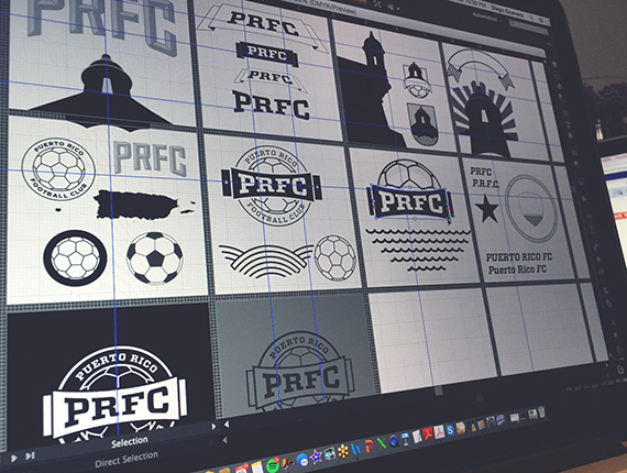


The circle shield combines unity and team spirit, while the football represents the love for the game and connection to the NASL. The circle shield follows european tradition, connecting old football with the new game, making the logo effective. The logo distances itself from other league team logos by featuring a modern and clean monochromatic timeless design able to work on print, web, social media , and merchandise without significant modifications.
The typography is bold, modern and features a variety of weights that will help communicate and establish a brand voice. It is part of a stylized banner that wraps the shield, which also serves as an independent badge, branding tool, or stylized monogram.


When it came to type, I wanted to use a typeface that would look great and match the personality of the brand we were creating. There were a lot of tests, elimination rounds and more tests. There were also a few options that matched the criteria I had established, but the unique characteristics and versatility of Vitesse felt like the perfect match.

Once we agreed on the identity, elements and the overall look, it was time to produce brand materials. Again, this required a lot of work and management since I was working on this project alone (agencies usually have a dedicated team), but I was fortunate to work with a great team of vendors in New York and Puerto Rico that worked together with me via phone and email to ensure everything ran smoothly and that our first challenge – the official PRFC announcement event, was a success.
Pardon the quality of some of the photos. They were either sent via text, email or are screenshots.


After long weeks of work, the day came. Melo was in Puerto Rico to officially announce the team and share with the world the identity we had been working on. Unfortunately, I was not able to be there, but that didn’t stop me from actively monitoring everything that was going on via ESPN, webcasts, blogs, and social media. It was a great day for Puerto Rico as this announcement meant the island would finally have another soccer team after a couple of soccer-less years.
It also meant that my latest project was going to be launched and televised, this time with a bit more fanfare and attention than others. Everything Carmelo does is amplified, so this was a new stage for me. But what truly made the day and announcement even more special is the fact that Melo, the client, not only was proud to show the work he trusted me to create and that the response from fans was extremely positive at the press conference and online, but the fact that he did something not many clients – let me rephrase that, something very, very few clients do. Thank the team behind the scenes. Melo took the time to publicly name and thank each member of his team for the hard work and effort that lead to a successful event. Have to admit, I honestly was not expecting this – I mean, how many of us usually get credit for the work we produce and that goes out to the world? Yup. Exactly. The fact that a celebrity like Melo did this as part of his speech, in front of the entire world, reminded me the type of professional he is, why he is where he is, and as a bonus, sealed his status as best client ever. We’re all #TeamMelo now.
By the way, if you are a client reading this, please consider this example next time you work with a Designer or agency. Gratitude is free and goes a long way. Sometimes, it’s the little things that make the difference and create a great partnership.


Ohhh! Remember I began this whole case study talking about Pelé and the NASL. Well, to make the entire experience even better, guess who tweeted my logo that day? Yup, O Rei! Now I can show my grandkids the screenshot one day and tell them that Pelé touched my work :) Boom!

Once the team was announced, it was time to go back to work to continue building the brand and create new material. Here are some of the pieces I’ve been working on and a couple ideas ranging from tshirts to sneakers….


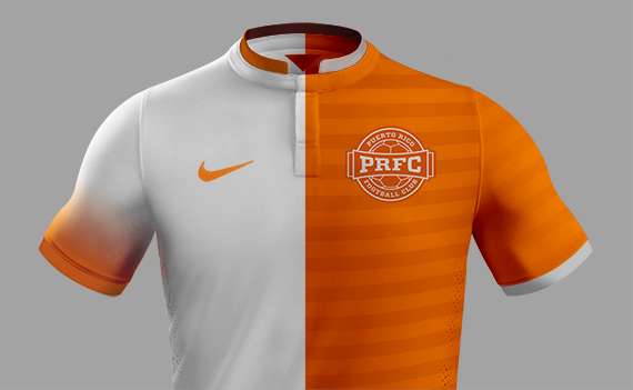
And because I always get questions about jerseys and kits, here’s a little sneak peek at some initial ideas. Disclaimer: These are not the team jerseys. These are just tests…
If you got to this point, great, and thanks! It means that you now know most of the story behind this identity and branding project. And whether you like it or not (won’t make a difference), whether you are an experienced designer, a student, a soccer lover or somebody who simply stumbled across this case study and decided to check it out, I hope this post not only informs you of how a project like this comes to life, but also inspires you, the same way hundreds of projects around the world inspire me on a daily basis.
Thank you again to all the people I had the pleasure of working with, my great friends who were always happy and willing to help, to my amazing wife who puts up with me, my sleepless nights and my crazy work life, Melo’s wonderful team, and of course, a very special thanks to Carmelo, and you Asani!!! for not only believing in me and giving me this huge opportunity, but also for trusting me and giving me that support and freedom that every designer dreams of and deserves in order to put out work with love, passion and meaning. I am happy and proud to be part of Team Melo.
Wait. We are far from over. We are still working on many upcoming projects that hopefully I’ll be able to share again soon. This is just a little taste and something I’ve been wanting to share for a while… See you soon! #StayMelo


