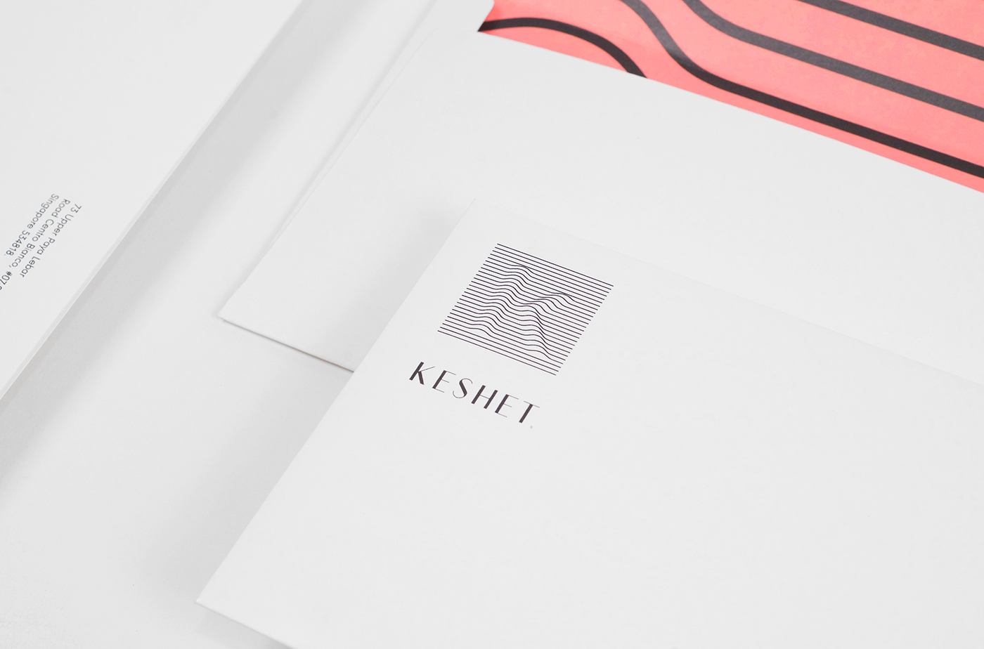
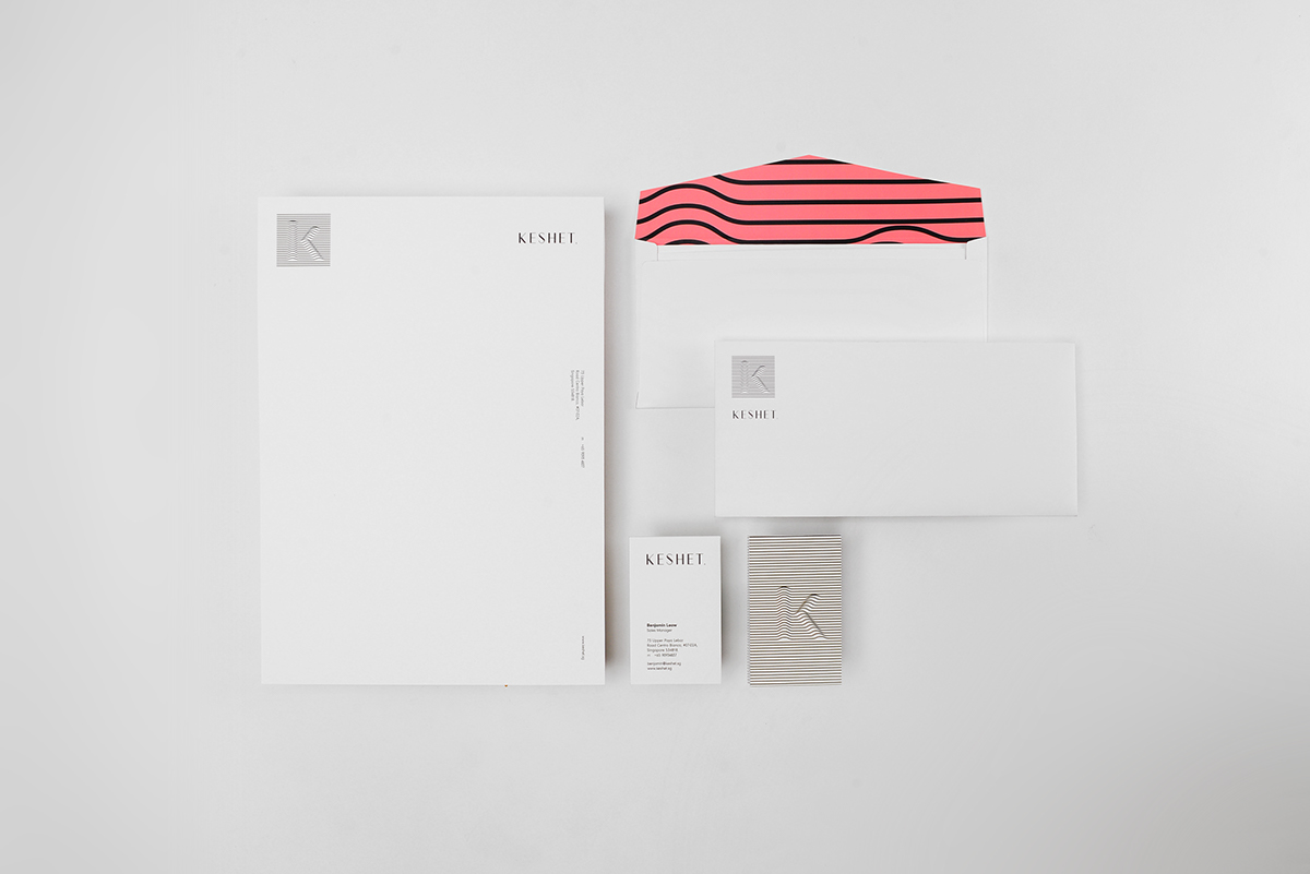
–––––– Keshet is a beauty distribution firm in Singapore. Sciencewerk designed & art directed the identity concept based on the the brand name 'Keshet' itself that means Rainbow in Hebrew. The stripe lines to symbolize the light spectrums, it uses 7 colour series in the overall applications, and the symbol 'K' is a shifting logo where it could be transformed into a keygraphic and visual elements of the brand.
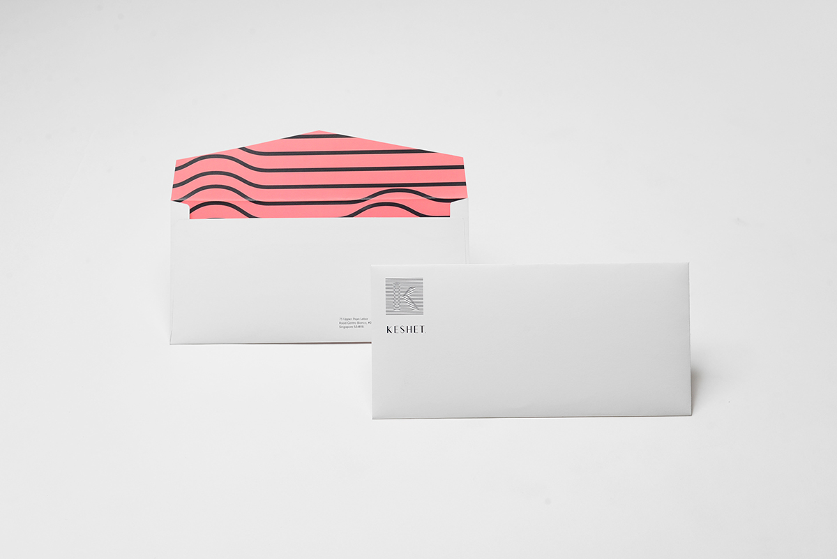
- Envelope Details

–– Business Cards

–– Business Cards
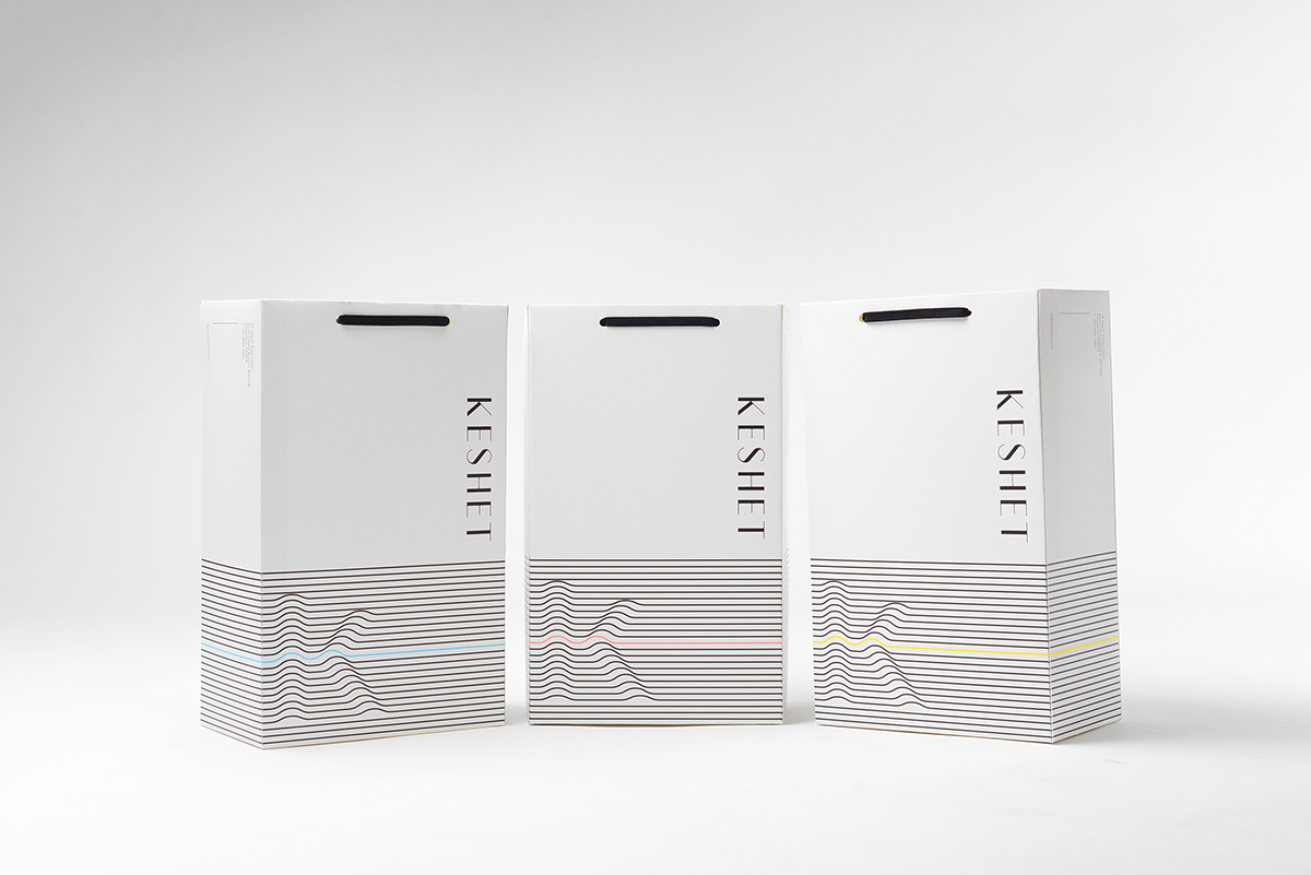

–– Paper Bag (1C)

–– Paper Bag (3C)

Art & Creative Direction – Danis Sie
Designer – Adji Dharma
Photography – Evelina K
Designer – Adji Dharma
Photography – Evelina K
w www.sciencewerk.net ig @sciencewerk fb sciencewerkdesign


