PGB branding
Mongram (using modified typeface) to communicate a personalised service with gravitas. The target was high level corporates but at the same time it was important to look a bit more fresh than the rest.


Stationery
Business cards, letterhead, brochures etc


Website design
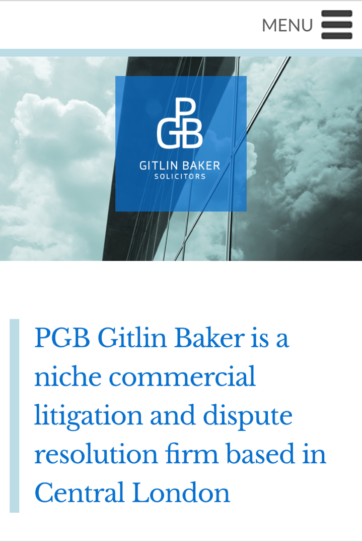
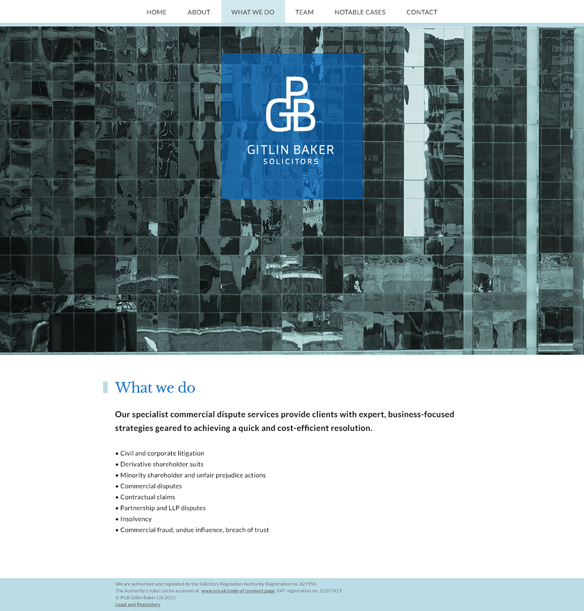
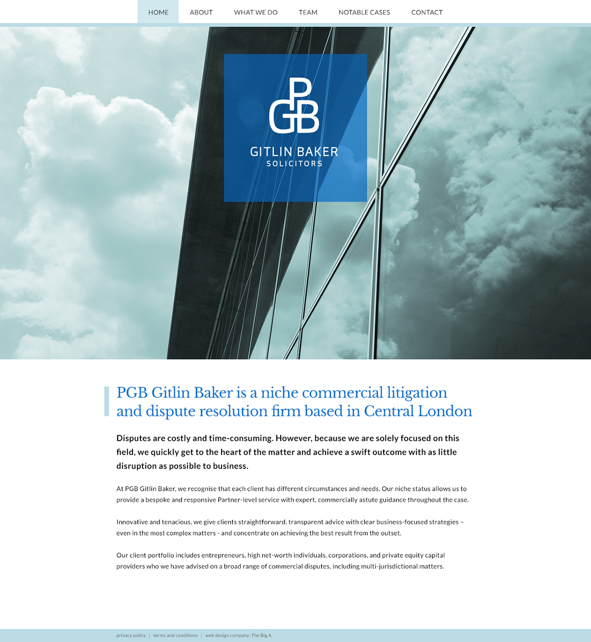
Their proposition is about transparency, clarity and a fresh approach. So the design, colour palette and imagery were all dedicated towards a transparent, clear and fresh feeling. The imagery also shows the corporate specialism.
The website was responsive and the copywriting was also undertaken to ensure clarity in communication, using a tone of voice the target market could relate to.
Mobile view