

Antique Chocolate Ampersands
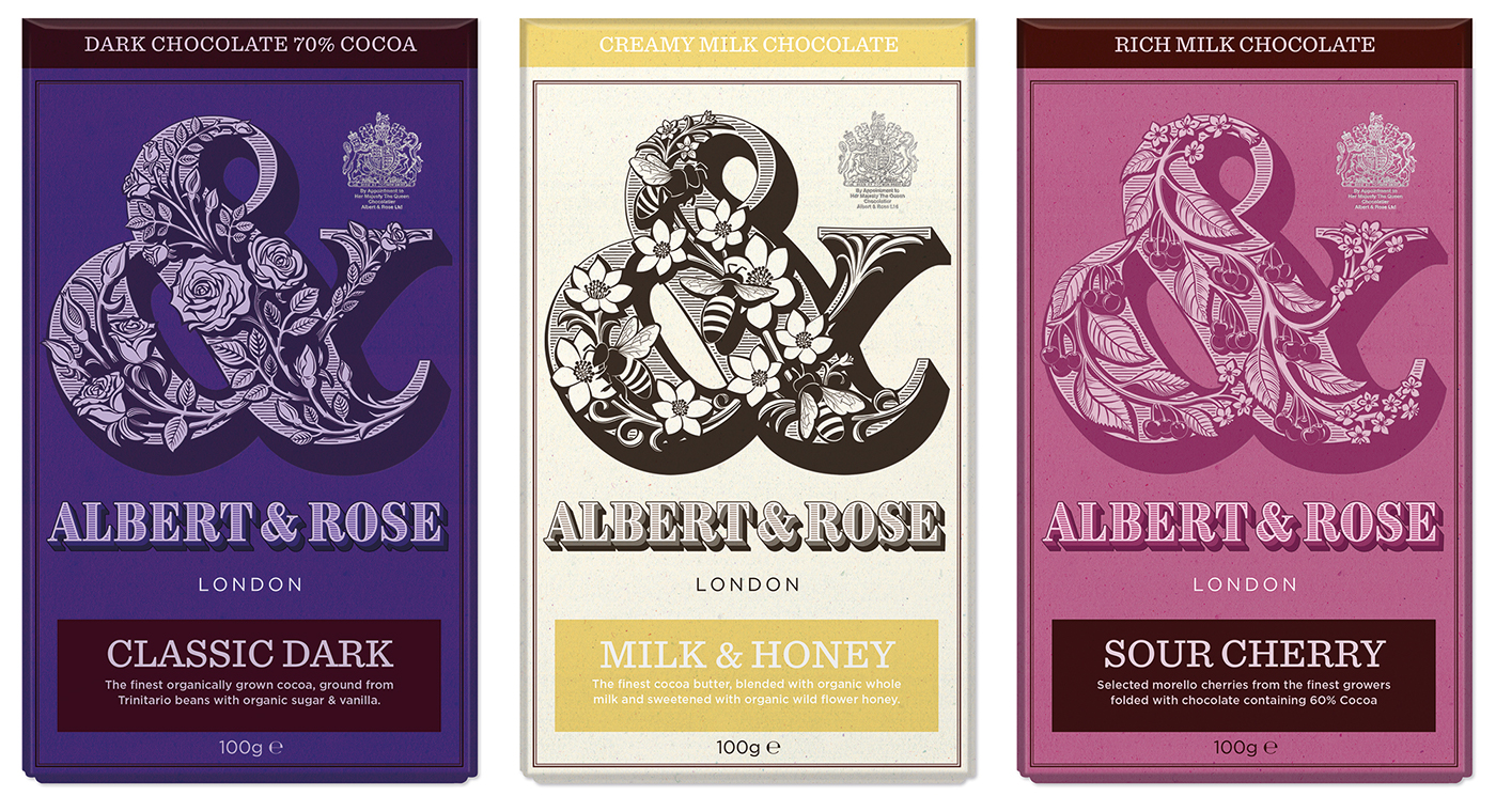
I'm a total chocaholic, so this packaging design seems a fitting tribute to my addiction. This self-initiated project was inspired by my research into the Pouchée wood alphabets. The illustrated ampersands matched with flecked, textured paper aim to evoke an early Victorian packaging feel.


The concept for a layered typeface
While creating the lettering for the broader identity for ‘Albert & Rose’, I thought the accompanying lettering would make an excellent, layered typeface. After many months of work, my first typeface, Brim Narrow, was completed It is available on MyFonts and Adobe Typekit.
I also wrote an article about the process of making Brim, featued on I Love Typography.


Process Notes:
I made several studies of a variety of ‘Fatface’ ampersands, including the Pouchée ampersands and those with more modern proportions. I redrew the characters, taking particular note of their weight, structure and ability to work with a strong shadow (without clogging up the arm or counter spaces) and overall suitability to accommodate decoration.
The main diagonal is curved and swollen to better accommodate illustration.
The shadow is drawn optically (rather than a true shadow), to strengthen particular areas of the character.
The ampersand illustrations were based on many, many sketches. Each design follows a simple underlying structure within the letter that helps the eye more easily comprehend the whole design. The sketches were scanned and then meticulously redrawn digitally.


