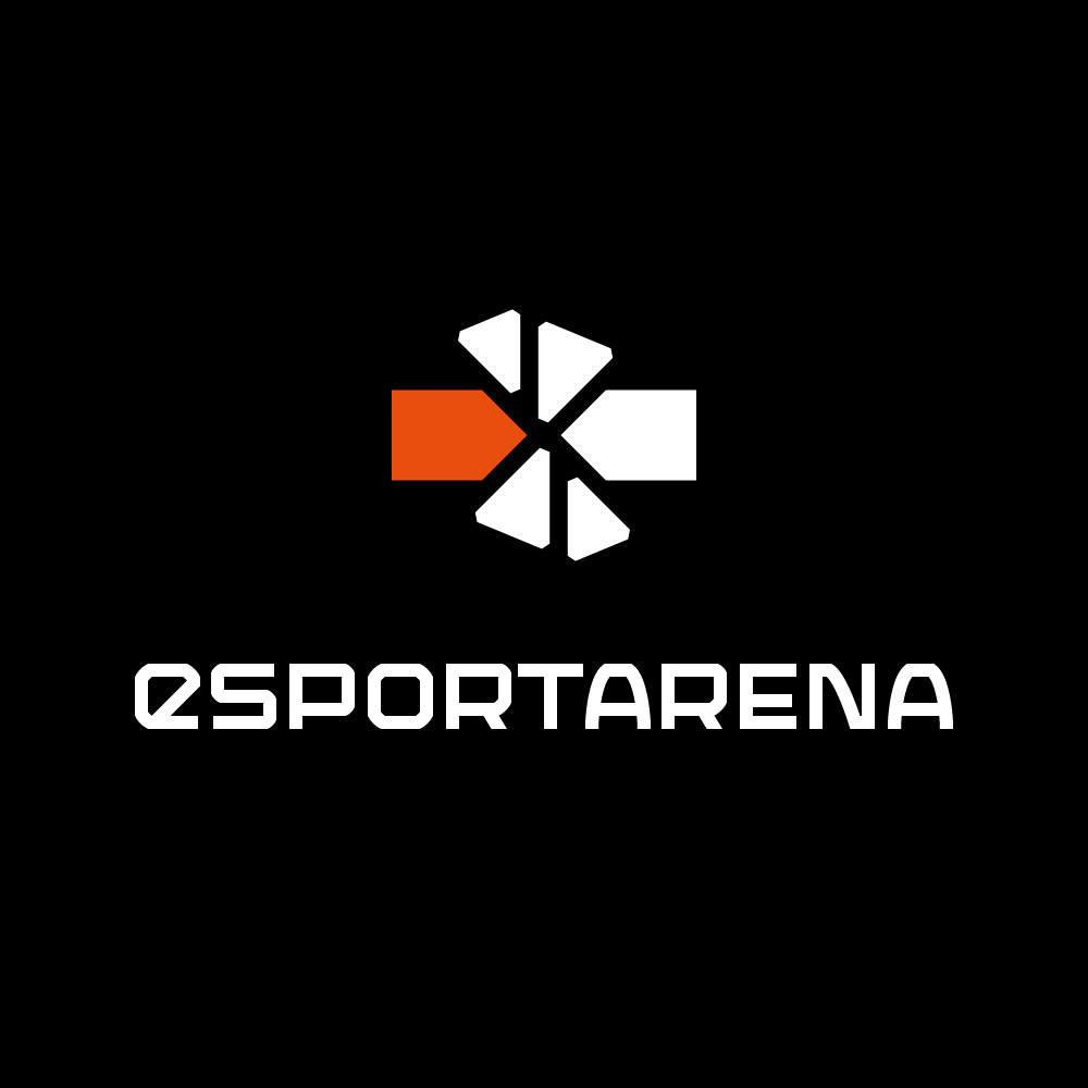
A game is not so much of a game without challenges to master, competitions to overcome and obstacles to break through. This is the concept symbolized in the logo — the enthusiastic orange ‘brick’ breaking through the challenges.
Since the ‘e’ in ‘eSport‘ stands for electronic, it is generally written in lower case. The typeface in the logo incorporates the small ‘e’ with the rest of the letters set in upper case — while being consistence in the letter heights. The geometric angular look fits well with the style of the logo-symbol and gives a sense of technology and sci-fi. The typeface is a slight modified version of the font Armadura Solid by Graviton Type Foundry.
eSportArena is now integrated in House of Nerds.