

DASHBOARD COMPARING ECONOMIC AND HEALTH INDICATORS BETWEEN INDIA AND USA (1990-2014)
I created this interactive dashboard to compare the various economic indicators that differentiate India and the United States. I currently live in the US, while I am originally from India. Even though India is one of the fastest growing economies in the world, I find that the economic and health uneveness within the country is massive. This difference is less obvious in the US.
Having lived in both countries, I thought that it would be interesting to compare the two countries on various parameters. I chose the years between 1990 to 2015 simply because I wanted to see the progress of both regions since the time I was born!
The result was this dashboard that compares basic economic and health indicators in both India and US. I have tried to bring out the differences with attractive, interactive visualizations. All the data was sourced from the World Bank database.
Technology used: Responsive web development for the dashboard template, d3.js for the viz.

The above image shows the home page of the dashboard. It sets a context for the whole project. The list of social indicators that form the basis of comparison are on the navigation pane on the left. The toggle menu can be used to hide/show the left navigation pane.

As a first step, I thought that it was vital to point out the huge population difference between India and US. With close to 1.2 billion people, India is the second most population nation in the world. The US has 300 million people and is a far third in this race. While the population of both have increased steadily over the last 24 years, India's population has grown at an astronomical rate.
With so many people, is it more difficult to maintain a sense of equality within the society?
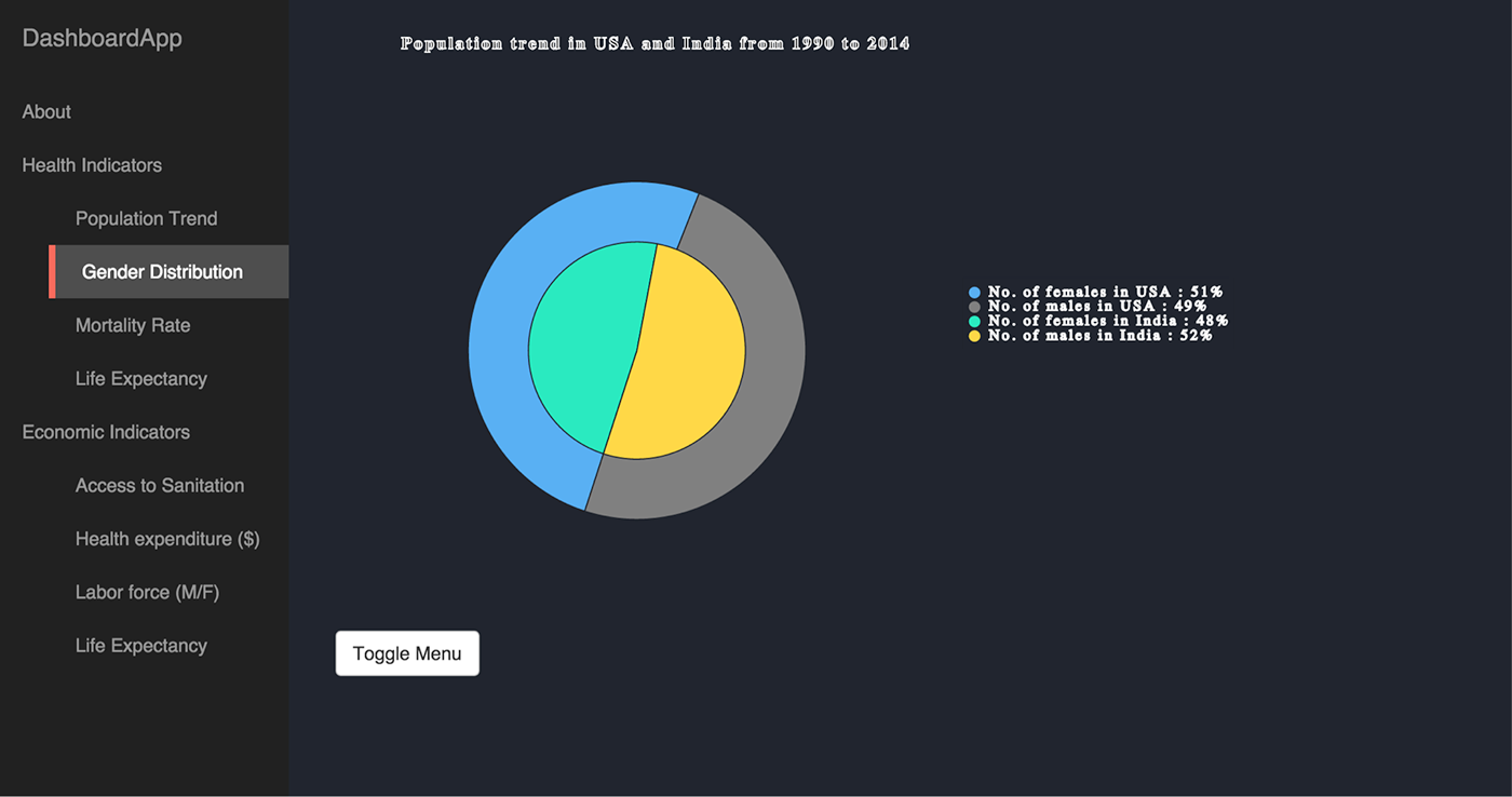
A study of the average gender ratio between India and the US reveals that this is fairly more imbalanced in India as compared to the US. With a general trend that shows favoritism towards males, this statistic accounts for several other imbalances such as skewed gender ratio in school-going children and in the Indian labor force.

The mortality rate of a nation could signify the quality of healthcare being administered in the country, among other things. A comparison of the mortality rates in India and USA over the past 2 decades reveal that the mortality rates in India have always been astronomically higher than that in USA.
However, these rates have dramatically decreased over the past few years, probably with better access to healthcare, advancements in the medical field and so on. Is this a recent trend that has caught up in India? Have the citizens of the United States always had better and improved access to quality healthcare?

Another factor that measures the quality of healthcare available is the average life expectancy of men and women in the country. This graph shows that while the average US citizen lived for 75 years in 1990, the average Indian citizen had a relatively short life of 59 years.
Has the situation improved now? The average life expectancy is 79 years for the US and 66 years for India in 2012. More numbers that point toward the amount of time it has taken India to match its quality of healthcare to that of the US.

This startling visualization shows the extent of population that have access to sanitation facilities in the two countries. The yellow and red circles are woefully incompete as compared to the circles representing the US population's access to sanitation. While literally everyone in the US has access to sanitation today, close to 64% of India's population still do not.
Could this important factor be responsibe for the increased mortality rates and lower life expectancy numbers in India?
These are some of the questions that I hope to answer with the help of this dashboard. While this is still a work in progress, a working version of this can be found at: https://s3.amazonaws.com/dashboard.com/index.htm
I hope to add on more comparitive factors to flesh out the whole idea!


