A type design practice based on Michael Bierut's poster
Year: Jan-Apr 2015
This project's brief is designing variations of a famous graphic design piece and I chose Michael Bierut's poster for Yale Architecture lecture series 2014.
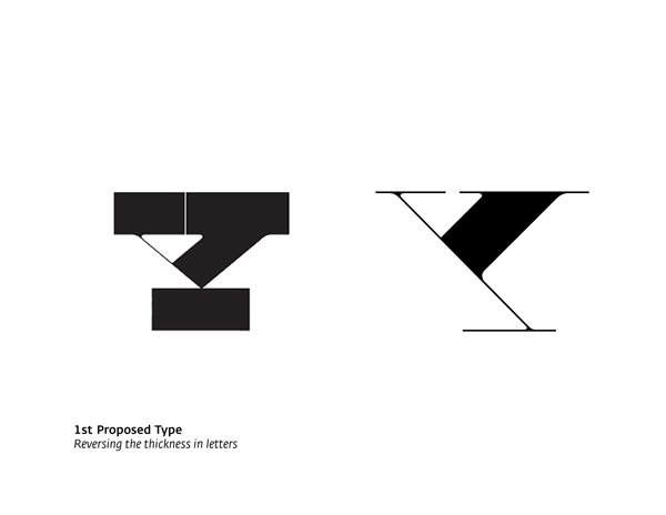
Switching the thickness
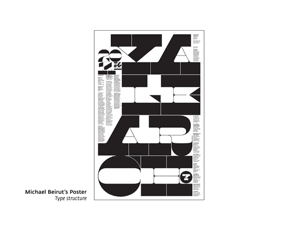
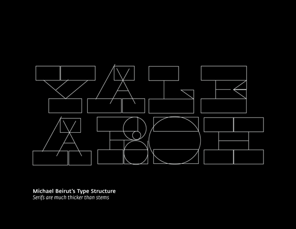
In the first part of the project I analyzed the elements of the original poster. As can be seen the type used in the poster is very geometric with extreme contrast in thickness of serifs and stems. So I decided to generate a new type by shifting this contrast in the letters.
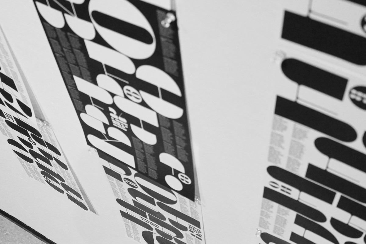
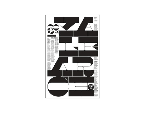
After I designed the letters used in the poster I designed some poster by the new type while maintaining the compositional characteristics
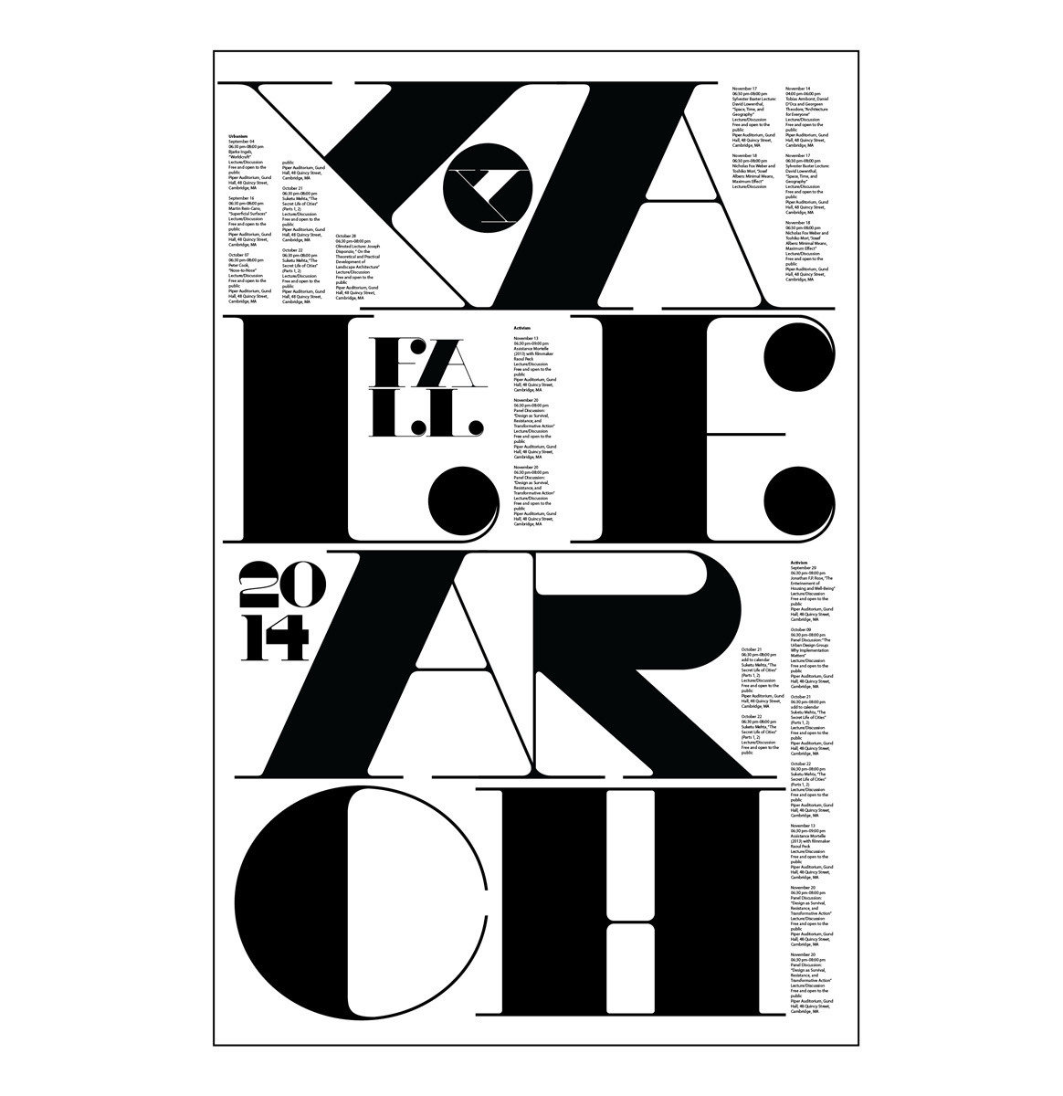
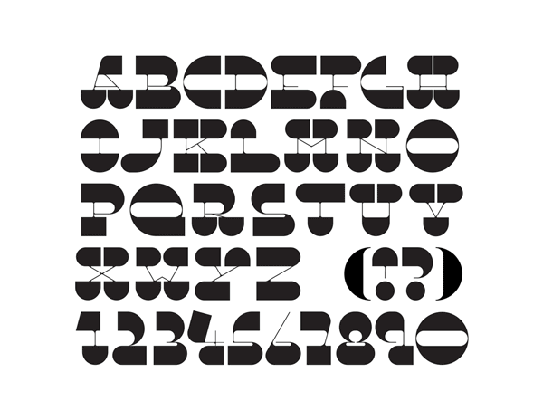
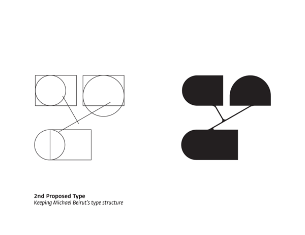
Maintaining the original type structure
Just reversing the thickness caused some weird shapes in letters that shouldn't have happened. Therefore, I decided to keep the original type's structure and redesign all the letters and glyphs!

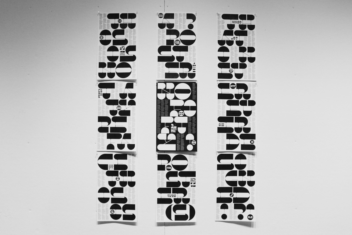
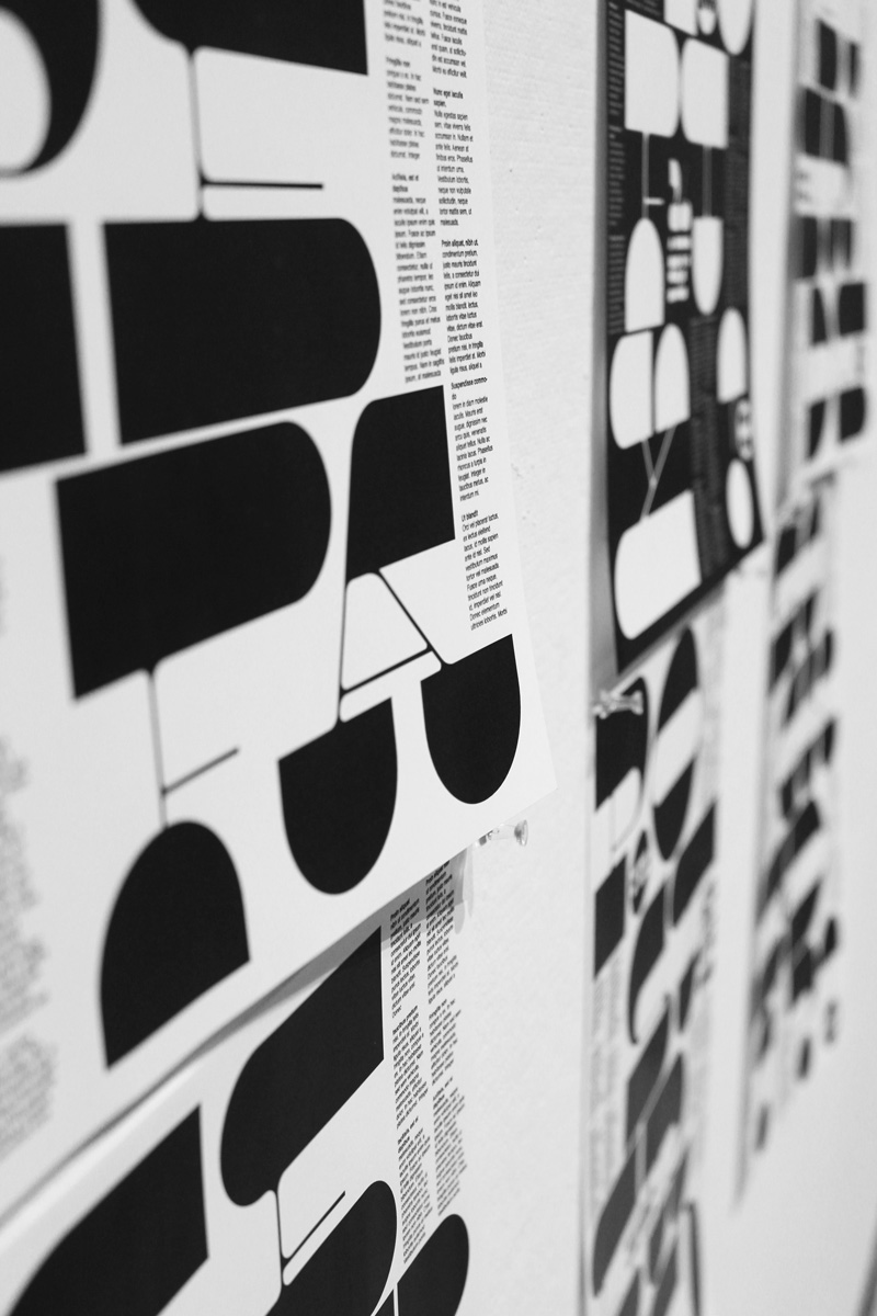

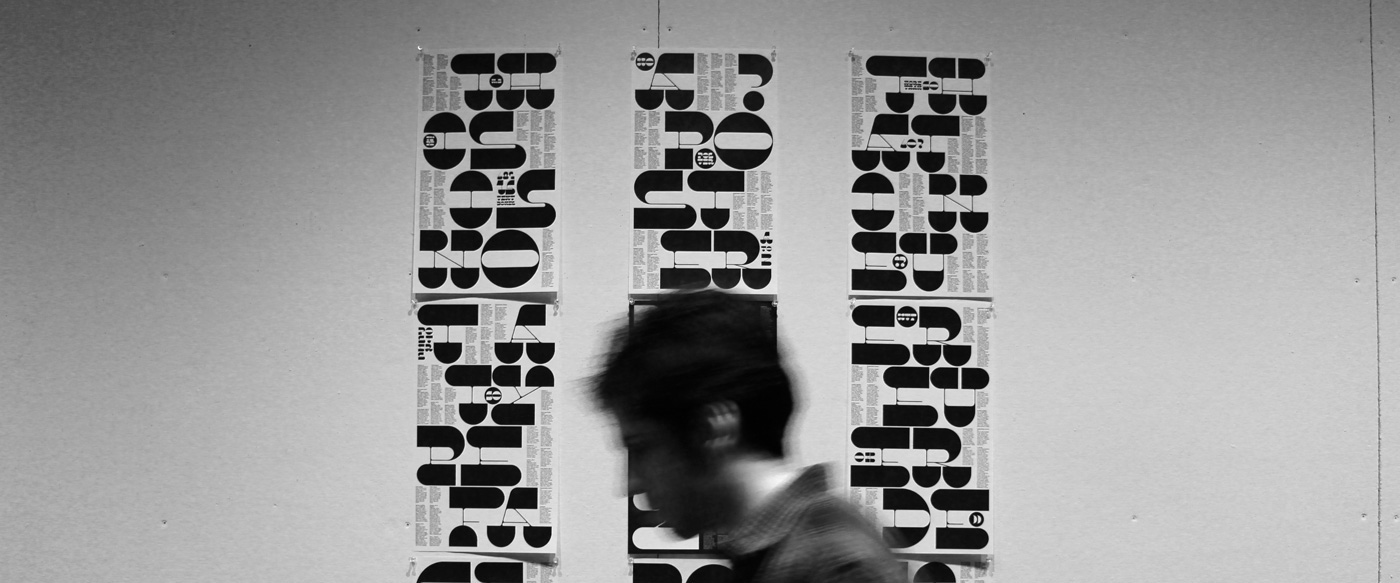
Posters designed by the new type
Finally 9 posters were designed with a totally different content but the same composition as Michael's poster! The content is about my personal thoughts in the design process of this type.