

A L I G N I N G I N S T O R E & O N L I N E S H O P P I N G E X P E R I E N C E S
Rug & Home, a successful brick and mortar home furnishings retailer founded in 1994 was plagued by an inconsistent and ineffective online presence. We were presented with three distinct challenges:
• Make 40K+ SKUs intuitive to interact with and easy to find
• Align the in-store experience with the online experience
• Improve the website’s architecture, but maintain search rankings
• Align the in-store experience with the online experience
• Improve the website’s architecture, but maintain search rankings
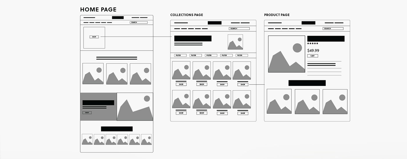
S T R A T E G Y & P L A N N I N G
With a large and varied product library, planning for both design and structure was tough. Literally thousands of product combinations and types had to be considered. The overall visual design for both collections and individual product templates needed to be flexible enough to accommodate, yet, unique to the brand itself.
From a structural standpoint, we needed to craft silo’s that both users and search engines would appreciate. This required re-categorizing almost all of Rug and Home’s existing product library, as it previously did not match either of those marks. Using Shopify Plusmade this task scalable.

D E S I G N
Showrooms
Rug and Home, first and foremost, is a brick and mortar company. With several stores across North and South Carolina, it was important to highlight them on the website. We wanted customers to experience what it was like to shop at Rug and Home before they entered a physical location. By leveraging Google’s business walkthrough we were able to create a virtual showroom. We also placed key images and testimonials to bring further value to a prospective in-store customer.

P R O D U C T O V E R V I E W
The product overview is focused on providing users with a simple touch sorting experience. We polled existing clients, observed analytics and competitor behaviors to come up with 6 custom filters: style, price, color, shape & size, construction, and materials. These filters are always in view for the user, pinning to the top of the page when they scroll. This ensures users can find exactly what they want, at any point in which they want it.

S O C I A L I N T E G R A T I O N
Social shopping is booming. People have options beyond your storefront to purchase your product. Rather than fight this, we wanted to embrace it. Google Shopping integrations, Pinterest shopping integrations and Instagram integrations help power sales off-site. On-site, we also did a bit of optimizing by incorporating socially curated photos directly with products, bridging the gap between product and real-world application of that product.


P R O J E C T T A K E A W A Y S
Rug and Home was a huge undertaking. It’s the largest platform to date in the Shopify echo-system, and was also one of the first true Shopify Plus, enterprise e-commerce platforms. (Learn more about Shopify’s take here, in their case study on the platform)
With the amount of variation this platform required, it really forced us to think long and hard about how design decisions could, or could not be limiting throughout the site.
Again, due to the sheer size of this project, drilling down to the real problem quickly and solving that was essential for the projects success. The biggest hurdle we faced was the structure, sorting and siloing of the site. The focus needed to be the menu, the sorting features and how products are displayed. While some features such as the virtual showroom or social product integrations were awesome, we needed to actively prioritize this other stuff first, and then layer in the rest. This allowed us to get a very big website to market faster, as well as deliver very focused solutions to these problems.


