
DANIEL MÒDOL
URBANISM + ARCHITECTURE
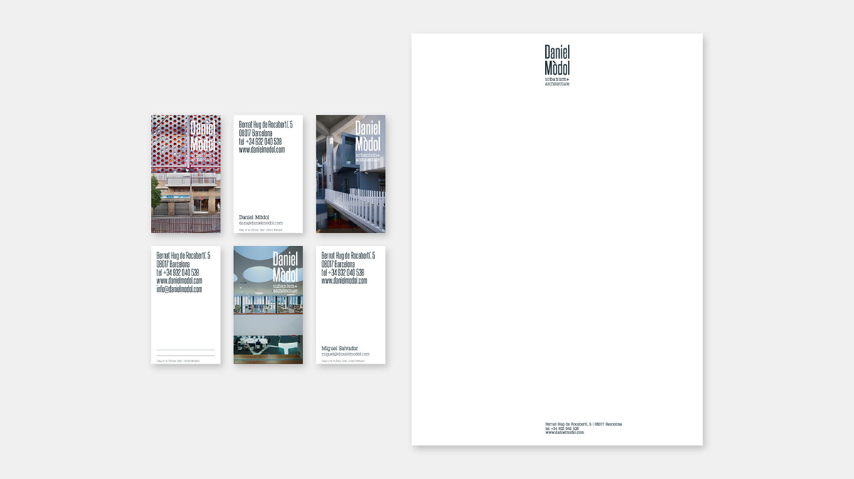
Rebranding & Visual identity for an architecture studio
Design of the Corporate Visual Identity (logo and stationery) for Daniel Mòdol's architecture and urban planning office. The ‘DANIEL MÒDOL urbanism + architecture’ logo is used as a brand in its entirety. The four words of the text will be used in a vertical sequence of four lines (one for each word), in a stamp aspect and giving greater prominence to the name of the architect over the areas of his activity.
This logo, which seeks to convey simplicity (minimalist and careful image), contemporaneity (its own identity and modernity) and character (strength and legibility, to be recognized in a quick and unmistakable way) is proposed as an evolution and adaptation of the graphic identity by 'dmdeau', taking up the combination of sans-serif typeface and finial typeface, in a more current version and with its own character.


Thanks for watching!
If you liked it, please give it a rate :)

DeVARGAS STUDIO
