


Scope of work: branding, logo design, business cards, business paper, brochure, copywriting, slogan
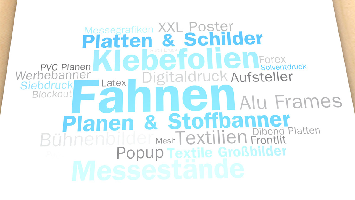
STO Print GmbH is a print service provider from Koblenz in Germany. Offering quality print solutions, the right technique, materials and the full range of project management for realizing them.
Our branding solution is focused on what STO is mainly providing - print project service and application management. The colors represent Print in general (C,M,Y, K), while we replaced Karbon intentionally with green to point out that this is a modern and ecological thinking company. The square shapes represent different materials (Paper sheet, PVC boards, etc.), by rotating them slightly we point on the dynamism and flexibility of the young and motivated team behind STO Print. Embedding the compass shape is showing that STO is active across Europe and not limited to its local area, while the cube in the center represents STO's solid business model and the core team behind.


Agency: Hyperfox
Client: STO Print GmbH, Germany
Creative Director & Designer: Maik Bodden
Creative Director & Designer: Maik Bodden
Junior Designer: Karina Zajac
Copywriter: Arne Ahlreip


