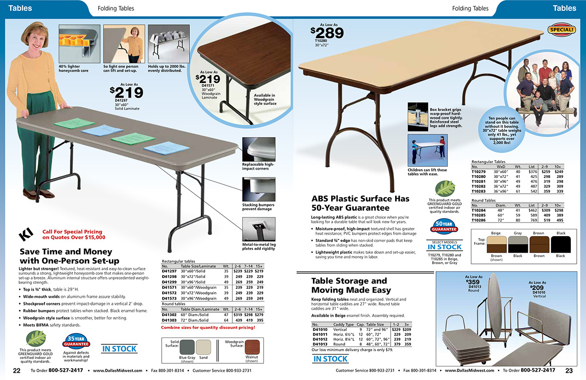
BEFORE: Prior to redesign, Dallas Midwest used a bold color palette, a large typeface, outdated type treatments, and large, bold icons and chart elements, all conducive to an elementary school brand. While photographic elements had to remain until they could be updated, all the other page elements changed in the redesign.

AFTER: I decided on a color palette that was still rich, but desaturated a bit. I chose Franklin Gothic, which can be bold when needed (headlines), but also serves well as body text and in charts. This was welcomed by production staff, who no longer needed to wrestle with spacing to include information in charts. I redesigned icons to appeal to a more mature audience, and removed or reduced rules around boxes and charts to subdue the loud tone the catalog conveyed previously.

BEFORE: Pages that directed customers to the web for more product choices also received a makeover.

AFTER: I reduced the size of the message for a softer touch; I wanted it to play well within the page structure.

AFTER: The above is another example of one of Dallas Midwest’s new page spreads. While still geared toward education, customers in higher grade level schools and even in corporate education settings will find the products appealing.

