Logo
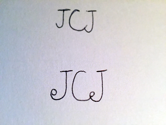
A conservative serif was used to come across as dependable and familiar.
The colours, sans serif typeface and minimal chic offset and compliment the traditional elements.
The curves on the 'J' are reminiscent of traditional crafts. It also works to join the 'C' and 'J', to indicate working in partnership.


Signage
brushed aluminium is a material that suited the brand for signage. Light, reflective and looks chic and classy.


Website
A responsive site. The header transparency refers to JCJ's specialism of worjking with glass.
The large imagery and minimal typography to underline the chic, elegant approach.


Business Cards
White foil block onto 700 micron claret colorplan.
The stock is luxurious but the simplicity of it together with the uncoated, thick stock is unpretentious.


