Logo
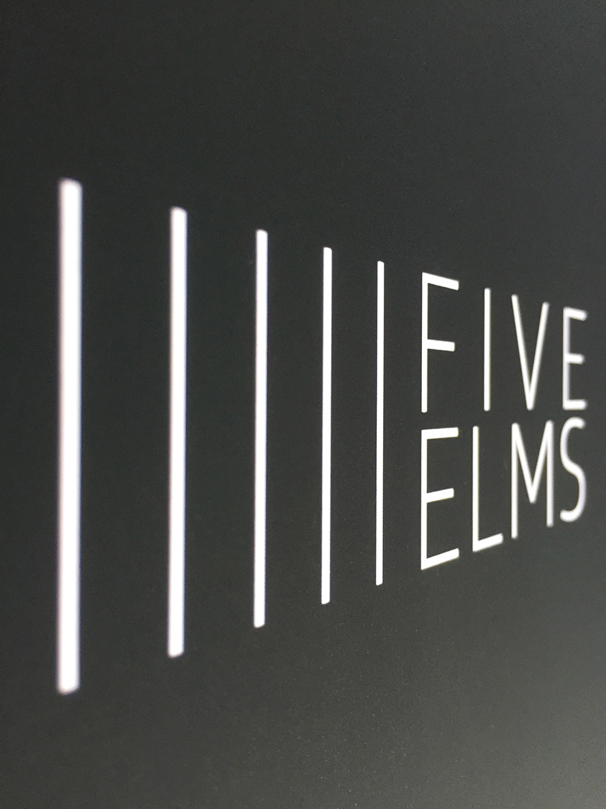
A simple graphic illustrates the Five Elms concept, which makes the logo stand out from other luxury apartment development logos.
Its light and airy feeling communicates the characteristics of the apartment block. It's contemporary and minimal with a dash of the 1920's heritage of the building

Brochure front cover
Shows the logo application. It's minimal and stylish with text and graphic towards the bottom which fleshes out the identity of the apartment block.

CGI spreads
As the apartment block is still being built, it was important to show how it will look using bespoke CGIs.
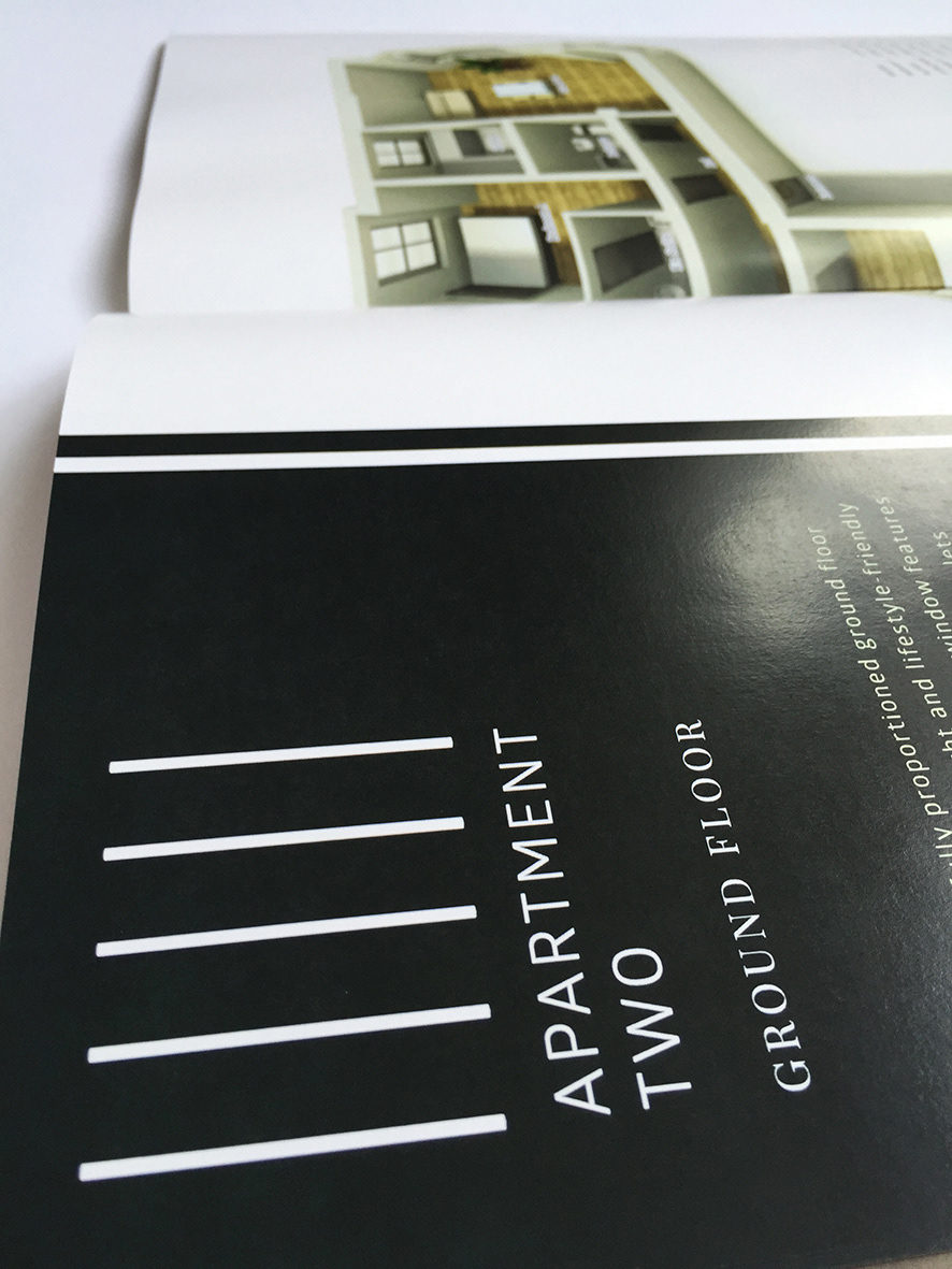
The lines from the logo continue throughout (including the folios) which adds to the identity of a clean, minimal feeling with a dash of heritage

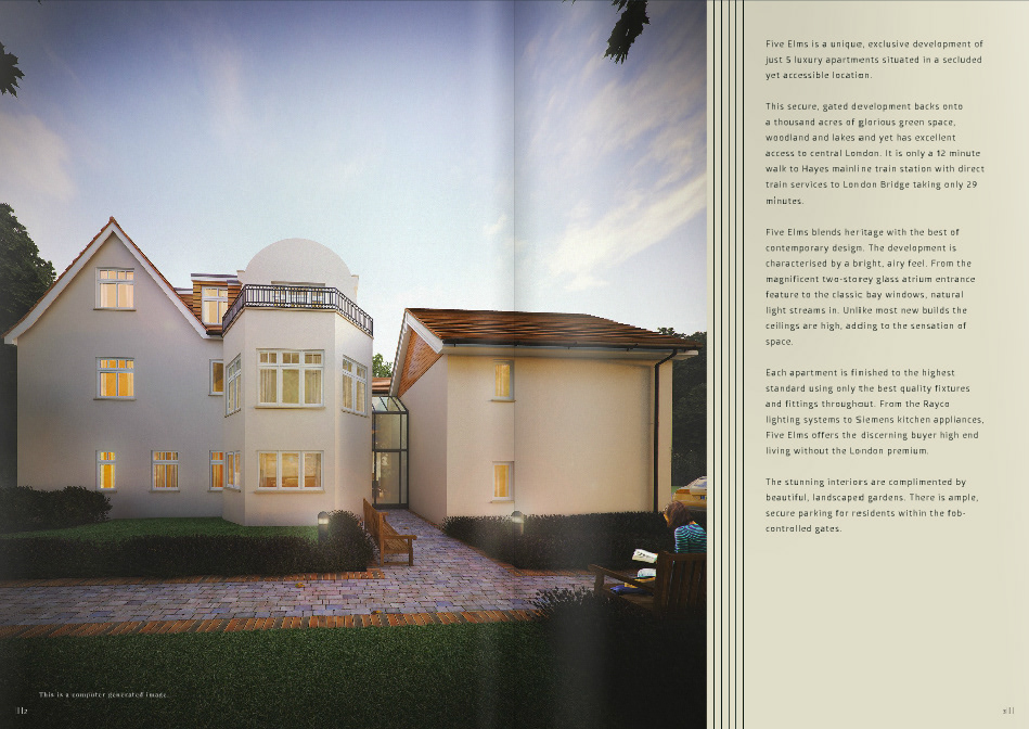
The camera angle fits in the entire front of the building and some landscaping while including aspirational elements such as lifestyle (the person reading - enjoying the ambience) and convenience (the car parked nearby)
The copy summarises the benefits of the development and the location.


The CGI showing the room uses a camera angle to show as much of the room as possible, with finishes and fittings, strategically placed plants etc, so the potential buyer gets a feel for how a finished room might look
The copy lists the specifications of the development.
Floorplan spreads
We used 3d floorplan to help the target market better visualise how the space would look upon completion.
Each spread was clearly labelled (with apartment number and floor) using brand elements from the logo. Copywriting helped the reader understand the benefits of that specific apartment.
The spreads were kept clean and simple so that there were no distractions from the floorplan.

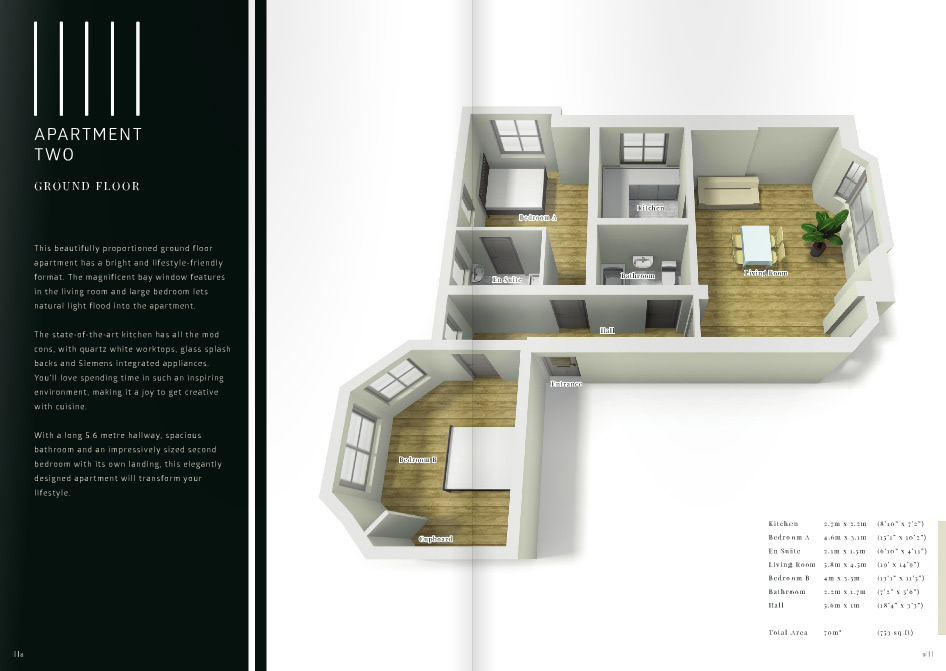
As well as each room being clearly labelled on the 3d floorplans, each room measurement was listed underneath for easy reference in metres and feet, with total area at the bottom.
Location spread
We created a spread dedicated to the main selling point - the location.
The copy, images and graphics refer to the picturesque and tranquil area, local facilities for lifestyle and convenient transport links for work.

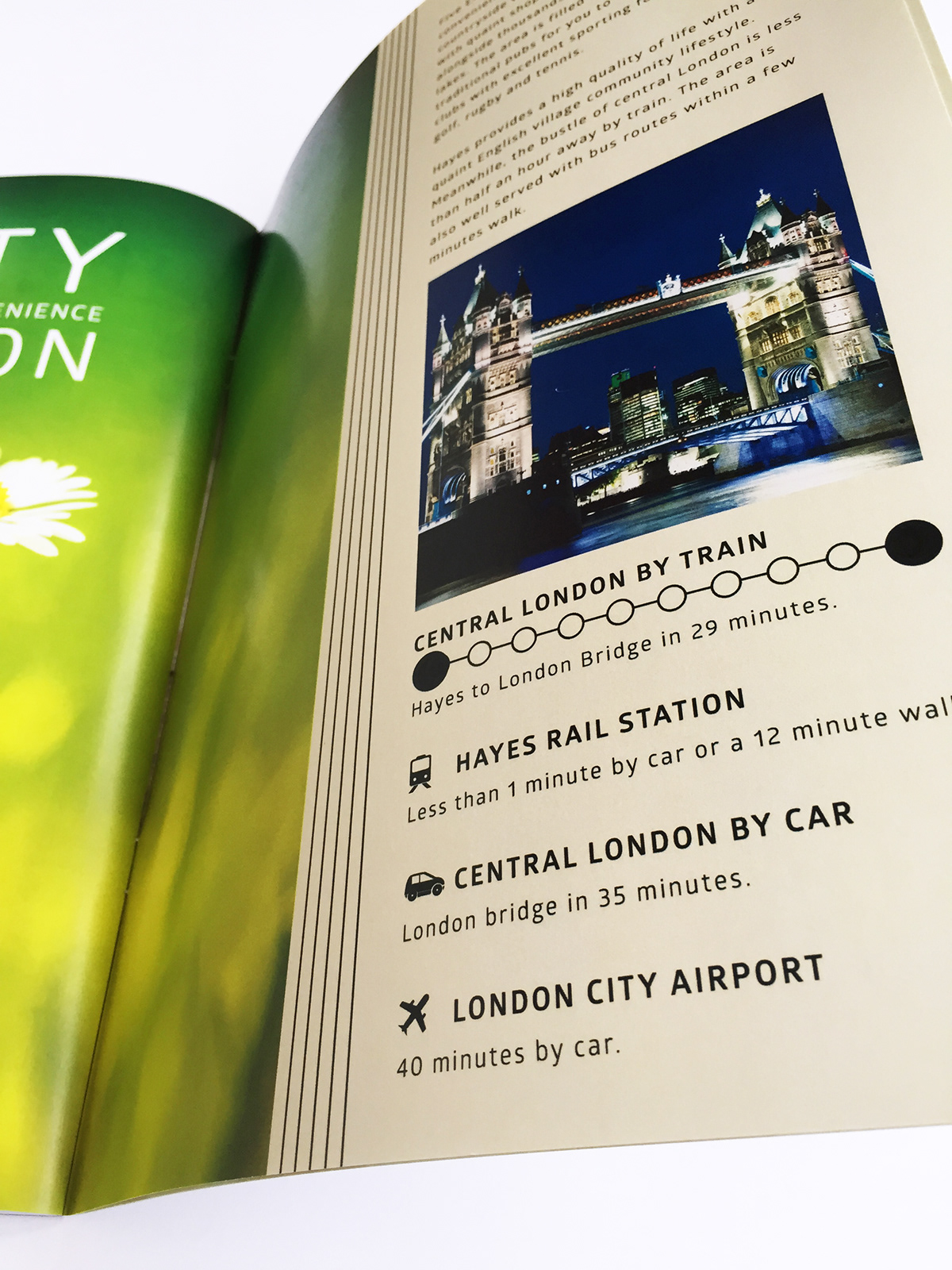
We focused on journey times and easy accessibility. The imagery juxtaposing the countryside with Central London illustrates this idea.

Folio
Website
Landing page where users can register their interest and download a copy of the brochure.
The communication tactic for this was a lot more immediate. The CGI of the front of the building was used with a small amount of copy, which was changed to take into account the different needs of users online.


