I worked with this citizens group of my town called "Luchando por un Monclova Digno" (Fighting for a Monclova with Dignity).
I suggested them a shortest name and more powerful like Monclova Bien (Monclova OK, Monclova in good shape) so I came up with this idea for representing their purpose as a pure and strong group who's will question the local government and its authorities.

The group suggested a logo which they started using it, and this was my main proposal.
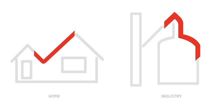
The logo is divided in two main sections:
1) The diary lives of the citizens (a house) and,
2) The steel industry where most people work or works indirectly (a long steel oven).


The first logo had purple instead of red, but it stayed red to resemble power.

The logo for social networks use.

Horizontal logo.
The "OK" logo is like a second and more fresh identity, minimal of what it is correct or should be.

Some branding banners with the OK logo.


This was their first logo.

