


Digital transformation of mobile app
With the already available app the task was to bring it closer to active users and make it easy and straightforward for newly registered. Having that objective in mind, the new app had to represent a logical evolution of the mobile app we began with.
As the feedback was collected from the client and together with conducted research, we identified our goals for the updated experience.
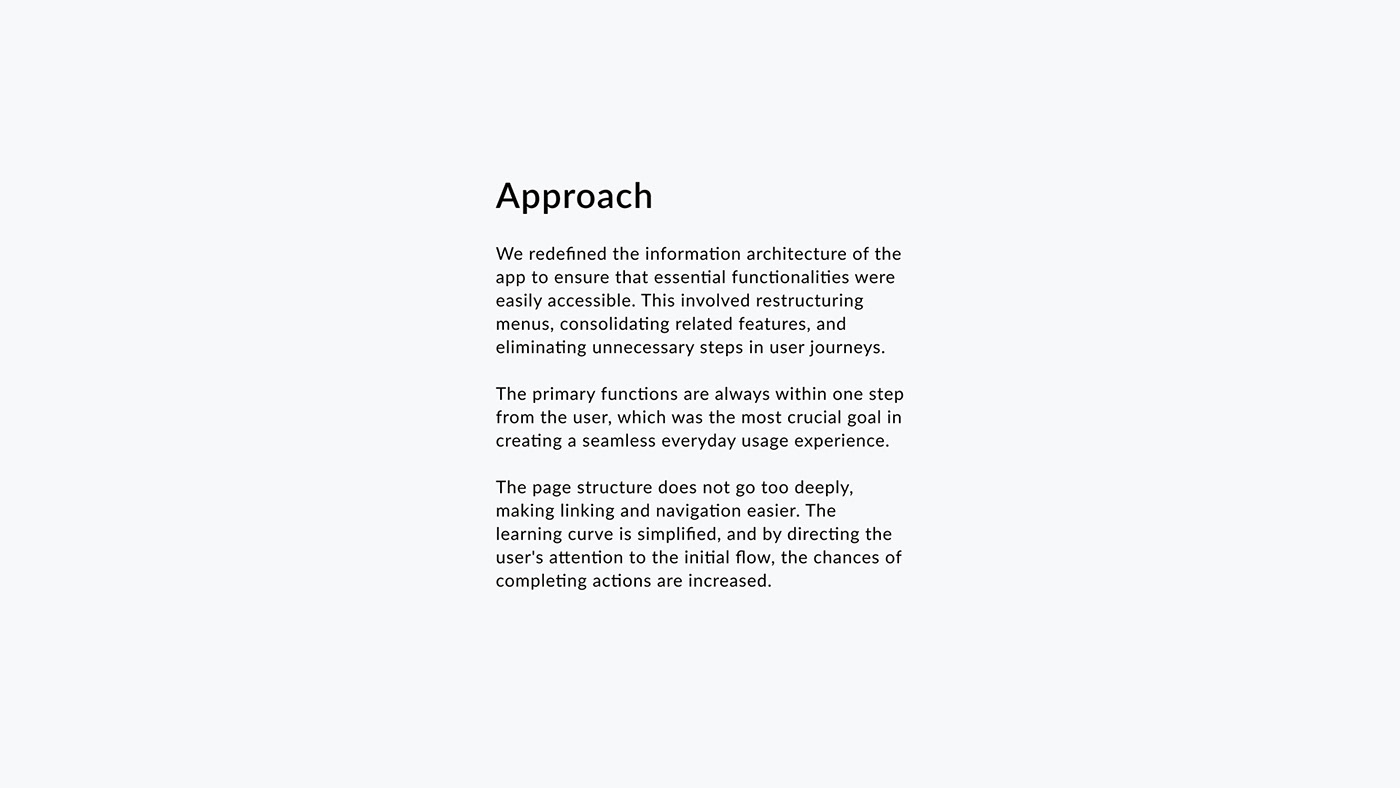
Approach
We redefined the information architecture of the app to ensure that essential functionalities were easily accessible. This involved restructuring menus, consolidating related features, and eliminating unnecessary steps in user journeys.
The primary functions are always within one step from the user, which was the most crucial goal in creating a seamless everyday usage experience.
The page structure does not go too deeply, making linking and navigation easier. The learning curve is simplified, and by directing the user's attention to the initial flow, the chances of completing actions are increased.
Iconography
The icons are designed after the logo, the elements are shown in a reduced, linear form, where the lines themselves are broken in some places. Thus, along with the choice of colors, the UI stylistically connects to the company’s visual identity.
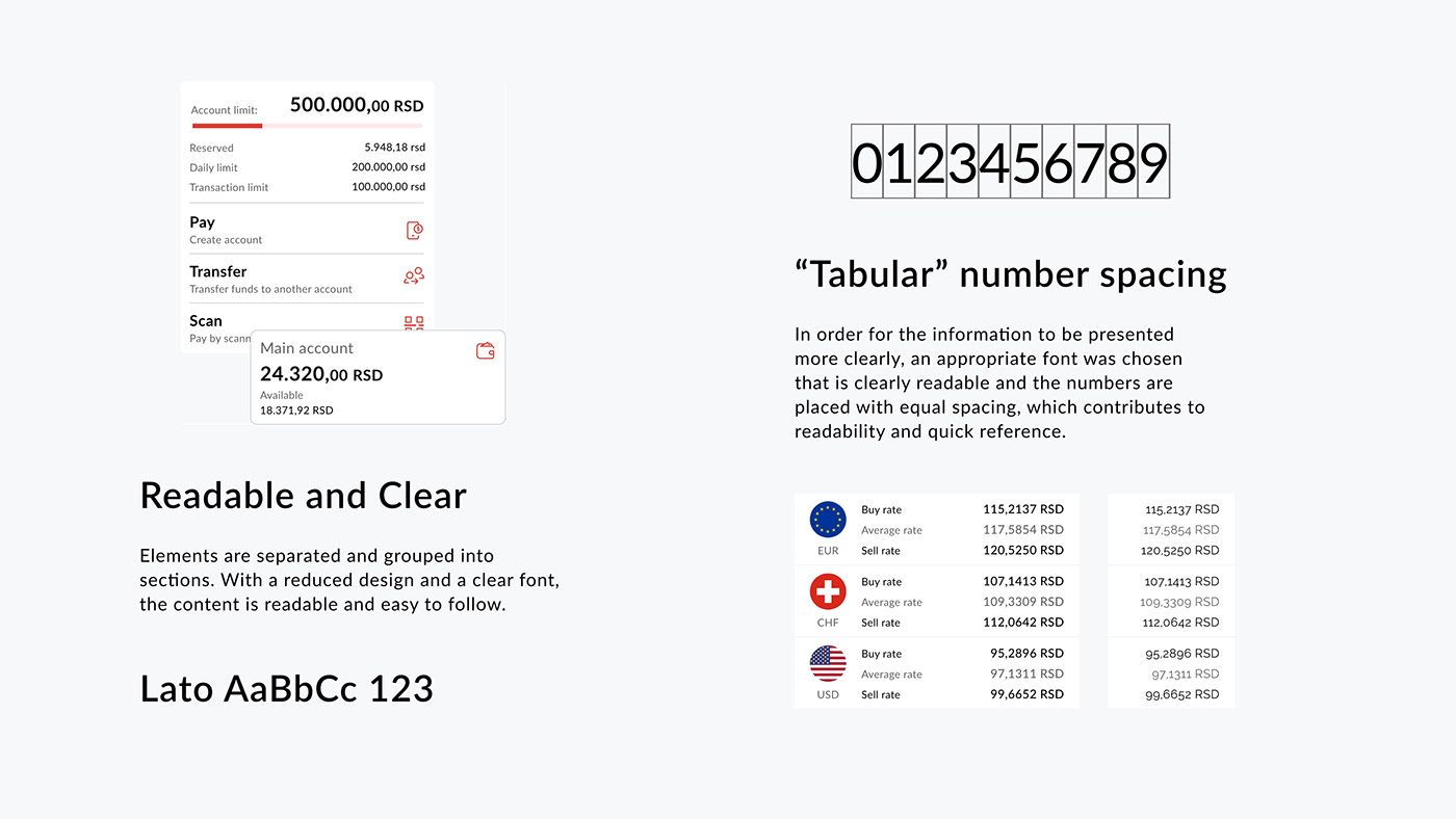
Readable and Clear
Elements are separated and grouped into sections. With a reduced design and a clear font, the content is readable and easy to follow.
“Tabular” number spacing
In order for the information to be presented more clearly, an appropriate font was chosen that is clearly readable and the numbers are placed with equal spacing, which contributes to readability and quick reference.
Home page
The front page should be used as a starting point for all the main flows, along with a list of all the links listed in the menu.
Contains key information and featured links. For the user, it is the starting point in every flow and serves as a dashboard for the main actions.
Menu
Available from the front page in the upper left corner. Contains the necessary links. By clicking on the logo, the user can add a personal photo.
Quick links in bottom navigation
Instead of a quick links section at the top of the front page, quick links can be contained in the bottom navigation. On scroll bottom, the navigation would remain visible in the lower part of the screen, and the options would be collapsed (without text); on scroll-up link names appear.
Transactions
By quick switching, the user navigates between accounts. Switching between details and traffic (transactions) is available on the toggle (and swipe).
Filter options open above for quick adjustment.
Payments
All fields are sufficiently spaced and organized so that the text itself is always equally separated. The selected options are highlighted and visible, separated to the right, while the labels remain on the left.
At the top, the user can quickly select another account from which he wants to make a payment or generate a payment slip from a template, or switch to the QR code scanning option.
Dark theme
A dark theme selection may be available as an additional option in the menu.
This would make the application attractive to a larger number of users.
The advantage of a dark theme is to highlight important sections, which can be emphasized by combining a light and dark theme.
Business account
The same color palette and elements are used for the application for business entities.
The visual difference is achieved by replacing the background of the highlighted elements, red replaced by blue.


