Hopscotch by Julio Cortázar is an experimental, open-ended novel written with the intention to invite the reader to rearrange the different parts of the book either by following a plan suggested by the author or, preferably, by inventing one’s own.
The idea behind this project was to mirror the innovative and playful nature of the novel in the book design, abandoning a widely used codex format. The end result of that process is a square „box” which opens up to reveal three separate booklets (part one and two of the story, plus a notebook) as well as a loose collection of random chapters and quotations that make up the third part of the novel. These can be freely rearranged to create limitless reading experiences. With each individual square of the box unfolded a full form of the book is revealed – a childhood game, hopscotch.
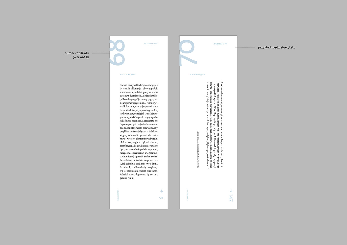
Positioning of chapters and pagination may look random at first glance but a curious reader will discover that they are governed by a number of simple rules as if they were involved in a simultaneous game of their own. The font used throughout the project – Alegreya by Juan Pablo del Peral – echoes the Argentinian component of the novel.