Ohamo
Lifestyle
Ohamo is a personal design project and lifestyle brand with the mission 'For your poetic life'. It began from my enthusiasm for 20th-century Korean artists who persistently seek a meaning of life and art in the midst of war and poverty. I immersed myself in the depressed beauty they depicted and eagerly recreated this sentiment in my own language.
Ohamo, meaning 'objects seen by crow,' is inspired by the poetry ‘Ogamdo’ by Yi Sang. It depicts scenes observed by a crow, describing an anxious society by war. Ohamo, moving forward, aims to embrace these anxieties in modern society and create objects that breathe life into your space.
The logo, featuring a vortex symbol, symbolises the creative energy amidst anxiety. The primary colour is a slightly washed-out black (#0a0a0a), representing the crow, while these muted hues evoke a vintage sentiment.
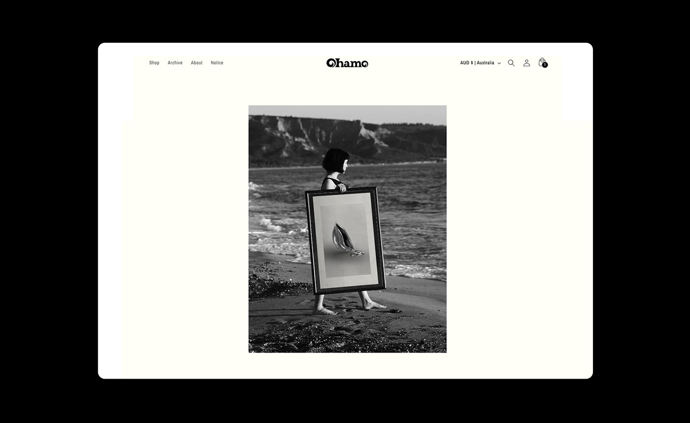
The first project, 'Silver,' reflects my fondness for the colour silver. While it may not exude the same level of luxury as gold, its subtle shimmer adds a touch of elegance to everyday life.
The logo, featuring a vortex symbol, symbolises the creative energy amidst anxiety. The primary colour is a slightly washed-out black (#0a0a0a), representing the crow, while these muted hues evoke a vintage sentiment.
The first project, 'Silver,' reflects my fondness for the colour silver. While it may not exude the same level of luxury as gold, its subtle shimmer adds a touch of elegance to everyday life.
Identity, Artworks, Photography, Website, Social Media


info.soohee@gmail.com


