Evesio, Nuclear Medical Center - Naming & visual identity
A new name and logo to embody the CMN group's commitment, adaptability and innovation
A new name and logo to embody the CMN group's commitment, adaptability and innovation
"Centres de Médecine Nucléaire" is a network of nuclear imaging centres located in the Île-de-France region. In these centers, they offer various nuclear medical imaging services such as scintigraphy, PET scan and SPECT. They have a twofold mission; to expand the network nationwide and to champion nuclear medicine for public health.
To accompany CMN’s growth, it was necessary to evolve the identity and the name of the brand. Graphéine assisted CMN in the creation of their new name and brand identity.


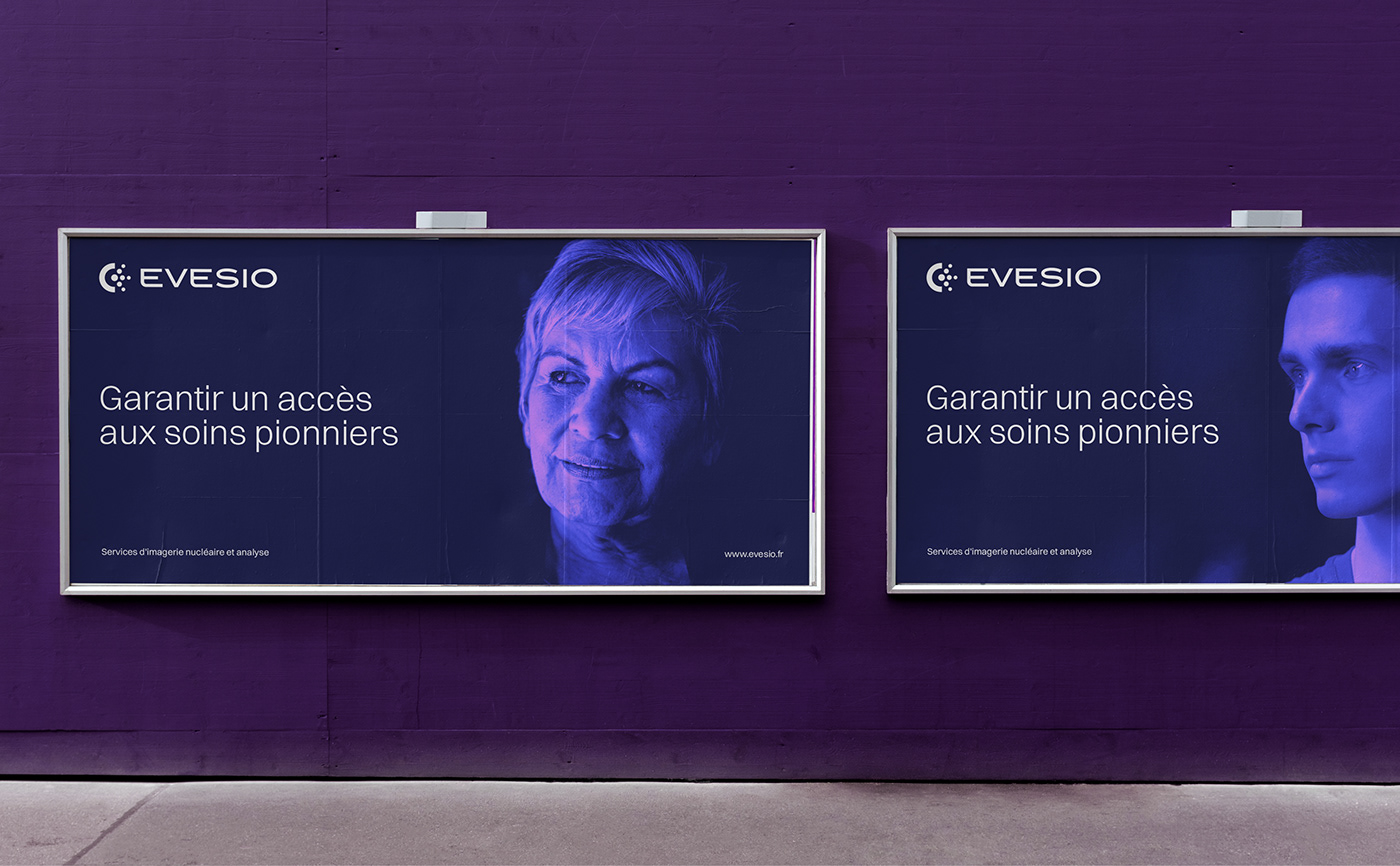
Communicating nuclear medicine with reassurance
In our analysis, it was found that the previous name and logo caused an instinctive apprehension due to the presence of the word 'Nuclear'. The word 'Nuclear' overpowered the rest of the name and, reinforced by the 'atomic' design of the emblem, brought to mind nuclear energy and the associated negative connotations.
In order to put the idea of medical care back at the centre of the identity, it was necessary to remove these negative connotations of nuclear power. So one of the main challenges of the project was to communicate the field of nuclear medicine in a reassuring way.


An evocative new brand name
With this objective of communicating nuclear medicine while removing anxiety-provoking associations, we proceeded to design an evocative and effective name.
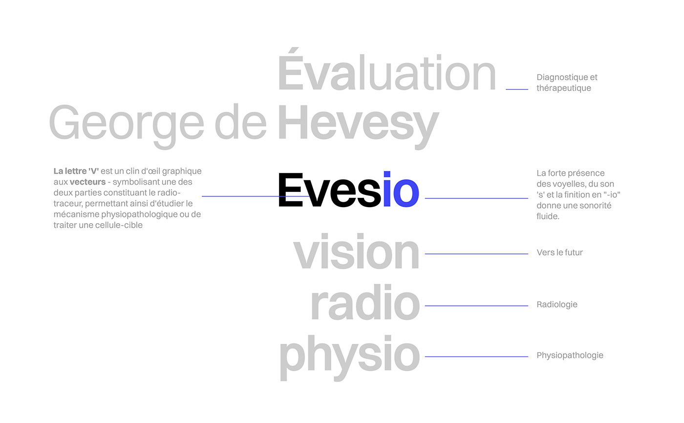
The name 'Evesio' is a tribute to the scientist George de Hevesy, a pioneer in the development of radiotracers. By paying homage to Hevesy's seminal work in this field, the brand has a name that communicates its mission of innovation and service in nuclear medicine.
The name 'Evesio' is a tribute to the scientist George de Hevesy, a pioneer in the development of radiotracers. By paying homage to Hevesy's seminal work in this field, the brand has a name that communicates its mission of innovation and service in nuclear medicine.
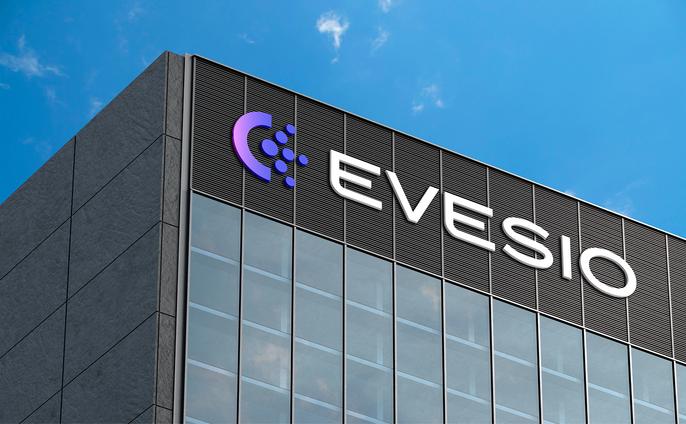
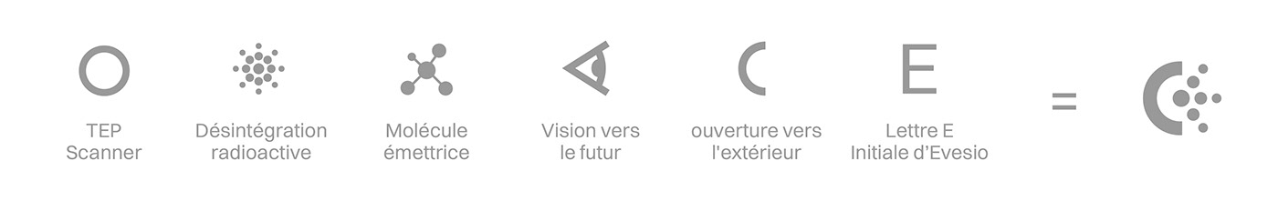
The radiant ‘E’ emblem
The radiant 'E' emblem is the main element of the Evesio identity. The emblem represents the round shape of a PET scanner, radioactive decay and the letter E. The three emitting branches of the logo symbolise the three pillars - the professions that make up the Evesio services: nuclear physician, electro-radiology technician and medical secretariat.
Just as the scanning machine envelopes the patient, the geometric semicircle on the left surrounds the particles making up the letter ‘E’. These two parts of the emblem also represent the idea of patient care. Thus, the new emblem communicates the technical precision and reliability of the human care offered by Evesio.
Just as the scanning machine envelopes the patient, the geometric semicircle on the left surrounds the particles making up the letter ‘E’. These two parts of the emblem also represent the idea of patient care. Thus, the new emblem communicates the technical precision and reliability of the human care offered by Evesio.


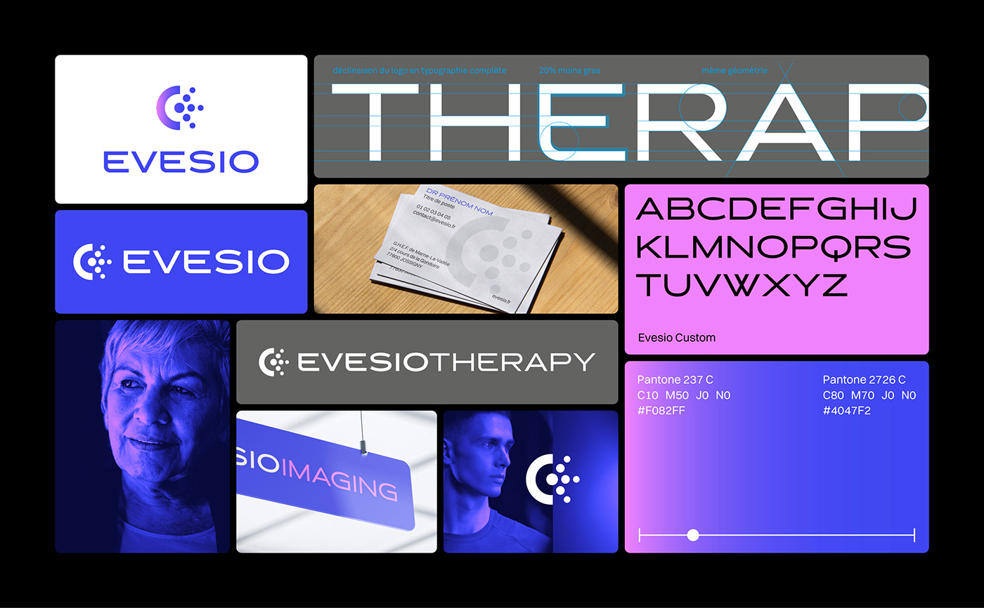


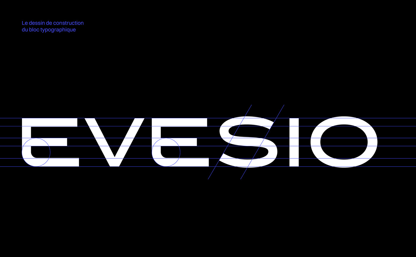
Wordmark and custom typeface
The Evesio wordmark is a custom-designed lettering. The design of its letters evokes technology, innovation and reliability. Based on the details of this design, a custom typeface was created and used for the tagline and the different variations of the brand.
Colour palette
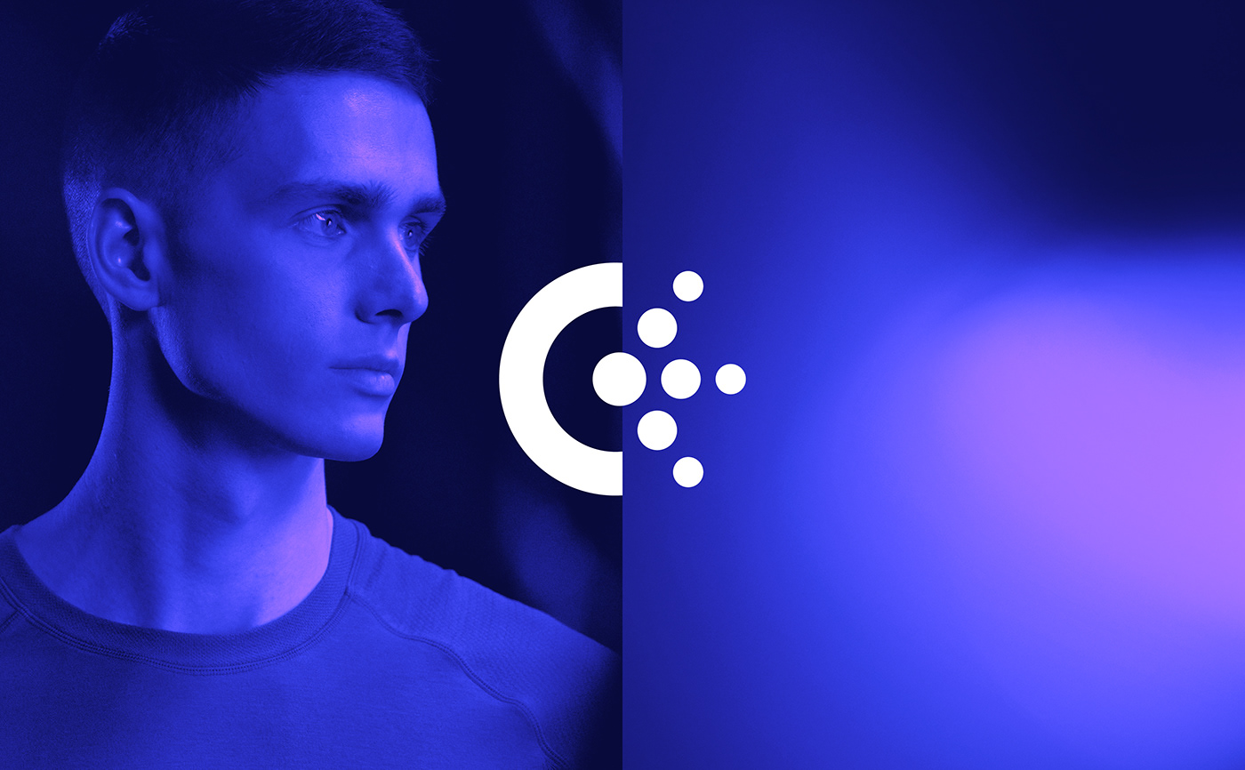
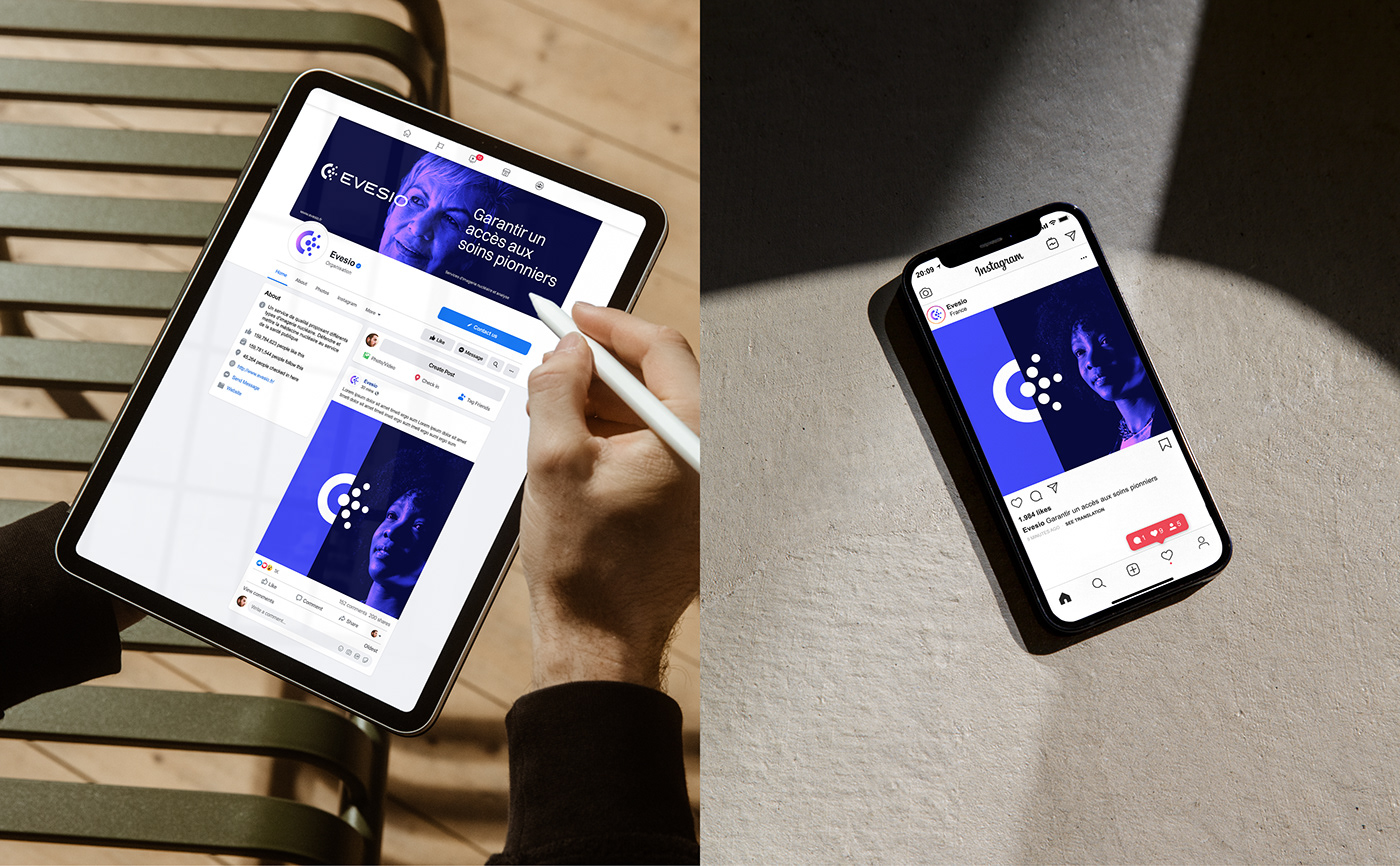
The Evesio colour scheme communicates innovation, technology, the ideas of radiation and precision, but also warmth and human care. Violet is a colour of learning, knowledge and understanding. Blue represents the medical world and professional service. Pink represents human warmth and care. The gradient of these three colours allows to simultaneously convey all the different aspects of the brand. This range is consistently applied in the brand's photography and materials.
An identity designed for the evolution of the brand
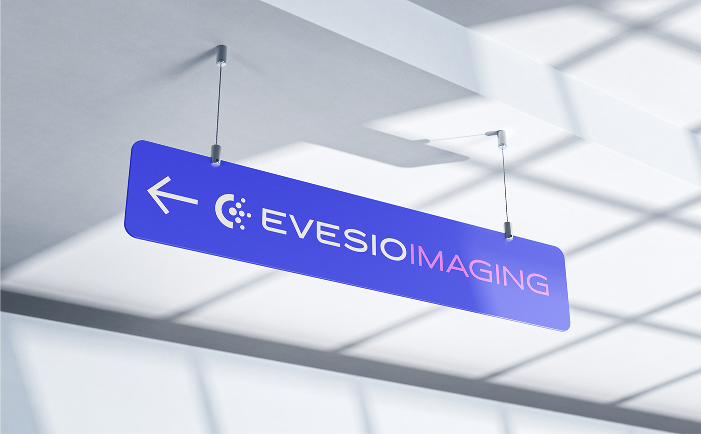
The Evesio identity and name have been designed to accompany the brand as it evolves over time. The identity can be easily adapted to create regional variations or sub-logos for the different services offered by Evesio - even outside the nuclear medicine domain. The abstract quality of the name "Evesio" combined with the modernity of the emblem allow the identity to remain relevant in the evolution of Evesio.