Omran BRAND DESIGN, Lebanon
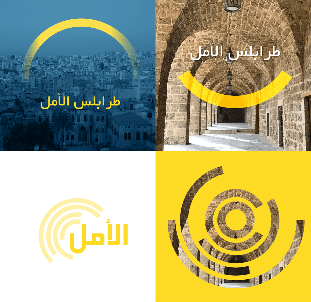
Omran is a professional NGO that strategically targets to improve the city of Tripoli, Lebanon. It plays a positive role amid the local deteriorating crisis. The Hope in the absence of governmental achievement.
The logo in composed of the name & icon. The subtitle can be added in both Arabic & English.
The icon is composed of a circular representation of Omran Arabic letters forming a target shape representing their strategic approach (a unique differentiating point from local NGOs.)
The icon is composed of a circular representation of Omran Arabic letters forming a target shape representing their strategic approach (a unique differentiating point from local NGOs.)
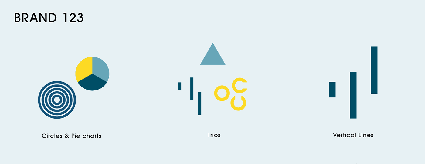
This radial target is divided by a trio of colors emphasizing on Tripoli (Tripoli means Tri-polis or the three cities).
The Arabic typography is composed of another set of trios. Three circles & three ascending lines. The ascension is used to represent development & improvement.
Colors used are dark blue & blue reflecting trustworthiness & professionalism & yellow for hope & rebirth.
The brandmark construction


BRAND APPLICATIONS