

BRIEFING
GEDII is a scientific association formed by healthcare professionals involved in studying and treating Inflammatory Bowel Disease (IBD). Bavaroise has been working with GEDII since 2022 designing and illustrating the Annual Reunion Event and IBD Courses. In 2023 they decided that it was time to update their website and brand Identity. GEDII only had a logo without an identity, so the challenge was to redesign the old logo (symbol + logotype), give it new tools, such as a new typography, and above all build a graphic universe with an elastic feature enough to create graphics to illustrate studies, clinical guidelines and articles along almost 20 years of existence.


IDEA
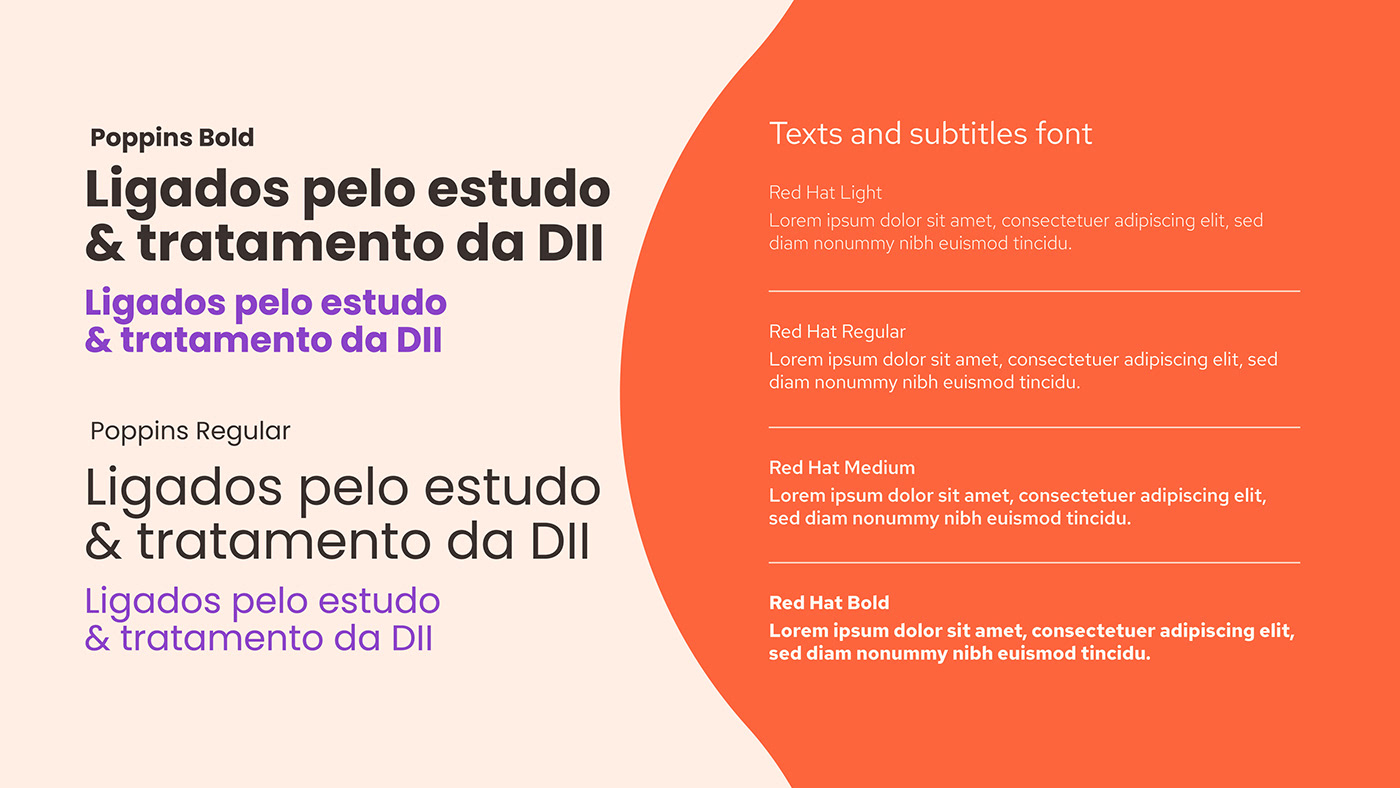
The process behind the symbol change was to keep the same essence (featuring the stylized bowel organ) but add a new meaning, so we started to rotate the old one to resemble the letter “G” and clear out the square shape keeping with the Inflammation's dot at the center. We follow the same logic to draw the logotype adding a tech and modern aesthetic while ensuring consistency in line weight.
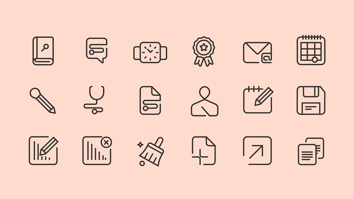
For the brand color palette, we kept the orange color but we opted for a vibrant tangerine shade and introduced purple (IBD World Color) and green as secondary colors. To create the iconography we follow the same rule.


WEBSITE
Bavaroise and Skrey combined efforts to bring both a smooth experience and a digital approach to move away GEDII from its old and dated online communication.
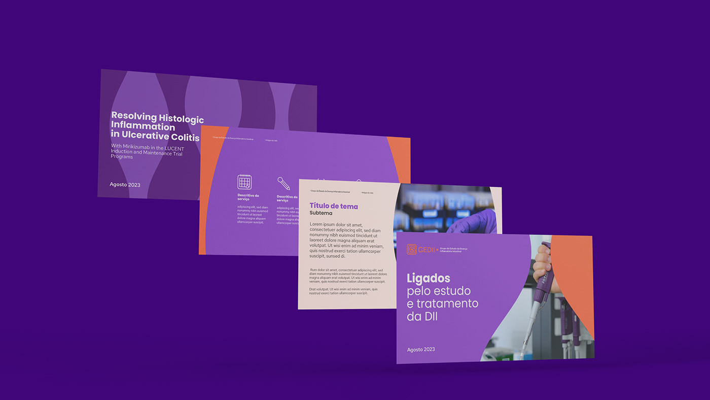
For the website design, we provided Skrey's team with comprehensive visual identity guidelines, including images, vectors, and 3D screens and animations, to seamlessly translate the brand's DNA onto the digital platform. The outcome was very user-friendly and impressive in the words of the client.


ILLUSTRATIONS
Additionally, GEDII commissioned us to illustrate specific themes for the Patient Area, a section dedicated to addressing questions and concerns about the disease. Here, we drew more tangible elements with a personal approach to enhance clarity and cohesion with the titles, while using the established color palette.


Do you need a new brand or rebranding for your business and want Bavaroise by your side to bring it to life? Let's work together to make it happen.
Client: GEDII
Brand Design: Bavaroise studio
Brand Design: Bavaroise studio
Code and Webdesign: Skrey
All rights reserved to Bavaroise Design
Sector: Health | Medical studies | Corporate
Services: Branding | Webdesign | Motion | Illustration
2023 |2024


