Introducing 2024. This year, I went bigger than ever and came up, not only with a single pair of dark and light variants of a graphic; but rather with a full array of eye-catching color variants, each of them carefully tuned by eye to provide the perfect amount of brightness and contrast for a wallpaper, because a good wallpaper is the one that (1) blends in with your desktop and personality, (2) protects your eyes, and (3) never gets in the way between you and getting things done. How did I implement these important three principles in the design of this year's wallpapers? Keep reading to find out!
(Otherwise, skip this write-up and you will find the wallpapers.)
Blending in
Most of the operating systems and desktop environments that are widely used today provide two main color schemes for their UI elements: light and dark. We all know that this feature is based on user preference, but not everyone has in mind that this user preference goes well beyond the UI elements themselves.
People want their visual preferences to be reflected consistently across their entire workspace, so it is key that the wallpaper blends in with the UI scheme set by the user. Darker wallpapers fit better with dark schemes, and that's why this collection includes both light and dark variants for every available color.
Your wallpaper choice says a lot about you, as well as your favorite color. Colors are nothing but combined wavelengths of light reaching our eyes; however, the way evolution has wired our brains allows us to make sense of those wavelengths. Psychologists have long known that colors evoke emotional responses in us, some of which we learn, and some of which we're born with. Depending on our psychology and social context, we might grow to prefer certain colors and dislike others.
That being said, it is possible that being surrounded by the colors that we prefer enhances our well-being, as well as that letting others know about our color choices might help us assert a small part of our identity; and that's the reason why I decided to diversify this collection of wallpapers, and take it from the initial blue version, to a wider palette. I wanted the wallpapers to not only be decorative, but to also serve as a tool for identity, self-expression, and well-being.
Protecting your eyes
In a world where screens are omnipresent, our eyes are subjected to unhealthy amounts of light in a daily basis. Now, more than ever, it has become necessary to take visual health into consideration when designing UI systems; and this shows: modern gadgets adjust their brightness to the level of ambient lightning, operating systems increasingly adopt dark color schemes and blue-light filters, and screens are built with newer technologies that allow for lower levels of brightness without sacrificing contrast.
In the process of designing this wallpaper collection, while I was testing the initial versions of the wallpapers in my monitor, I noticed that my eyes were getting fatigued very quickly. Both the light and dark variants were too bright, so I started to gradually decrease their intensity until they felt easier on my eyes. The resulting versions were more eye friendly, but the light variants kept hurting my eyes. There was only so much I could do without turning the light variants into dark; but that's because I had failed to take into account one important factor: ambient lightning.
Our eyes have a relative response to brightness, and this is especially noticeable with screens. When we use our phone at night in a dark room, the ambient lightning is low, so our eyes become more sensitive in order to adjust to the scarce luminosity. This results in our screen looking much brighter than how it would look during the day. I tested the wallpapers at night, so there was a lower level of ambient lightning, and the light variants were brighter than my eyes could handle at that moment.
Ambient lightning is important when choosing between light and dark schemes of, not only the wallpaper, but the overall UI theme of any device. I advice to whoever (if any) uses my wallpapers to set the light variant only when there is enough ambient lightning to make up for their higher brightness. The dark variants should work in any lightning conditions, provided that the screen is always set to an adequate brightness.
Getting out of the way
Another key design principle for wallpapers is that they should be as little distracting as possible. The wallpaper should only catch your attention whenever you want it to, and get out of your sight when you're getting work done. In other words, it should have variable visibility: it should only be as (mentally) visible as you need it to at any given time.
For example, you're often not getting anything done in your computer when your wallpaper is shown in your lock-screen, so that's a good moment to see it and let it be seen. By the time you unlock your computer, if you just turned it up, it is likely that the the desktop is empty, so your wallpaper has another chance to be the center stage.
As soon as you start getting things done, it is likely that your wallpaper will get covered with windows, and if your wallpaper complies with the third principle, the parts of it that remain visible beneath the windows won't distract you, because your brain will filter them out so as to keep you focused on your tasks, effectively becoming invisible.
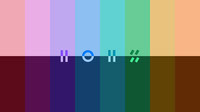
The minimalist visual language that I created specifically for this set of wallpapers is an abstract expression of the four-digit number “2024” using lines and circles exclusively. By using constructed symbols instead of the widely familiar Western Arabic numerals, it becomes possible for the brain to skip their processing if no effort is made to read them, thus saving mental energy and preventing distractions.
Now, meet the colors!
You got lucky! All the wallpapers in this collection are provided free of charge, under the CC BY-SA 4.0 license, provided that you give me proper attribution in any modifications that you make, and that you share all of your modifications under the very same license. You can find the editable SVG, and the PNG wallpapers at 1080, 4K (@2), and 8K (@4) resolutions attached as assets in this project. Bring that variable visibility to your desktop now!
Rebel Red


Super Pink


Brave Violet


Humble Blue


Olympic Aqua


Elemental Green


Glamour Golden


Sunshine Orange


Full disclosure
Parts of the write-up are satire, in case it wasn't obvious. Although I did make use of the principles to design the wallpapers, this write-up was mostly to mock the way graphic designers market their designs; it wasn't meant to be serious. They're simply wallpapers that I made to prove myself, not for any well-being-self-expression-identity stuff, and “variable visibility” is a term that I came up with. The only reason why I used symbols instead of numbers was because I thought they would look cool. Enjoy.