Project: SPG Branding
Client: SPG
Background:
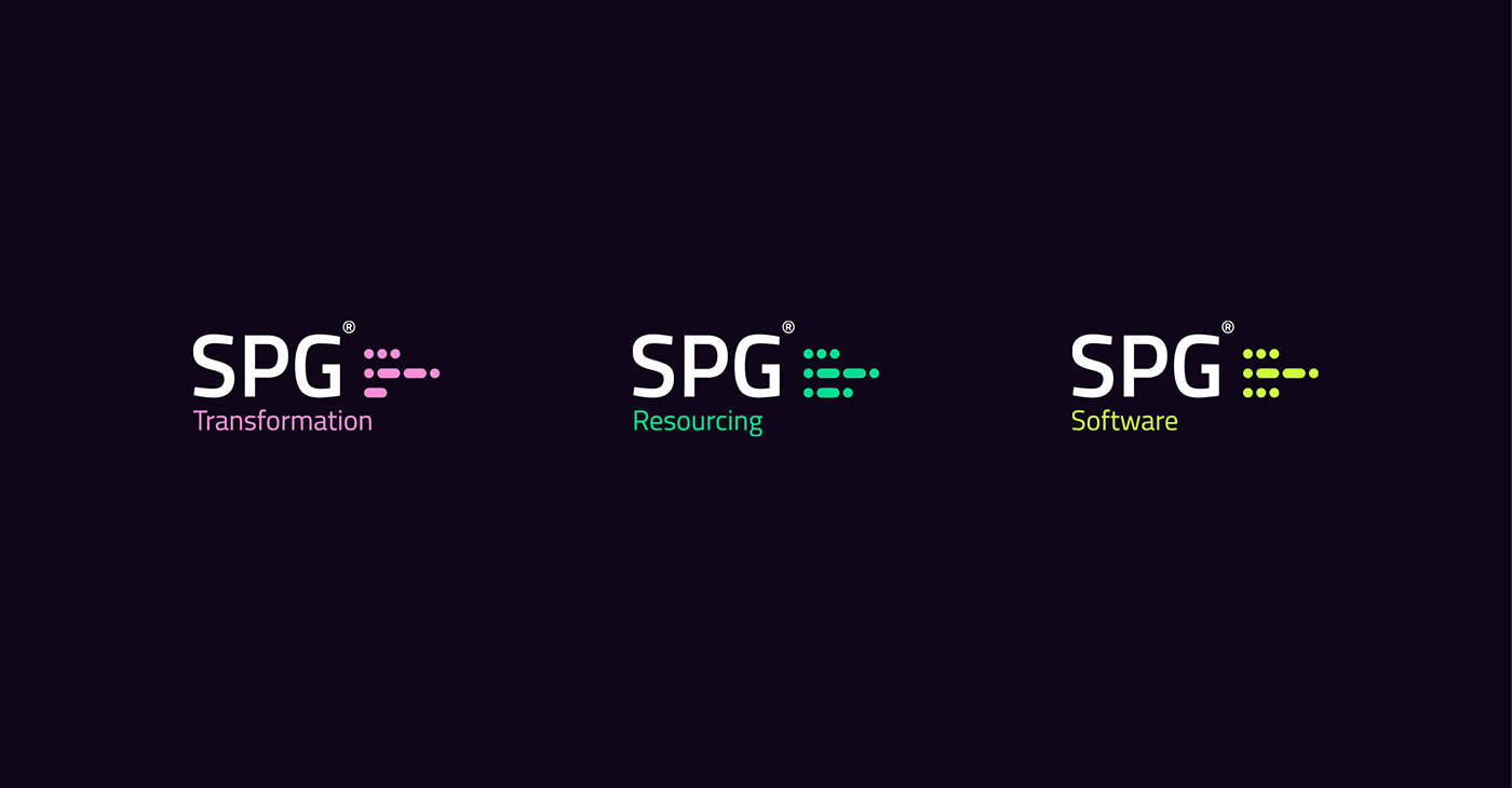
SPG is a group of companies – Solution Performance Group – that operate in the complex technology solutions space and work with large clients like NHS or Banks. The group includes: three subsidiary companies:
Solution Performance Consulting, Solution Performance Resourcing and Solution Performance Software. The company is going through dramatic growth but has never given time to its brand and wants to stand out from its competitors.
Challenge: At the heart of SPG's vision is to be the most admired technology transformation team in the industry. The primary aim was to create a striking brand with a visual presence in the market where the company operates.
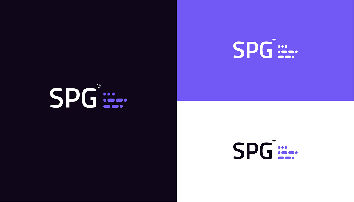
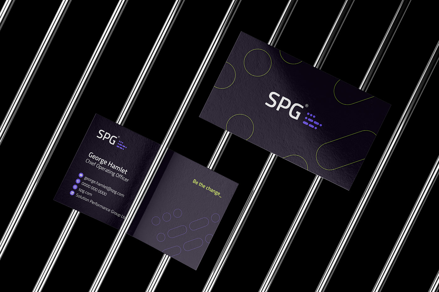
Solution: Our approach for the SPG brand is engrained in their core values and vision. We began by creating a new brand language and brand archetype, from this we were able to craft a brand personality that can solve complex problems, find the best tech brains in the business, and develop solutions and software which solves complex problems. The strong wordmark and symbol exist in perfect harmony. The idea behind the composition was to develop a symbol which could behave and look like modern day code while maintaining an established look and feel. A nod to the importance of knowledge and heritage. To achieve this we used Morse Code - one of the oldest forms of encoding communications, helping make sense of non-connected random data, building solutions and reading between the dots and dashes to build the perfect product to display data.
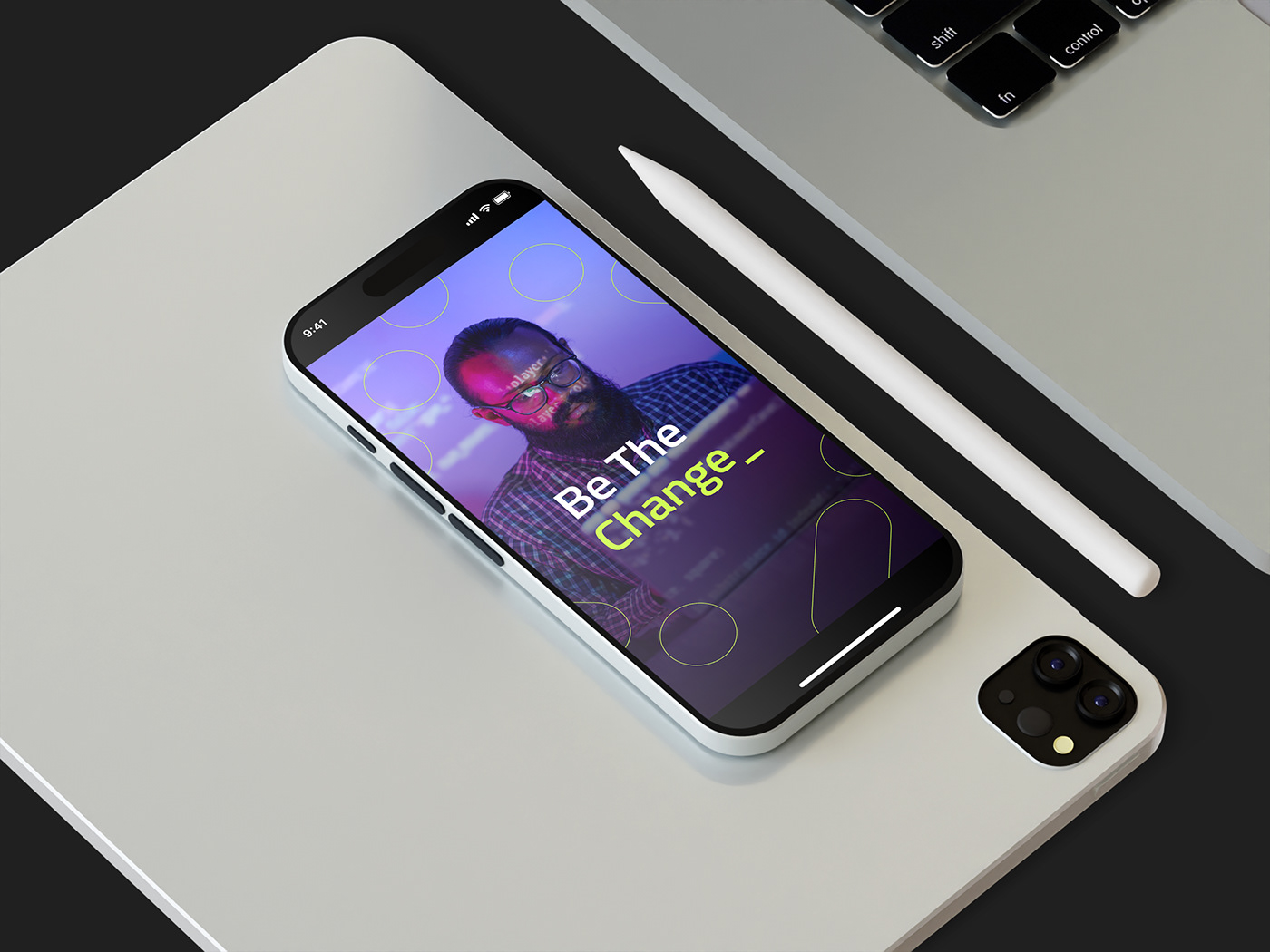
Evolving. Everyday. From Morse Code to Digital Code.
Be the Change_