


Pharmacy Museum in Podil –
Visual Identity
Design Type: Brand Identity
Business Sphere: Arts & Culture
(non-commercial project)
Dating back to 1728, the oldest pharmacy in Ukraine was established by the Bunge family, who were German aristocrats. Back then, pharmacies were rare and used for military needs. The Pharmacy Museum in Podil broke stereotypes and made history by being the first museum to provide access to medicines and prescriptions for those who have had to rely on traditional healers. This pharmacy has been turned into a museum since 1986.
Here, you can immerse yourself in 18th-century life with handcrafted items and a mystical atmosphere. The museum has gathered an exposition that demonstrates the fascinating evolution of pharmacy, from the mystical practices of alchemy and witchcraft to the more grounded and scientific approach.
Design Goals
The identity of the Pharmacy Museum was created to highlight the uniqueness and distinctiveness of this place. Our design is meant to immerse people in the museum's atmosphere and make it stand out among other museums in Podil.


Concept
In this very place, ordinary people could buy medicine for the first time. However, most perceive this pharmacy as just another pharmaceutical outlet and are unaware of its historical significance.
We are like X-ray radiation that illuminates essential objects for pharmacy development.
Visit our website and look how we make so unique designs!

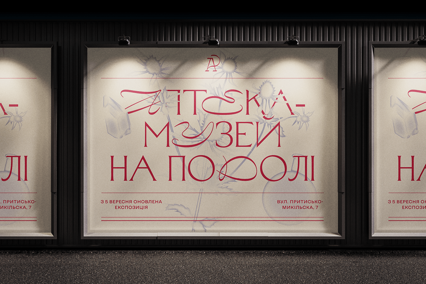
Design Solutions
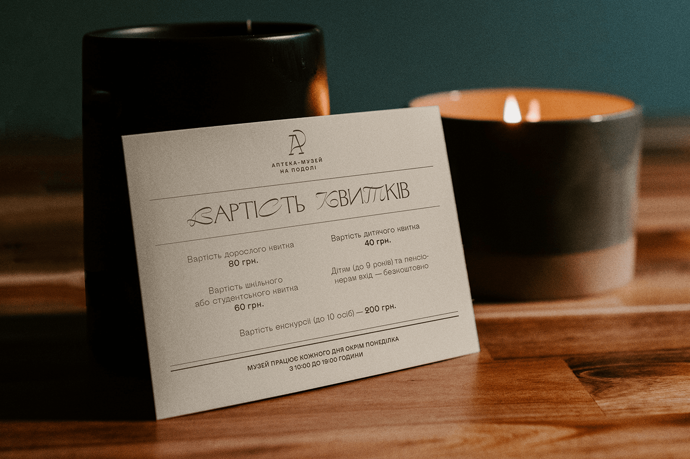
In typography, we combine a decorative accent font with a modern antique style, drawing inspiration from old pharmacy journals, documents, and records kept by pharmacists. The layout is inspired by the medicine labels of that time used on medicine bottles, characterized by a central composition with decorations and layered divisions.
Color Palette
The inspiration for the color scheme comes from the museum’s interior design and the colors of the vessels and herbs used in making medicines.
Logo
Our goal was to update the logo while still honoring the traditional symbol of the medical industry - the snake and cup,
also known as the Bowl of Hygieia. The typography of the logo blends the decorative flair of calligraphy with the practicality
of medicine labels.


Powered by League Design Technology
Design Director: Mike Samovarov
Team Leader: Aleks Gusakov
Graphic Designer: Anastasia Kobernyk
Case Design: Anna Fedorovych, Anton Bukoros, Alina Kovalenko
Design Director: Mike Samovarov
Team Leader: Aleks Gusakov
Graphic Designer: Anastasia Kobernyk
Case Design: Anna Fedorovych, Anton Bukoros, Alina Kovalenko
Important!
If you want to support Ukrainian designers and the entire Ukrainian people in the war for world independence from russian terrorism, please, follow the links below:
savelife.in.ua (charity fund)
u24.gov.ua (an initiative of the President of Ukraine)
If you want to support Ukrainian designers and the entire Ukrainian people in the war for world independence from russian terrorism, please, follow the links below:
savelife.in.ua (charity fund)
u24.gov.ua (an initiative of the President of Ukraine)


