I like to use the style of commercial evidence to convey my artistic visions. What appeals to me about commercial evidence is the simple use of clean, solid lines. Although there is hardly any shading and minimal use of color, commercial evidence still provides a chance for me to pay close attention to detail through the repetition of line and the use of line quality. In a way it’s so simple, yet so detailed and intricate. Once finished, commercial evidence posters have the power to convey a powerful message that is fairly straightforward due to the use of different typeface.
The idea for my project started with one man: Alphonse Mucha. Mucha’s artwork is the epitome of commercial evidence. His simple yet extremely intricate use of lines and patterns captivated me and inspired me to mimic this style. I decided to use the basic style of art nouveau: the use of borders, bold outlines, a single typeface, and a woman with exaggerated hair as the main subject. The message I conveyed through the typeface is a line from the song “Sleeping Sickness” by City and Colour. I interpreted the line how I saw it in my mind and used various symbols like skulls and stars.
The process of creating my final project began when I went to the library and checked out a book simply titled Alphonse Mucha, which I referred to multiple times throughout my project for inspiration. For my materials I chose a 22x30 piece of rag paper (to try and mimic the general dimensions of a standard poster) and black India ink Faber Castell pens with varying tips. After I collected the basic materials I needed, it was time to officially start my project. I drew the basic outline and line work with a pencil. Then I proceeded to go over the basic outline with the Faber Castell pens to bold them and make them stand out. After the basic outline was inked, I finished off the piece by using the pens yet again to fill in empty spaces, vary the line quality, shade in objects and create different textures. The process I chose wasn’t very complex but it required numerous two to three hour sessions of intense concentration to get the lines just right.
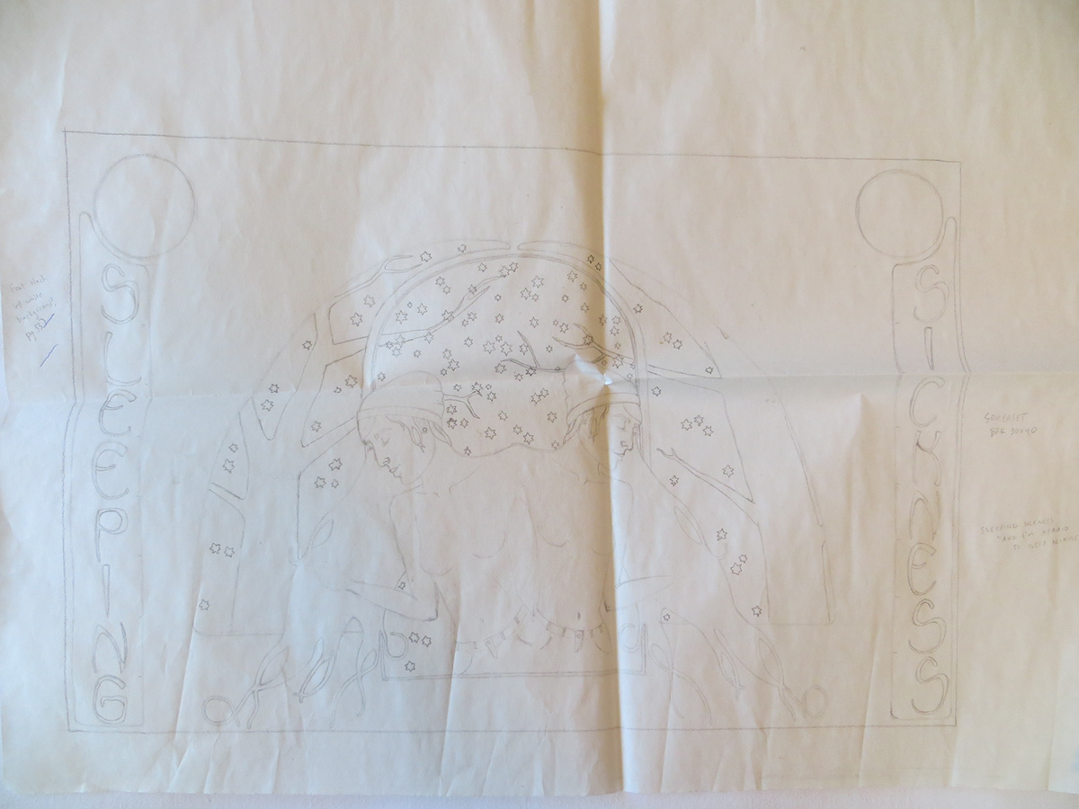
Preliminary Sketch

Sleeping Sickness
Black ink on rag paper
22x30 inches
2013


