
“Learn&Fun” Landing page Redesign
About Lear&Fun:
“Learn&Fun” is an online edutech platform that offers courses on various subjects. This includes the numbers of online videos curated by highly professional Teachers of there department in a very effective manner. So that a child can easily understand and follow.
Problem Statement ⚠
“Learn&Fun” is an online edutech platform that offers courses on various subjects. The client was facing problem regarding the output quality rate due to a poor user interface and user experience. Hence, Me & team decided to redesign their landing page to improve the UI/UX and satisfy the client concerns.
Process 📝
-- The first step was to understand the user requirements and the current pain points. The feedback from client revealed that the website is cluttered and confusing, with no clear call-to-action buttons and not in a good shape.
-- Based on this feedback, the team decided to redesign the landing page with a clean and simple design, with a focus on improving the user experience. The first change was to declutter the landing page by reducing the number of elements on it. The team removed unnecessary images and text, and re-organized the remaining content in a more user-friendly manner.
-- The next step was to improve the visual hierarchy of the landing page. This was done by using a clear and consistent color scheme, and by using font sizes and styles to differentiate between important and less important content.
-- To improve the user experience, the team added a clear call-to-action button on the landing page. This button was designed to stand out from the rest of the page, making it easy for users to find and click on it.
The changes I made 🤖
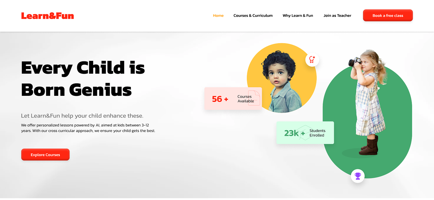
1. Earlier the top fold was using the AIDA method but was not able to visually represent the focus and was looking like the elements has been just thrown there.
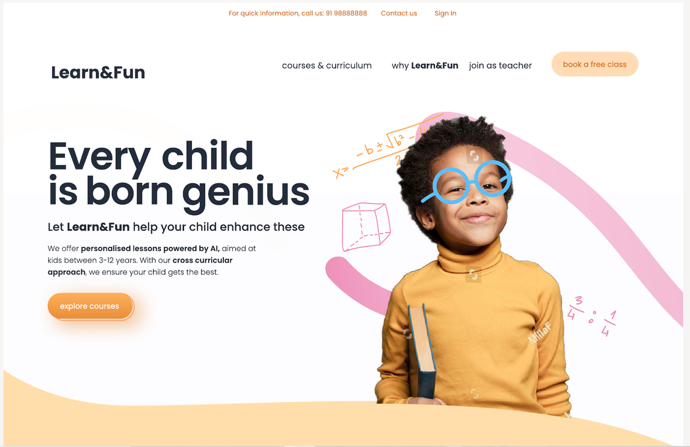
OLD VIEW
THE NEW VIEW
2. Making intentions clear, I have made this visually clearer and more understandable by listing down the best things a learner is looking in courses, and listed the courses in a more beautiful and effective manner with clear call-to-action button.

Results 🚀
Finally, the team conducted usability testing to ensure that the redesigned landing page was effective in improving the user experience. The results of the testing showed that users found the new design much easier to navigate and engage with, resulting in a significant good and satisfied feel from the client end.
Final Design 🚀

Prototype link: https://tinyurl.com/4xxsz2k8


