Description: Naming, logo design, corporate identity and window installation applications for WILLCO® Elevating Goods, a services and supplies company.
Strategy: We set the objective of the absolute identical attribution of the narrative with its visual representation, as for the message of the company to easily and clearly communicate with both the brand name and the logotype, at the same time.
Naming: As a main name we used an international radio-communication brevity word (WILLCO), meaning “messase received, I will execute” (will comply), adding one more “L” in order to make “will” as clear as possible. We then extended this main name with the clarifying “elevating goods”, giving the fact that the company’s services and goods are elevating the customers’ mood.
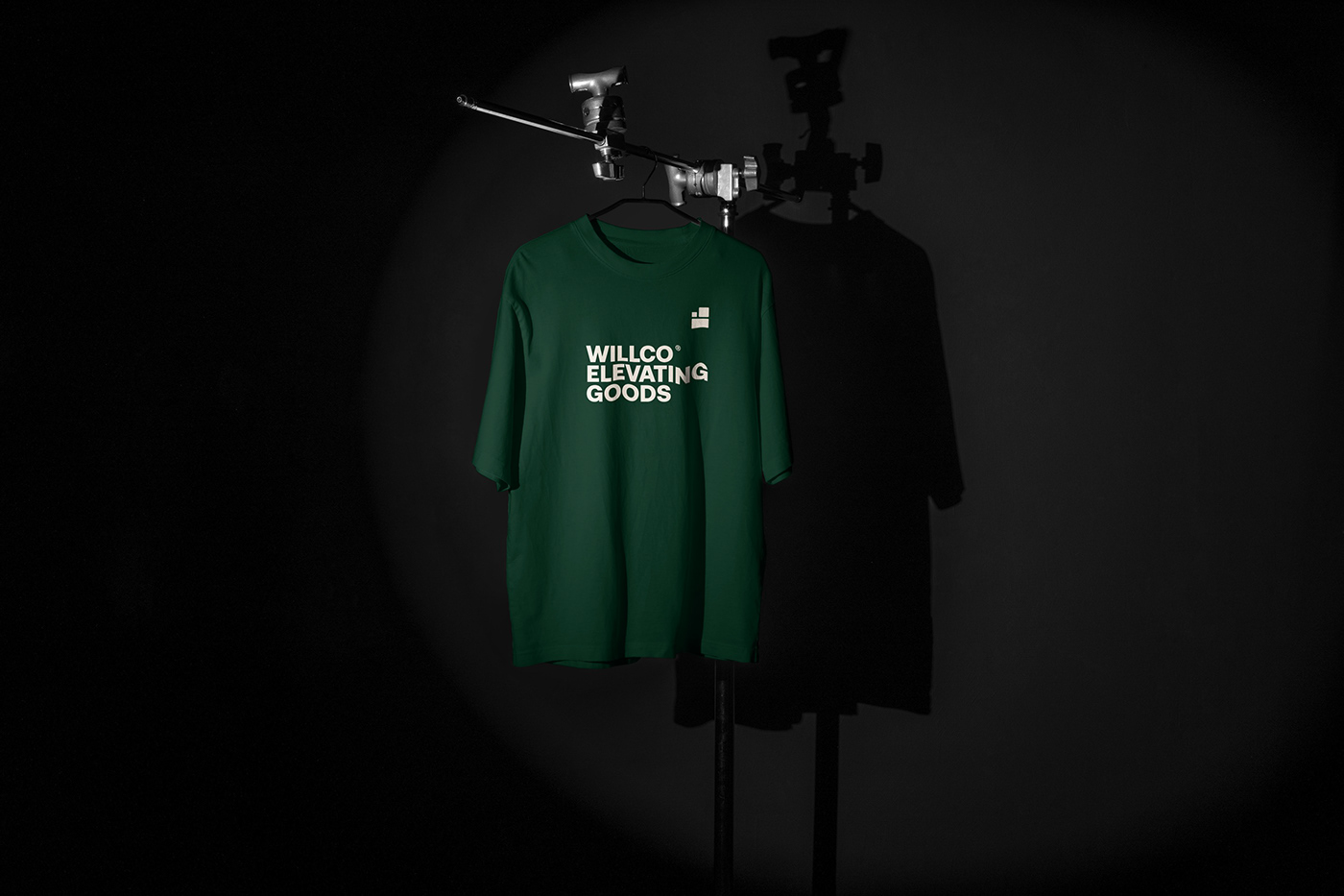
Logo Design: We attributed the brand name visually with a minimal geometric logotype, which represents elevating boxes with products. A straightforward trading symbol, escorted by an equally straight and robust font, which communicates power and trust. Overall, the logo is a statement of the balance, the arrangement and the security that every customer is looking for.
Corporate Identity: The corporate ID remained clean and settled, while reinforced with a
deep green color, as to highlight a promise of security and responsibility.