

Visual identity for conference event
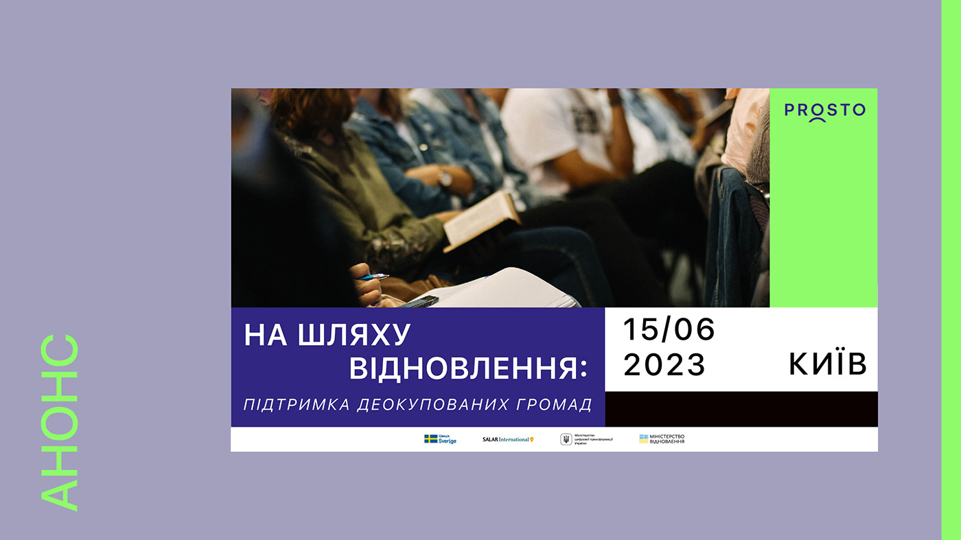
Path to Recovery: Support for Decentralized Communities
Target Audience: Leadership of decentralized communities in Ukraine (heads and deputy heads)
Format: Mix of offline attendance and online streaming
Objectives: Create visuals for event communication, animations, any other event elements
Emphasize: Recovery, collaboration, support, unity, resilience, adaptability, hope, optimism, interaction, stability, inspiration, and energy
Include: Event title, project logo, and possible use of branding elements
Deliverables: Visual design and two examples of its implementation for different channels
English translation:
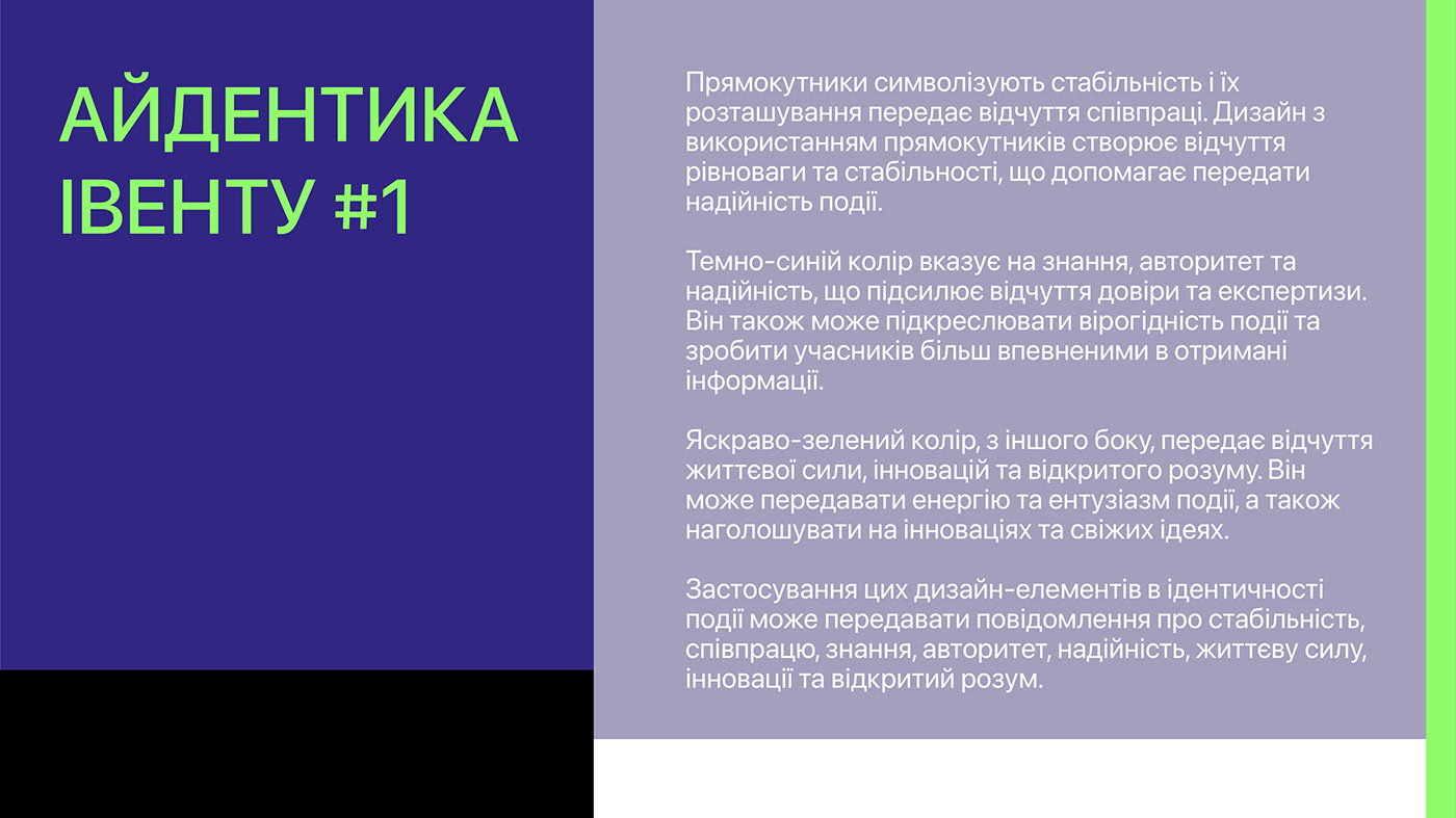
Rectangles symbolize stability, and their arrangement conveys a sense of collaboration. The design utilizing rectangles creates a feeling of balance and stability, which helps convey the reliability of the event.
The dark blue color signifies knowledge, authority, and reliability, enhancing the sense of trust and expertise. It can also emphasize the credibility of the event and make participants more confident in the information they receive.
On the other hand, the bright green color conveys a sense of vitality, innovation, and open-mindedness. It can transmit energy and enthusiasm for the event, as well as emphasize innovation and fresh ideas.
Incorporating these design elements into the event's identity can communicate messages of stability, collaboration, knowledge, authority, reliability, vitality, innovation, and open-mindedness.
Banner announcement
Event agenda brochure


ID Cards


